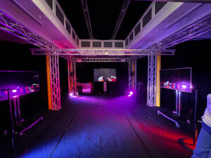
We wanted the space to feel open, so people could explore it in their own way without too many instructions. The sound of a slow, steady heartbeat played in the background and became the rhythm of the room. We placed stage lights on the floor, and later discovered they changed colour when they picked up vibrations. So, we kept them there, and they ended up reacting to the bass in the heartbeat sound, which made the space feel alive.
There were four sensors placed around the room. One Kinect in the front was taking visual input from the space. Three screens showed visuals that shifted in real time. The major shift happened when all four sensors were triggered at once. That meant people had to explore and figure out how to interact together. When it clicked, you could feel the energy shift with sound and change in visual. It looked like everyone had unlocked something at the same time.
This was our proposed room plan:
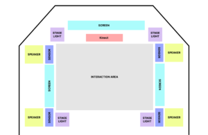
Sensors
- Kinect: Provides Visual input to process through the TouchDesigner effects
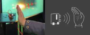
- Distance Sensor: Lets visitors trigger visual changes, such as making on-screen flames grow when they move closer or shift to the next effect when triggered at the same time.
Electronics
- Computer or system units: Runs the interactive software and connects to the sensors.
- Speakers: Play a continuous heartbeat sound that sets the mood and drives interaction.
- Cables and power: All necessary connections and adapters.
- Mounting hardware: Used to position the Kinect and other components securely.
Displays and Lighting
- Three screens: Positioned around the room to show responsive visuals that change based on visitor behaviour.
- Stage lights: Originally designed to change with a tap, but we used them on the floor to respond to bass vibrations from the heartbeat sound.
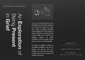
Designing the Brochure
We put together a trifold brochure to help visitors interact with the space more easily. Since the sensor only responded when the hand was placed in a specific way, a lot of people were unsure how to engage with it at first. So we included a simple diagram in the brochure showing exactly how to position their hand for the interaction to work.
Reflections and Learnings
One of the biggest takeaways was the importance of clear communication in guiding the visitor experience. While we had hoped the sensory feedback would be intuitive, we quickly realised that many visitors needed a bit of direction to fully engage with the space. The diagram in the brochure was a simple but effective solution, as it helped demystify the interaction process.