This week is final presentation week. The time set by our presence group is from 18:00 to 20:00 on Wednesday night, at the Atrium of Alison House. The reason for setting it at night is that we want a darker environment, which will greatly increase the immersion for our installation, and the value of the light sensor will be easier to control. But the sudden arrival of daylight saving time caught us off guard. Although the brightness is higher than originally expected, the on-site effect is still relatively good.
Following are some videos of the final installation:
Sensor Sensitivity Issues
In the afternoon before setup on the day of the final presentation, I met with Joe at the scheduled time to resolve the sensor sensitivity issue. Joe pointed out the problem with the sensor sending data part of the original Max patch, that is, I divided the information received by the sensors on the same Arduino Uno into two route objects (see Figure 1).
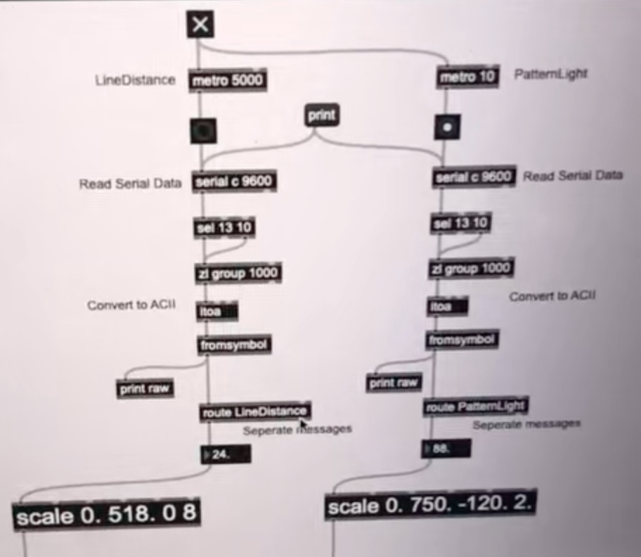
Figure 1: The Sensor Sending Data Part in the Original Max Patch.
This will cause Max to only receive one of the sensor data allocated by the route object, and cannot output the data of all sensors at the same time. After gathering all the data into a route object, the data transfer ran normally (see Figure 2).
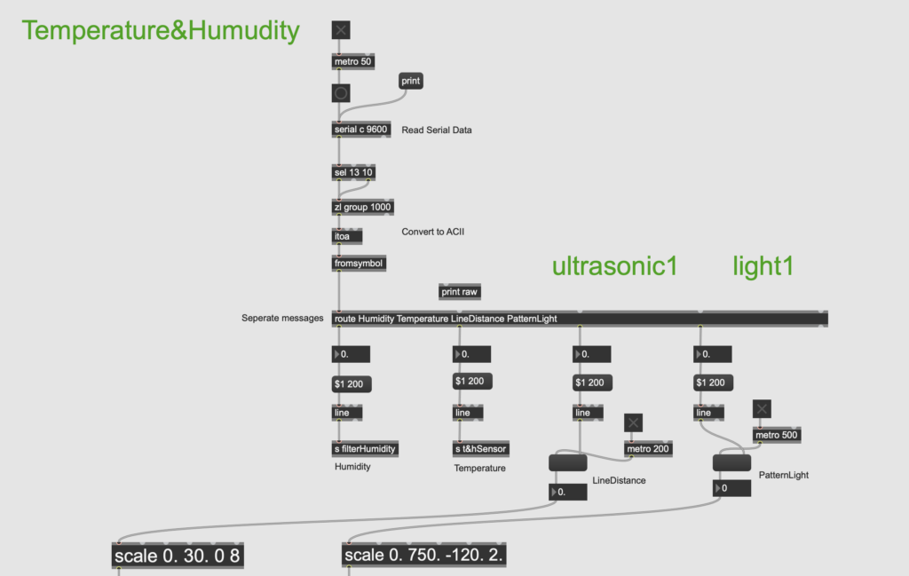
Figure 2: The Sensor Sending Data Part in the Modified Max Patch.
In Arduino, Joe suggested changing delay() to yield(), so that the code can run step by step without affecting the progress of other tasks (see Figure 3).
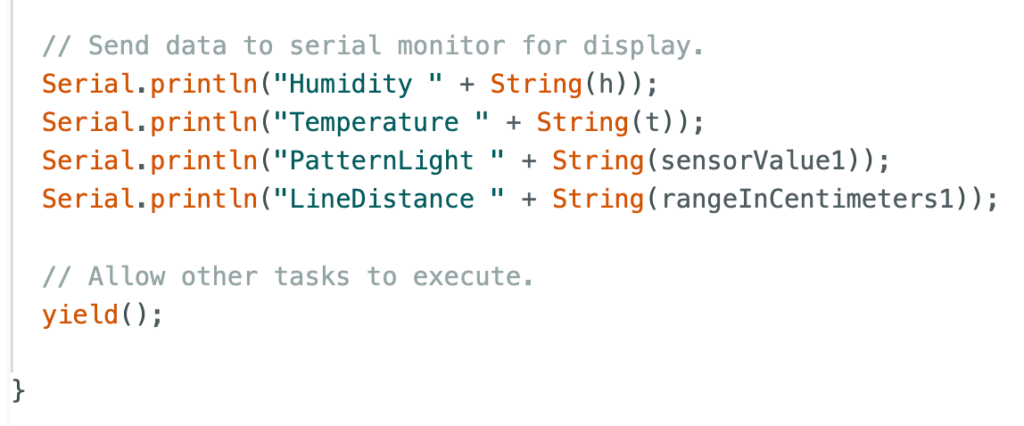
Figure 3: The Application of “yield()” in Arduino Project.
After these adjustments, the sensor sensitivity problem was successfully solved. This greatly helped improve the integrity of our installation while ensuring fun.
Ending
In addition, we intensively discussed the ending settings before the final presentation. Considering that each user’s perception of emotions is different, some people may want to escape from the environment after calming down, but some people may still be immersed in it and want to feel it again. So we decided not to limit the specific ending, but to let users choose which level to end the experience. This means that the four levels are in some kind of loop. After users press the button to reach the fourth calmness level, they can continue to press the button to restart the first level, and so on. That is, users can press the button an unlimited number of times until they want to end at a certain level.
Feedback
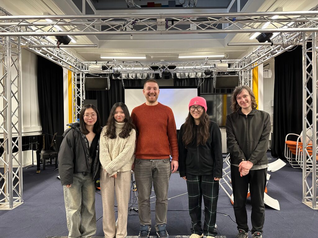
We also received some very helpful feedback on site. The first one to arrive was Jules. He experienced the entire interactive installation on his own and gave very substantive advice (see Figure 1).
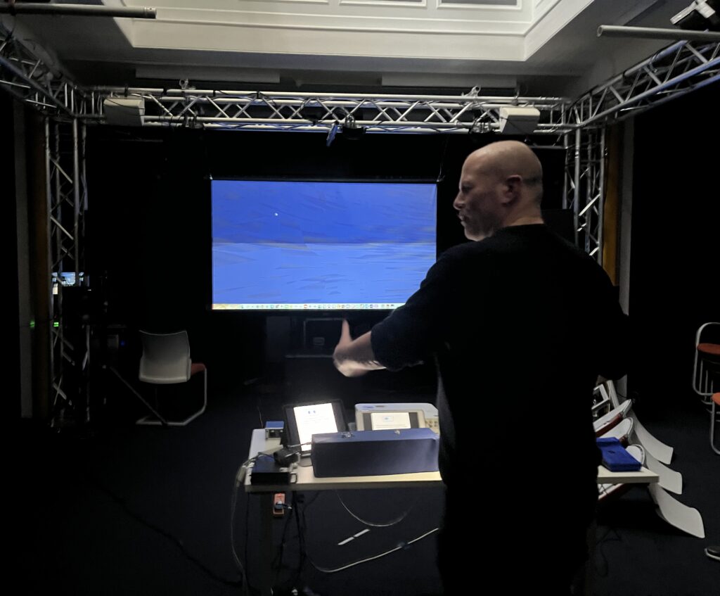
Figure 1: A photo Showing Jules Giving Feedback.
The first thing is that most of our sound samples are concentrated in the same frequency band, mostly in the middle and low frequencies, resulting in the phenomenon that music and sound effects are easy to “fight” with each other, so that the two can not being well highlighted or integrated together. The solution is to replace some music and sound effects with higher frequency sounds, such as piano arpeggiated melodies or high-frequency sea monster sounds.
The second one is that it would be more immersive if we could add four speakers above to create an underwater perspective. Since our theme centered around thalassophobia, it would have been more engaging to create a deeper ocean atmosphere on site.
The third one is that we would better make a poster and stick it on the door outside, so that everyone can have a general understanding of our group’s installation before entering. So we drew our own cute posters and put them on the door of the Atrium (see Figure 2 and Figure 3).
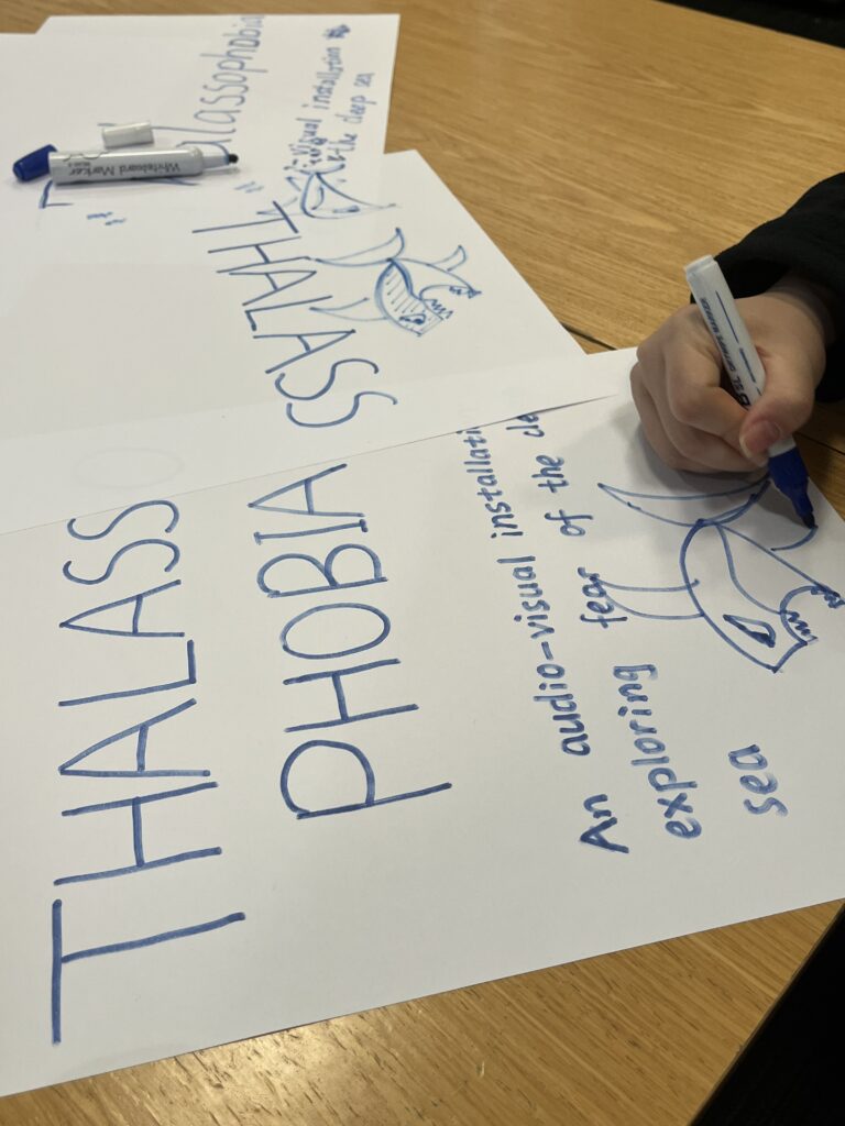
Figure 2: Poster making process.
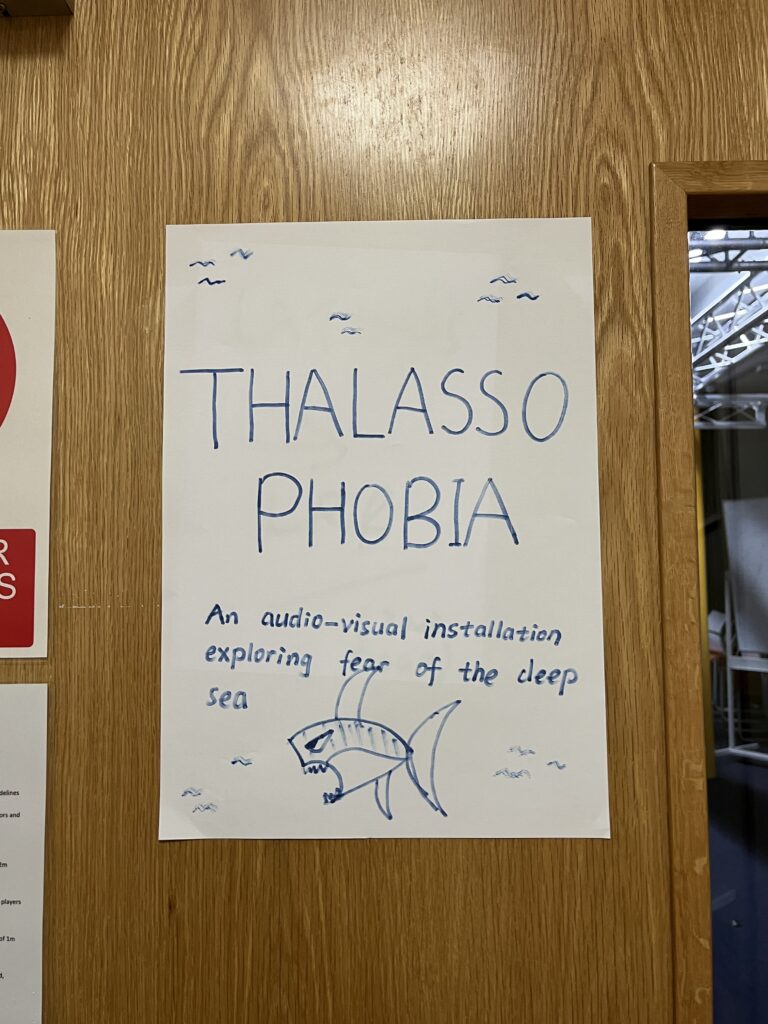
Figure 3: Poster of our group’s installation.
The last point is the placement of hardware equipment. Jules suggested placing the two sensor boxes in columns together on the table, rather than in the same horizontal row (see Figure 4). In this way, when the user controls one of the light sensors, the other light sensor can also be controlled together, so that the user can better feel the changes in sound and vision at the same time.
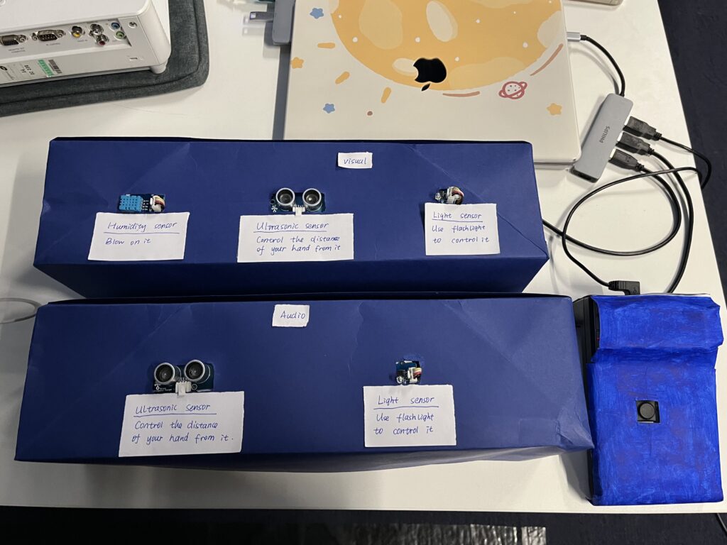
Figure 4: The Placement of Hardware Equipment.
During the formal presentation, a tutor made a very clever suggestion about the placement of our equipment. She suggested that we could attach the sensor usage instructions directly to the sensor boxes, so that users do not have to glance at the iPad next to them and then come back to interact with the sensor, which reduces some troublesome steps. Therefore, we wrote small notes with instructions for each sensor and posted it on the sensor boxes for the convenience of users (see Figure 5).
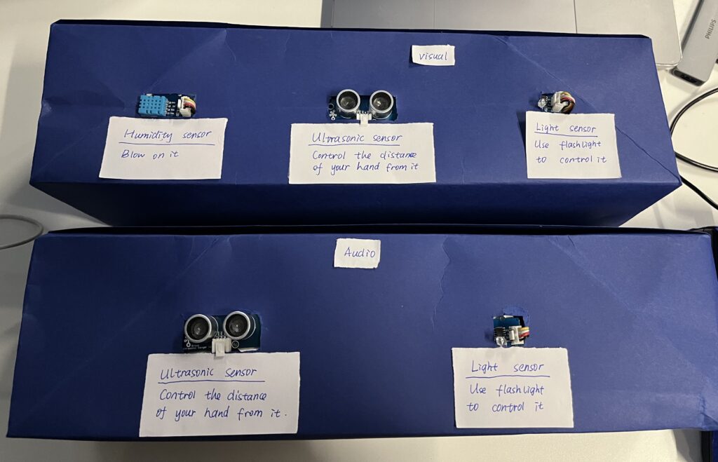
Figure 5: Sensor Instruction Note.
Most users found our interactive installation interesting, but the visuals could be richer and the sensor settings could be clearer. Overall it’s quite immersive. I am personally satisfied with the overall setup on site (see Figure 6). It can be easily understood by users without losing the sense of atmosphere. What we need to do now is to analyze the feedback we get in the presentation and solve the problems found. In addition, I personally think that some optimizations can be made in the software, such as making the project look more concise and clear.
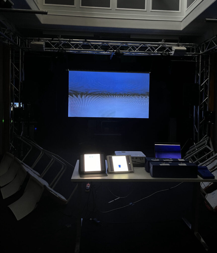
Figure 6: On-site Installation Setup.
Thanks very much for everyone’s hard work during this time. Special thanks to Jules, Leo and Joe for their strong support and technical help. Thanks also to all the teachers and classmates for attending. From the prototype in the first week to the actual implementation now, I am very moved by the step-by-step efforts of our Presence group. Thanks to my group members.