Static User Interface Design
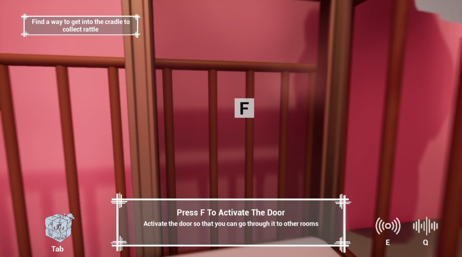
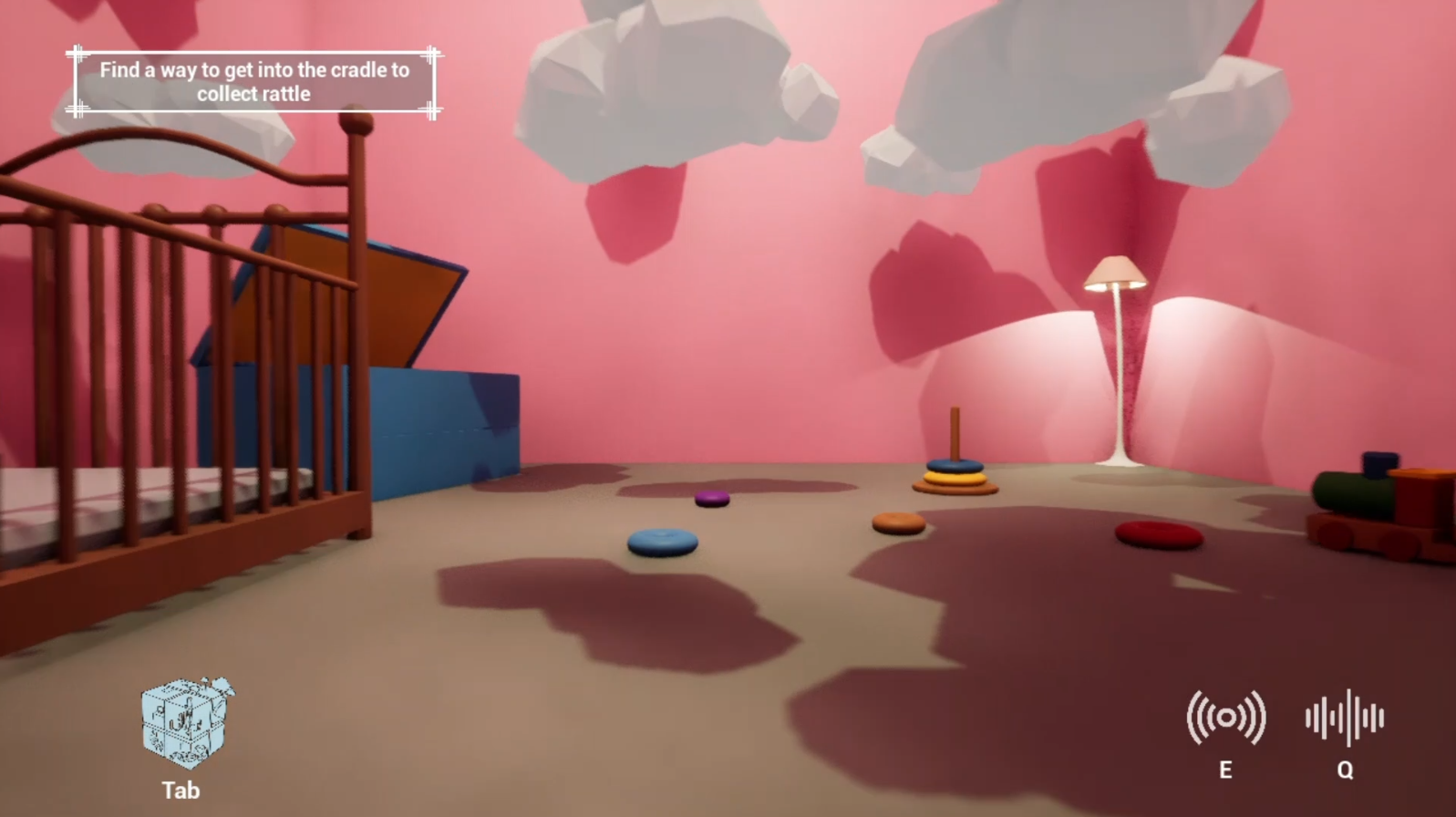
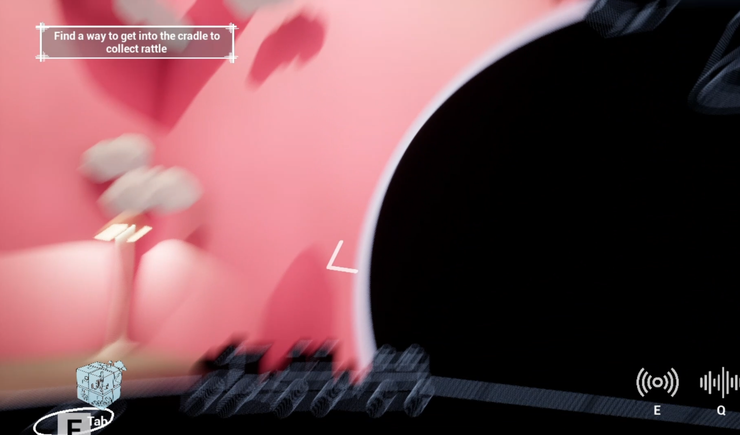
Regarding static UI design, usability and intuition are the first principles we follow. In addition, we divide the UI design into two main modules, one is the resident UI displayed during regular gameplay, this module adopts minimalist design principles, only including the task prompt text in the upper left corner and the three keystroke icons at the bottom of the screen for reminding purpose, all patterns use translucent style to minimize the impact on game immersion.
The other module is the map UI which requires pressing the tab key to exhale. The UI design of this part aims to provide users with more auxiliary information and emphasizes the real-time interaction of UI. Based on this, we designed a 3D Rubik’s cube map in the middle of the interface to more intuitively show the spatial relationship between different rooms, and also provided a rotation function for players to view the location of each separate room from different perspectives.
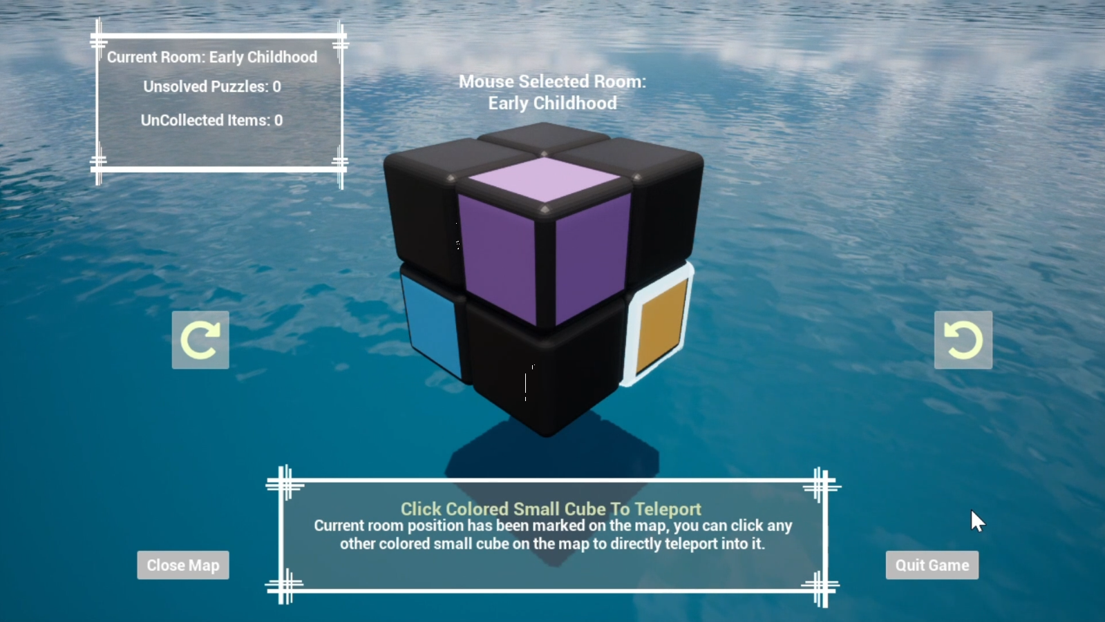
This map UI module was designed to show more information for helping players pass the level, so it includes a “Current Room” tab on the upper left corner which gives the current room name and remaining puzzles, a real-time responsive “Selected Cube” tab on the upper middle area to tell the name and status of the mouse-selected cube, as well as a “Target Guidance” tab on the lower middle area which gives a lot of text details to help players understand what to do next or how to use this UI map.
When hovering the mouse cursor over small cubes, a glowing frame will appear to remind the player which cube is selected, and colored cubes will display a glowing outline of its key object in the center of it to remind the player which room this cube refers to, together with the room’s name displayed in the “Selected Cube” tab, we try to make it more clear for the players to understand the reflection of cubes and rooms.
Dynamic User Interface Design
As the progression of the game process mainly depends on the interaction between players and key items, guiding players to find the location of interactive items became a very important part of UI design. In order to reduce the effect of the UI prompt on immersion, we bind the UI prompt to the sonic radar so that the player can see the explicit UI prompt only when the sonic radar is triggered actively.
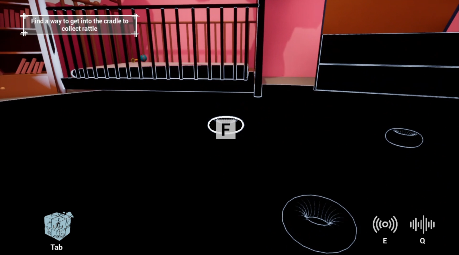
We also split such hints into 2 ways to give players intuitive guidance. First of all, when the interactive item is directly in the player’s field of vision, an “F” icon, as well as a glowing outline, will be displayed on the interactive item to indicate its interactivity as shown in the below image.
When the interactive object is not directly in the player’s field of vision, according to the angle between the object and the center of the player’s camera, an arrow UI pointing to the interactive object will be displayed on the edge of the screen to prompt the player to turn their camera to the direction of the object. The horizontal position and orientation of this arrow icon on the screen will be updated in real-time following the player’s movement and rotation of the view angle. When the player’s view field is aimed at the interactive object, the icon will change into a hand pattern to indicate interactivity. You can find an example in the below image:
Besides, when the player moved close to an interactive item, the “F” icon and some text hints will also be displayed to indicate the interactivity like in the below image.
