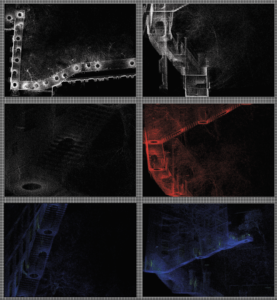
When creating promotional materials for the exhibition, our goal was to convey the essence of the project in a way that was engaging and accessible for potential visitors, we opted to use the rawest form of visual data available, in our case it was the images generated through cloud compare when we first started working with the cloud points.
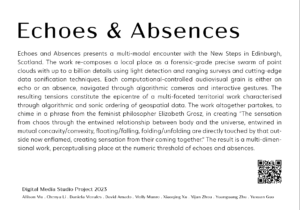
Our goal was to visually convey the key ideas of Echoes and Absences to potential visitors, using imagery that was both captivating and informative. To achieve this, the team chose to create posters showcasing some of the images generated during the process. In addition to the posters, we also designed postcards for visitors to take home with them. These postcards feature some of the images generated during the development of the project, as well as additional information about the project and a QR code to the blog that shares our work. The postcards are intended to serve as a reminder of the exhibition, as well as a way for visitors to further learn about the project after their visit.
Overall, the team’s approach to designing promotional materials was to focus on the visual representation of the project’s core concepts, using captivating imagery to engage potential visitors and encourage them to learn more about the exhibition, the materials created were intended to serve as effective tools for promoting the exhibition and generating interest among the public.
Final Poster Design
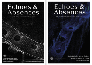
For the posters we printed both of them in A1, and once we saw the printed results, we decided to use the black and white one for the exhibition as it looks with more quality. While the blue one we used as a supporting poster at the entrance of the room, and decided that this should be used for the digital posters, as the quality digitally is amazing.
Final Postcard Designs
The postcards will have a selection of images on one side, our manifesto on the back, along with the team’s members’ names, and a QR code to the home page of our blog. On the exhibition day, the postcards received great feedback from the audience, as it allowed them to take a bit of the exhibition with them, and gave them the opportunity to learn more in-depth about the project.
If you’re reading this in order, please proceed to the next post: ‘Sound Installation Setup in Exhibition’.
Daniela M