- Video Filming-Chao Li, Ruotong Wu
-
Video Editing and Color Grading- Chao Li
Video Production Process
Filming
- After deciding on a video-based format, we discussed how to create an immersive experience that also highlights the differences between a dog’s and a human’s perspective. Through two rounds of prototype testing, we finalized the current presentation style.
- The format involves a dog and its owner roaming Calton Hill together, switching between the dog’s and the owner’s viewpoints to help the audience appreciate the uniqueness of the canine perspective.
- We consulted Mia, a dog expert, to better understand canine behavior, she provided valuable insights. This greatly helped us mimic a dog’s state during filming.
- We attempted to use a GoPro mounted on a real dog to capture the roam, but encountered two major challenges: 1) We couldn’t find a dog that would fully cooperate, and renting one exceeded our budget. 2) Although a kind stranger on Calton Hill allowed us to test with their dog, the dog was unwilling to work with the GoPro harness, so we had to abandon this approach.
- Ultimately, we conducted three formal shoots and cleverly edited footage from all three sessions into the final film. We were fortunate to have good weather for all shoots, which made it easier to blend the footage seamlessly.
Post-Production
- Before editing, we conducted extensive research on canine hearing and vision to inform our audio-visual production choices.
- Dogs have a wider hearing range than humans, especially in the high-frequency region (up to 60kHz). We decided to enhance the high-frequency elements in the audio to make sounds sharper and clearer, simulating a dog’s sensitivity to high-pitched noises.
- We also added emotional elements, such as reverb and amplifying subtle sounds that humans might overlook, to simulate a dog’s heightened emotional response to certain auditory cues.
- In terms of vision, dogs differ from humans in several key ways:
- Color Perception: Dogs have dichromatic vision, seeing primarily shades of blue and yellow, while red and green appear as shades of gray.
- Visual Acuity: Dogs have poorer visual acuity (about 20/75), meaning they need to be much closer to objects to see them clearly compared to humans.
- Motion Detection: Dogs excel at detecting motion due to more rod cells in their retinas and a higher flicker fusion rate (~75 Hz).
- Field of View: Dogs have a wider field of view (about 240° depending on breed) but narrower binocular overlap (about 60°), resulting in reduced depth perception.
- Light Sensitivity: Dogs are more sensitive to brightness and shades of gray, thriving in dim environments, while humans are optimized for bright light and color differentiation.
Based on this research, I used color curves in editing software to adjust for canine vision characteristics, including edge distortion and color grading. To simulate the difference in depth perception, I selectively blurred parts of the image. For the human viewpoint, I applied a LUT to make colors more natural and vibrant, emphasizing the contrast with the dog’s perspective.
Specific Editing Steps
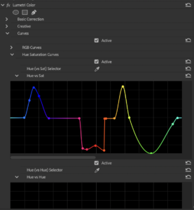
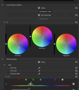
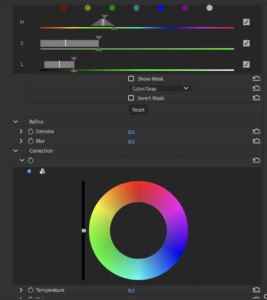

Step 1: Adjust Color Perception
- Use the Lumetri Color effect on the dog’s clips or an adjustment layer.
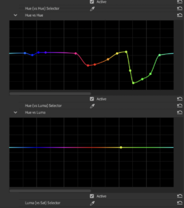
- In the Curves Panel, utilize the Hue vs Saturation Curve:
- Reduce saturation for red and green tones.
- Enhance saturation for blue and yellow tones.
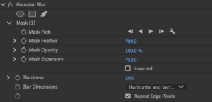
Step 2: Simulate Reduced Visual Acuity
- Apply the Gaussian Blur effect to the dog’s clips or adjustment layer.
- Set the blur radius to subtly reduce sharpness without making the footage unrecognizable.
- Use masking tools to isolate areas and feather edges for a natural look.
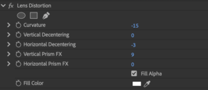
Step 3: Adjust Field of Vision
- Apply Lens Distortion.
- Adjust curvature settings to slightly widen the perspective, creating a fisheye-like effect.
Reflection and Summary
During the color grading process, I spent a significant amount of time trying to achieve a more pronounced yellow tone, but was never fully satisfied with the results. Since yellow and red are close on the spectrum, adjusting one often brought out unwanted green tones. After weighing the options, I settled on the current version, which features predominantly blue, cooler tones, creating a strong contrast with the human perspective. If I had more time, I would continue refining the grading to bring out more yellow tones and achieve a more satisfying result.