
Purpose:
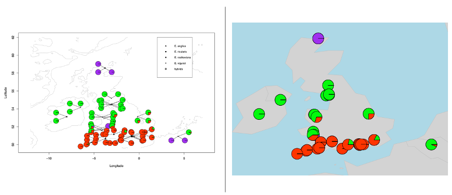
Link the structure pie charts to the map according to coordinates.
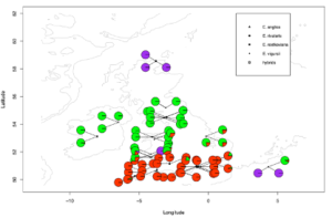
Part One. Simple maps without separating pies
R package required: #reshape#; #rworldmap#; #rworldxtra#
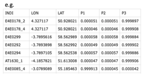
Input files: pie plot details with coordinates; format including three parts: 1. individuals; 2. longitude and latitudes; 3. pie proportions
Code:
K3 <- read.csv(‘DDA-K3.csv’, sep = ‘,’, header = T)
mapPies(dF = K3,
nameX=”LON”,
nameY=”LAT”,
nameZs =c(‘P1’, ‘P2’, ‘P3’),
zColours=c(“green”, ‘red’, “purple”),
oceanCol = “lightblue”,
landCol = “lightgrey”,
mapRegion=”uk”)
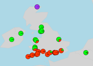
Part Two. Separate overlap pies
R package required: #marmap#
Input files: 1. Illustration file (if needed, showed in topright legend); 2. pie plot details with coordinates, the same showed above in part one.
Code:
library(marmap)
uk <- getNOAA.bathy(lon1 = -12, lon2 = 7, lat1 = 49.6, lat2 = 62, resolution = 5) ##set the map’s range and resolution####species, for legend
s1 <- read.csv(‘DDA-ANG.csv’, sep = ‘,’, header = T)
s2 <- read.csv(‘DDA-RIV.csv’, sep = ‘,’, header = T)
s3 <- read.csv(‘DDA-ROS.csv’, sep = ‘,’, header = T)
s4 <- read.csv(‘DDA-VIG.csv’, sep = ‘,’, header = T)
s5 <- read.csv(‘DDA-HYB.csv’, sep = ‘,’, header = T)
###K3
plot(uk, deep=-8000, shallow=0, step=1000,col=”grey”)
points(s1[, 2:3], pch=17,col=”black”, cex=0.5)
points(s2[, 2:3], pch=19,col=”black”, cex=0.5)
points(s3[, 2:3], pch=15,col=”black”, cex=0.5)
points(s4[, 2:3], pch=18,col=”black”, cex=0.5)
points(s5[, 2:3], pch=11,col=”black”, cex=0.5)
d2 <- read.csv(‘DDA-K3.csv’, sep = ‘,’, header = T)
a2 <- rep(“green”,length(row(d2[1])))
b2 <- rep(“red”,length(row(d2[1])))
c2 <- rep(“purple”,length(row(d2[1])))
color2 <- data.frame(a2,b2,c2)
space.pies(d2[,2], d2[,3],
pie.slices=d2[,4:6], pie.colors=color2[,1:3], pie.radius=0.3)
legend(2,62, c(‘E. anglica’, ‘E. rivularis’, ‘E. rostkoviana’, ‘E. vigursii’,’hybrids’),
cex = 0.8, col = ‘black’, pch = c(17, 19,15,18,11), y.intersp = 0.5,
text.width = 1.5)
Other tutorials
Drawing beautiful maps programmatically with R, sf and ggplot2 (three parts):