Week 06 – Key Strategies for Enhancing Visual Comfort and Directing Attention


Lighting design plays a critical role in shaping the ambience of a space and enhancing visual comfort. This week I read ‘How to Design for Visual Comfort Using Natural Light’ and ‘The Six Priorities Determine Where the Eye Looks First’.
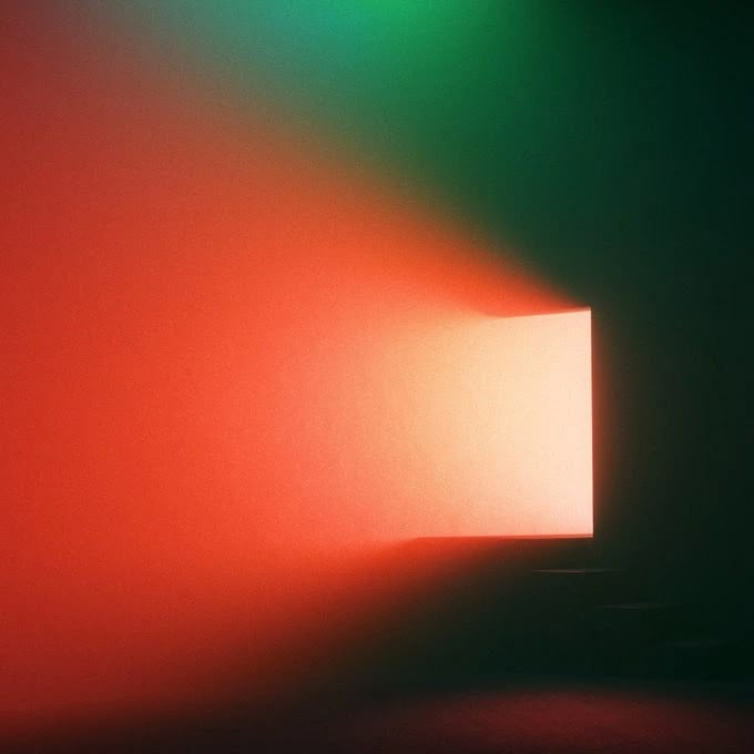
Based on the ArchDaily article, I understand that visual comfort is determined by the following metrics: First, the Illuminance Level should match the function of the space, ensuring that there is enough brightness without overdoing it. Secondly, Luminance Contrast needs to be appropriate to avoid visual fatigue. Glare Control is also key, as too much light can cause discomfort. In addition, the Color of Light should be coordinated with the use of space, the choice of warm and cold tones will affect the mood and feelings of people. Finally, light distribution should be even, avoiding shadows or bright spots.
Peachpit’s article emphasises the priority of visual attention, which is also important in lighting design. Firstly, Movement attracts the most attention, so dynamic lighting directs the eye. Secondly, areas with a clear focus become the centre of vision, so highlighting a specific area or object by means of a spotlight, for example, can be an effective way of directing attention. Difference is also key, unique light and shadow effects or colour changes can attract attention. Additionally, areas of greater brightness are noticed first, so adding brightness to areas that need to be emphasised is a common technique. Size and In Front can also affect visual priority, with larger objects or elements in the foreground more likely to be noticed.
Taken together, successful lighting design requires comprehensive consideration of light intensity, distribution, colour and coordination with the function of the space, as well as using the principle of visual attention priority to subtly guide people’s eyes and create a comfortable and functional environment.
References:
https://www.peachpit.com/articles/article.aspx?p=3089307&seqNum=2