Death is often seen as the ultimate void, yet it holds deep symbolic and aesthetic significance. This week, I continue my research on The Colors of Death, integrating Fran Cottell’s artist-curator theories, the agency of exhibition spaces, and the transient nature of materials in contemporary curation.
Curating Death: Space, Objects, and Agency
Fran Cottell’s work challenges traditional exhibition formats by treating space and objects as active participants. In The House Projects (2001-17), she blurred the boundaries between domesticity, memory, and institutional critique, raising key questions:
- How can we curate something as fleeting as death?
- Can colors, as symbols of mortality, carry agency within an exhibition?
- How does the exhibition space itself embody ephemerality?
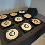
Figure 1: Fran Cottell, The House Projects. Cover image of The House Projects,Image courtesy of South London Gallery.
Different cultures assign varying meanings to death through color—black in Western mourning, white in East Asia, and vibrant hues in Mexico’s Día de los Muertos. How can curatorial strategies disrupt these norms?
Case Study: Damien Hirst and the Spectacle of Death
Figure 2: Damien Hirst, For the Love of God (2007). Image courtesy of Damien Hirst and White Cube Gallery.
Damien Hirst’s The Death of God (2006) at Hilario Galguera Gallery explored mortality through gilded skulls, preserved animals, and religious iconography. His use of gold, symbolizing eternity and divinity, subverts traditional mourning palettes. Instead of portraying decay, he frames death as opulence and transformation, raising a critical curatorial question:
Can exhibitions shift the perception of death from absence to presence, from decay to rebirth, through color?
In contemporary curatorial practice, ephemeral materials—decaying flowers, melting wax, and oxidizing metals—allow exhibitions to evolve over time. Inspired by Cottell’s notion that exhibitions possess agency, I am exploring the concept of a living archive, where elements fade, shift, and disappear. Could color itself become a temporal medium, with light-sensitive or interactive pigments altering the audience’s experience?
Conclusion: Towards a Working Exhibition Concept
Moving forward, I aim to develop a curatorial framework where color is not static but changes over time, using material transformations to embody the transient nature of death. This week’s research has reinforced the need for exhibitions that not only display but actively enact their themes, ensuring curatorial criticality.
What colors do you associate with death, and how might an exhibition reframe them beyond mourning?
References
- Fran Cottell. (n.d.). The House Projects. Retrieved from http://www.francottell.com © by Fran Cottell is licensed under CC BY-SA 4.0.
- Guangdong Museum of Art. (2011). Approaching the Horizon Indefinitely. Retrieved from https://www.gdmoa.org/Exhibition/Exhibitions/2011/201102/t20110228_10392.shtml © by Guangdong Museum of Art is licensed under CC BY-SA 4.0.
- Artsy. (n.d.). Damien Hirst | The Death of God, Galeria Hilario Galguera (2006). Retrieved from https://www.artsy.net/artwork/damien-hirst-death-of-god-galeria-hilario-galguera-6 © by Artsy is licensed under CC BY-SA 4.0.
- Marialaura Ghidini. (2020). Curating the Ephemeral: New Forms of Exhibition in the Digital Age. Retrieved from http://archive.rhizome.org © by Marialaura Ghidini is licensed under CC BY-SA 4.0.
- MyArtBroker. (2022). The Skull, the Butterfly and God: Damien Hirst on Death & Religion. Retrieved from https://www.myartbroker.com/artist-damien-hirst/articles/damien-hirst-death-religion © by MyArtBroker is licensed under CC BY-SA 4.0.


Julie Louise Bacon
10 February 2025 — 18:11
The first Blog of any substance was posted on 4th February, Week 4 of the course. This is a major concern and can impact on your achieving a pass for this element of the summative assessment. I have stressed the importance of adding content each week to your curatorial portfolio (summative assessment #1) and directed all students to the Toolkit which we discussed as a cohort in depth in the Planning Meeting in Week 2. Take time to correct this as soon as possible. The post contains some interesting content about the symbolism of yellow, but the writing is disjointed and not properly contextualised: the posts should give a narrative description of the research and development of your SICP.
You make no mention of the collective work that is done in Planning Meetings: you need to review and reflect on the collective work, link it to you own project where relevant and add independent research that expands on the tasks/discussions.
It is also very important to add content that contextualises your independent project research in relation to the content and key ideas raised by course materials and weekly lecture themes. This can be references to readings, a thinker or curator, case study examples of arts organisations, arts practice etc from the lectures. You then show how this has informed your own work.
With so little content it is hard to give more useful/personal formative feedback at this stage.
Presentation: Do not write your content in any language except English. Use headings for weekly posts and sub-headings strategically; format key terms/ideas (eg bold), delete the first post automatic WordPress post or personalise; use Week in each heading, use different lead images for each post; take care to give all information necessary when you cite research; add bibliographies to end of posts.