The First Swallow
On the 4th of March I had a follow up meeting with Kristína Bujnová. I gave her the footage I had sorted through, and she showed me some of the designs created by some graphic design students. They had created an array of posters, social media posts and short animations, all for the purpose of marketing The First Swallow. We discussed how each product represented the style of the film and I shared my opinions.
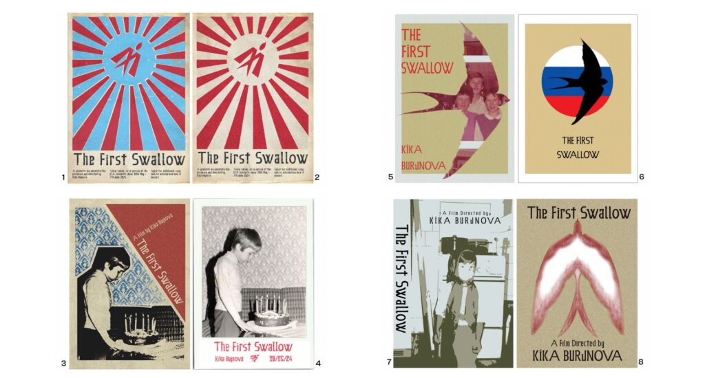
We first looked through the mock-ups of the film posters, pictured above. Kristína and I shared the opinion that the swallow on the front of cover, as seen in posters 5, 6 and 8, was too closely linked to the title and not representative of the films message. Personally I liked the third poster the most.
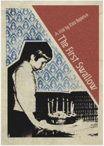 This poster was more fitting with the colour scheme Kristína has created for the First Swallow. It also has a textured quality to it, and has an interesting composition which will create audience interest. It also has a vintage aesthetic, which reflects the way the film follows people from three different generations. Film Companion highlights the importance of distinctive key art for a movie poster, as it helps make the film recognisable and more memorable. According to Nashville Film Institute, there are some key features of a film poster:
- The Movie Title
- Name of the Directors
- A visual that represents the film
- Name of actors and actresses that feature in the film
- Producers
- A ‘tagline’ or teaser
Key art is “the singular, iconographic image that is the foundation upon which a movie’s marketing campaign is built.”
– The Hollywood Reporter
The graphic design team also created some animations, for the purpose of posting on social media or for other marketing strategies. Below are two examples of these animations. The first would most likely be used for social media, to start introducing the aesthetic and the title of the film. The second clip is an example of something that Kristína felt didn’t fit her film, mostly because of the neon colours. I agree with her judgement, because the bright colours are too contrasting with the old photographs and don’t fit the aesthetic she has created for The First Swallow.
They also created a short title sequence, which could also be used as a short teaser for the film. I think it is very effective, and it’s clever how they turned the ‘w’ into a logo.
Articles Referenced:

https://www.filmcompanion.in/posterphilia/posterphilia-what-makes-a-great-movie-poster

https://www.nfi.edu/how-to-make-a-movie-poster/