This week, we turned our attention to General Arrangement – adapting our hero design to fit the floor plate of the building, and planning and developing the public spaces in our hotel designs. I began with some rough zoning ideas, reflecting on the case studies I had looked at and how each of those had allocated and prioritised uses of particular areas. Additionally, as part of my consideration I looked to the AA star rating system for hotels which we had discussed at the beginning of the semester to dictate both the provisions of my rooms as well as the amenities provided – with the intention of designing a 5 star boutique hotel.
Following some tutorial discussions, I began planning in more detail, starting with the placement of the bar and reception desk. I felt that these elements would be best placed quite close together, near to my proposed entry on the fourth floor of the building (the lower of two levels of our site).
 Initial thoughts, with a reception desk opposite the entry point by the lifts and a bar to the right (when facing reception).
Reception desk to the left of the entry point with a bar ahead. I wondered at this stage if it might be useful for the bar to be built between the two fixed structural columns.

Separating the Reception area more distinctly – I didn’t feel that this had a very good flow, however might be useful in terms of delineating the arrival point from the rest of the public spaces without a physical barrier.

Considering here the potential for a separate food countertop (lower in the image) backing onto an open kitchen, with a separate bar for drinks. I felt that this was excessive, however the zoning made more sense to me, with a bar area nearer to the entrance and Reception, and more separate space for dining.
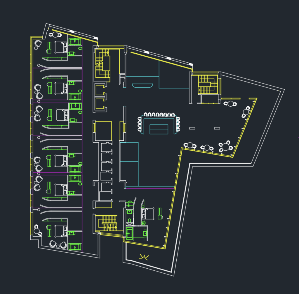
At this point I felt I had come the closest to a positive solution, with space for a Reception/back office area near the entry point, a kitchen beside it and the bar backing onto what I imagined to be a dining area. I was still experimenting with placing a Suite near here (bottom right of the plan) however I felt that it would lack privacy with the balcony overlooking it as a public space – and blocking the windows with shutters or blinds would take away from the experience of staying in a luxury room.
To allow myself some time to ruminate on a more formalised solution to the General Arrangement, I returned to my FF&E selection – which I felt had come together roughly but required more attention. While the film’s colour grading is impactful and high in contrast and saturation, Elisabeth’s apartment (which the room scheme draws most inspiration from) is a little more muted. I had hoped to integrate some Scottish brands into my design and found a wallpaper by Timorous Beasties which fit well with the scheme.
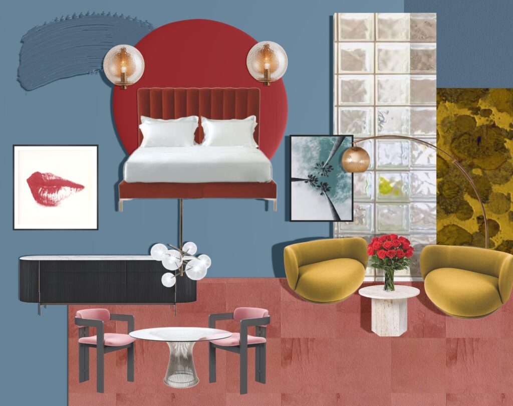

Art print from Ink & Drop, reminiscent of the movie’s palm tree motif – Elisabeth’s final view before her face dramatically dissolves into her star on the Walk of Fame.


Page from Lips book, c.1975 by Andy Warhol, by King & McGaw – an Easter Egg of a filmic reference within the film, itself referring to David Cronenberg’s 1983 body horror Videodrome starring Debbie Harry.
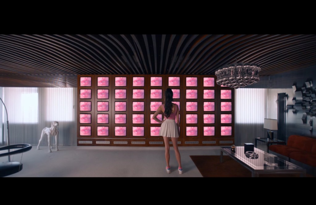

Still from Videodrome (1983) via Mubi
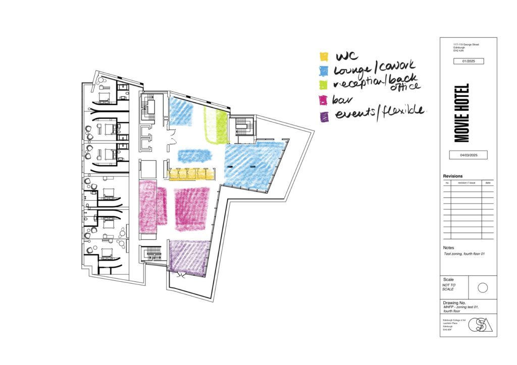
After returning to my General Arrangement, I reached a point that I felt will be closer to my final design. Having given the amenities some reflection, I felt that there was adequate provision for food & beverage and so my initial thoughts regarding the upper level as a private guest area changed.
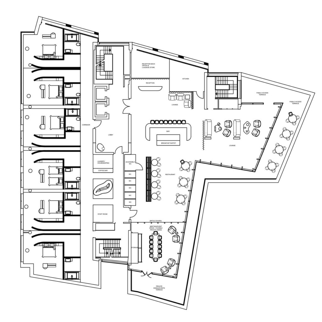
Fourth floor General Arrangement
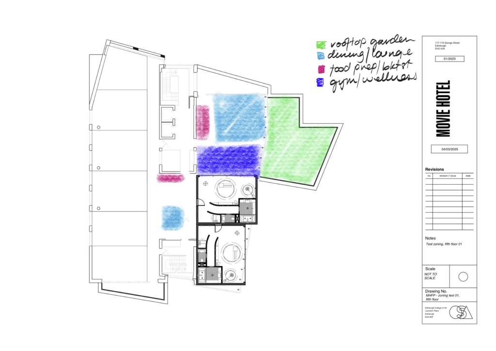
I had originally thought of adding some kind of gym or wellness area on the fifth floor, however when I considered the themes of the film. While the film does explore themes of body image and self, Elisabeth does not reach her aesthetic goals through a focus on fitness or wellbeing. I considered the idea of a dance studio (as she is a dance/aerobics presenter) however a dance studio, although a unique amenity, would perhaps prove impractical for most visitors. Along these lines I had thought about the potential for a meditation or yoga studio – however this line of thinking feels to be quite at odds with Elisabeth/Sue’s fragile mental state in the film. Ultimately, I felt that the space I had originally allocated for this purpose might be best placed as a penthouse suite most reminiscent of Elisabeth’s own domestic sphere (and with a dazzling view of Edinburgh Castle).
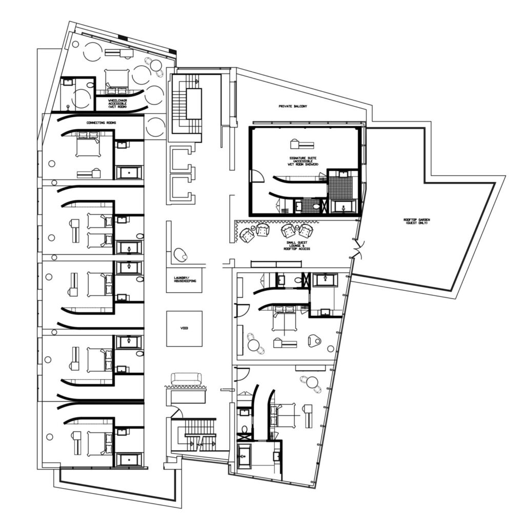
Fifth floor General Arrangement. Some further development to be done, along with an opportunity to design a “signature” suite with separate rooms – in line with the AA star rating guidelines for a 5 star hotel.
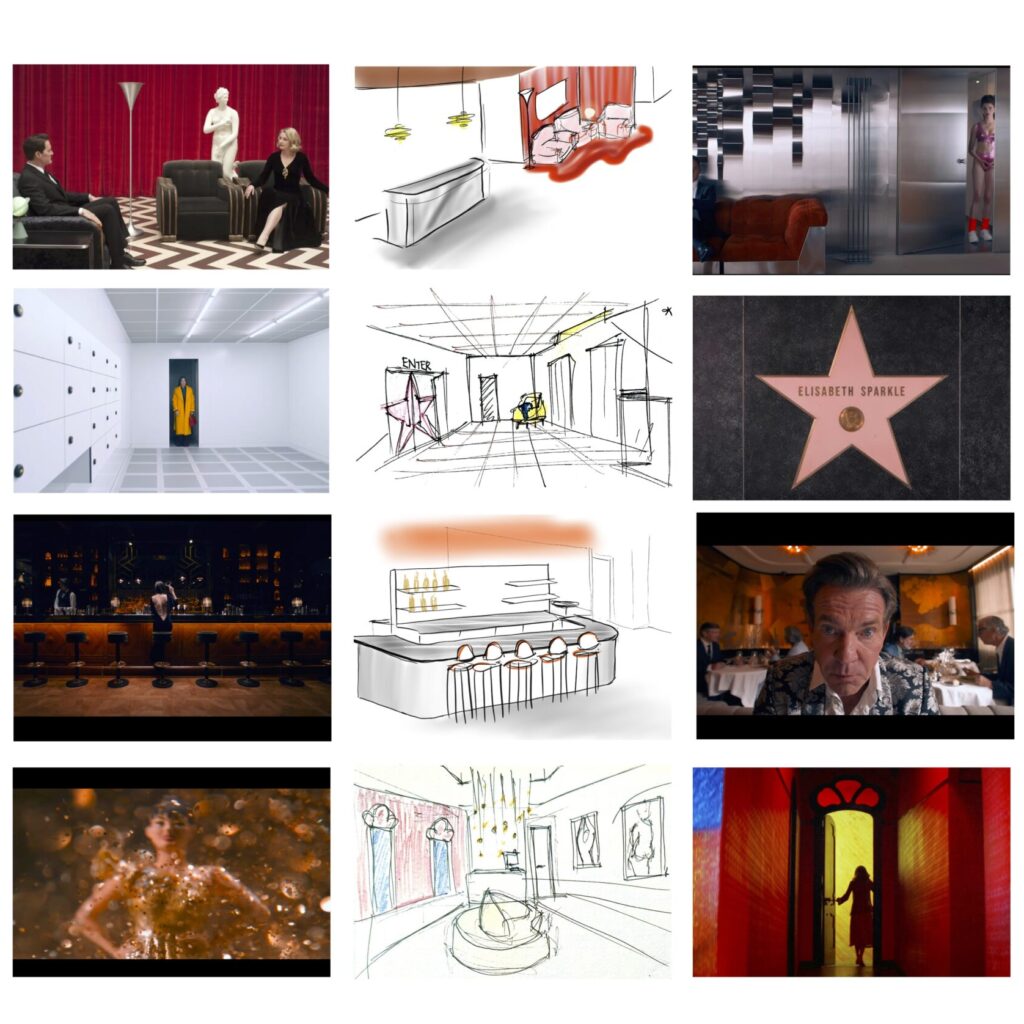
Some quick thumbnail sketches of small areas around the hotel and references that they incorporate.
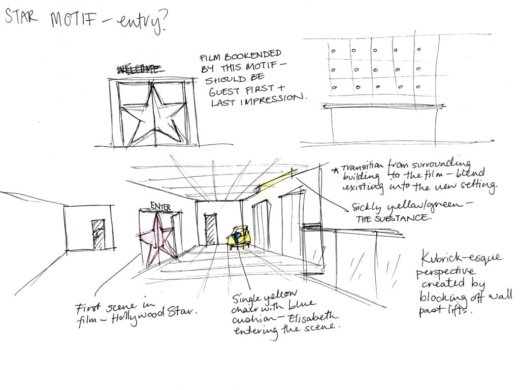
Sketchbook page reflections on the first arrival point – the lobby – and how the aesthetics of this space relate to key scenes/motifs.

A view from the top of the stairs at the existing site, looking towards the area which would be adapted to create the lobby landing space.