This week we returned to research – some desk-based case studies as well as a site visit to a boutique hotel within the University of Edinburgh’s hospitality offering. I had developed my design scheme to a point that I felt was taking it in the right direction, however a more focussed look at some design hotels helped me to zero in on my choices. Having sifted through what felt like hundreds of hotel-related entries in various online design publications, I was finding that a lot of hotel offerings featured really colourful, dazzling public spaces which were quite starkly contrasted by rooms and suites clad in neutral shades. While this may offer a simple, serene and practical option for hotels (based on the wear-and-tear I’ve seen from my own work experience), it feels to me like a break from the impactful design of the sites overall. I specifically sought examples which broke from this trend.
Naumi Central Private in Queensland, New Zealand is a 15 bedroom boutique hotel. Undercurrent Studio, who designed the hotel, noted that the client specifically requested no white or neutrals, and each room is boldly colour blocked with a splash of pattern courtesy of vinyl printed wallpaper made in collaboration with local artist Deborah Moss. I was pleasantly surprised to see that the hotel was fitted throughout with bold, cradle-to-cradle “Dye Lab” carpet tiles by ShawContract (fitting almost exactly what I had been searching for for my own design), which won Undercurrent a ShawContract 2022 design award for the Australia/New Zealand region.

Junior suite, image via Naumi Hotels
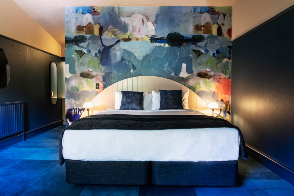
Image courtesy of Undercurrent Studio
“Habitat” room overlooking the garden

“Oasis” room overlooking the treetops. Images courtesy of Naumi Hotels, via we-heart.com
Locke am Platz in Zurich, Switzerland is an 80 room boutique aparthotel with retro, theatrical flair. Designed by Tatjana von Stein, the hotel mixes lush, soft upholstery, a bold 70s colour palette and Swiss Riviera stylings. I was interested in von Stein’s use of materials – mixing seemingly contrasting materials (particularly in the lobby area) such as stainless steel and velvet in a similar manner as in The Substance’s set design. The use of vivid colour is consistent throughout, creating an immersive sense of escapism from the everyday/ordinary.
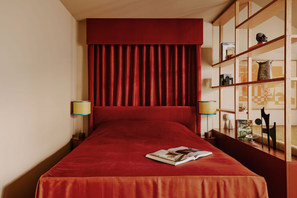
Images by Kensington Laverne via Tatjana von Stein
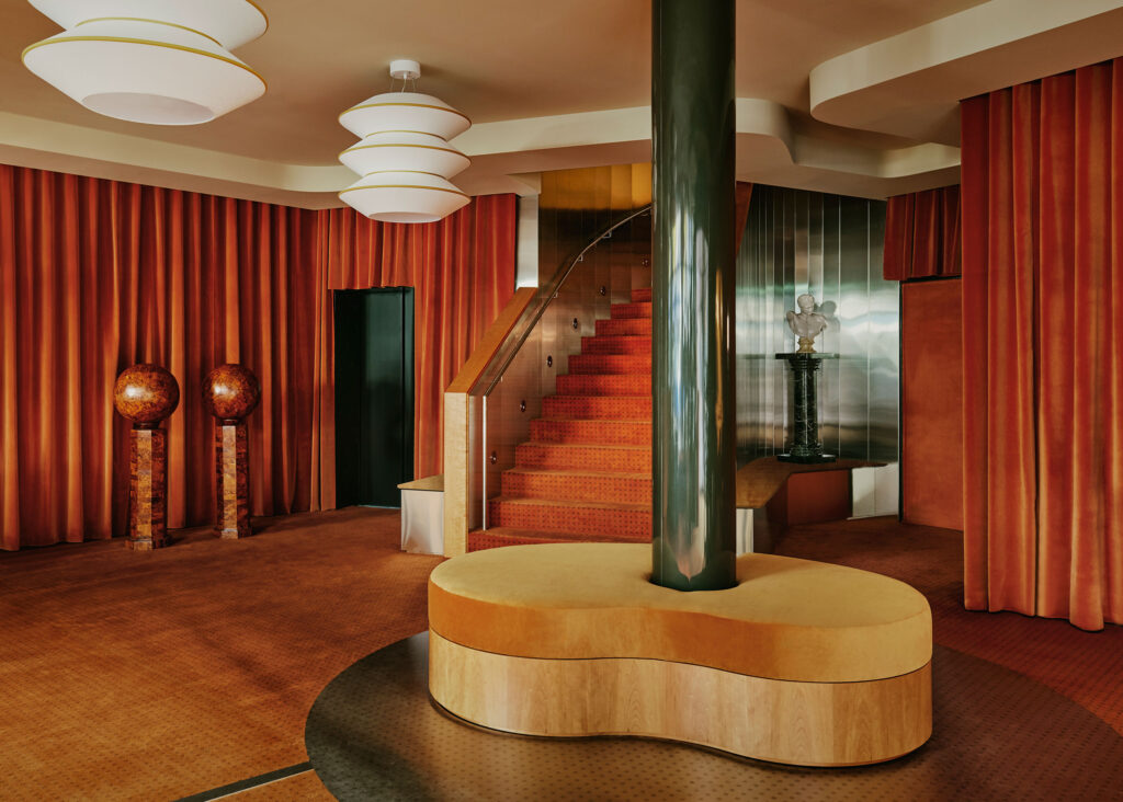
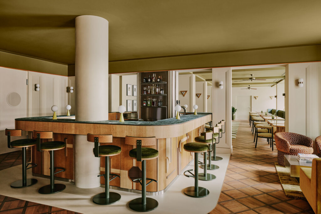
At the end of the week we visited The Scott Hotel in Edinburgh. A very different kind of building re-use project, I found it very interesting to see how the designers had navigated preservation of the historic elements of the building that could not be altered or adapted (a whole wall of antique mirror/glass, and velvet wall panels in the Velvet Lounge bar – which could not be drilled through). It was useful to see a site in person, being able to have a tactile experience of the finishes as well as being able to ask more in depth questions of the staff about the functioning of the hotel. Some key information and ideas from the visit:
– The building lacks storage space for flexible uses of public areas – an unexciting but practical design feature;
– Floor coverings were unexpectedly bold in the rooms – but appeared understated at first glance;
– Public and staff areas occupied approximately one third of the building – the entire ground floor (reception, 17 seat bar, small fine dining restaurant, a lounge, small bookable meeting/events space, plus back-of-house areas such as kitchen/M&E/housekeeping).
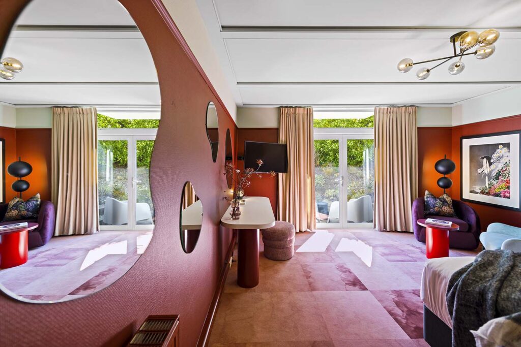
– Contemporary artwork from artpistol Gallery and printed wallpaper & upholstery by Timorous Beasties provided an interesting and effective juxtaposition to the historic setting.
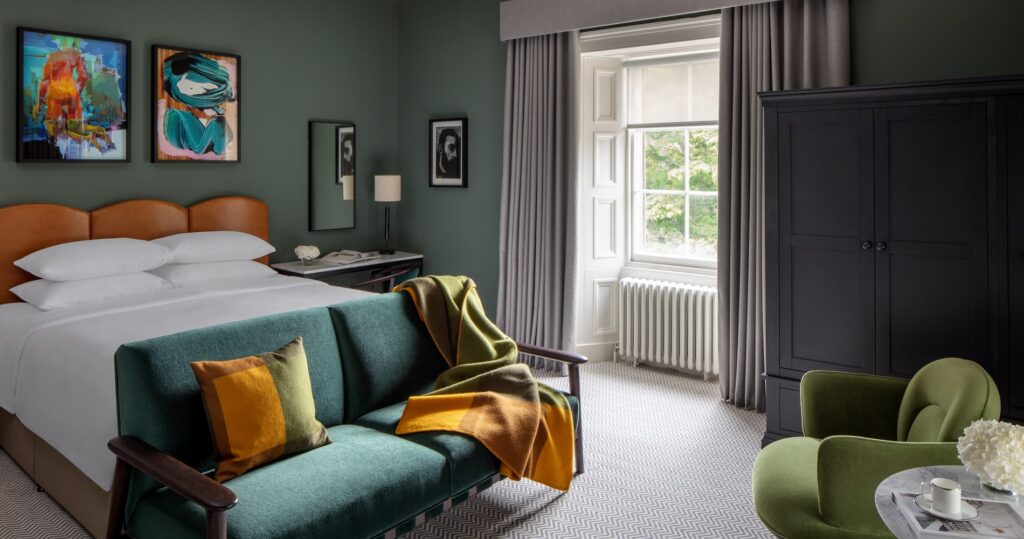
Signature Double room, image via uoecollection.com


 (Own photos)