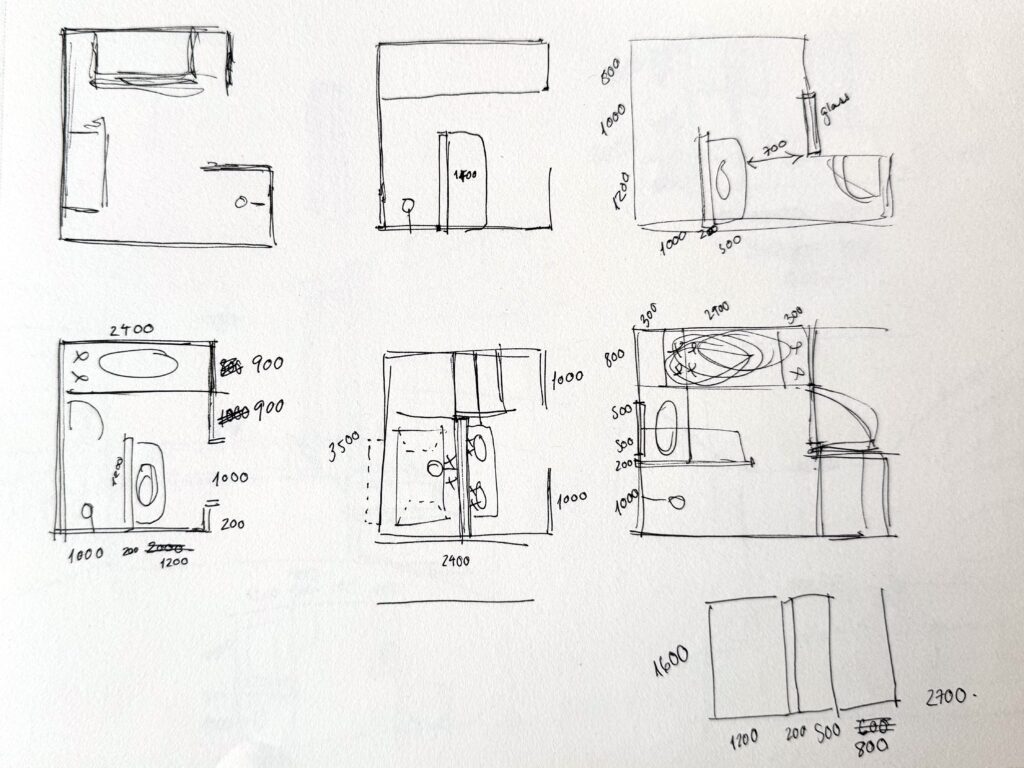
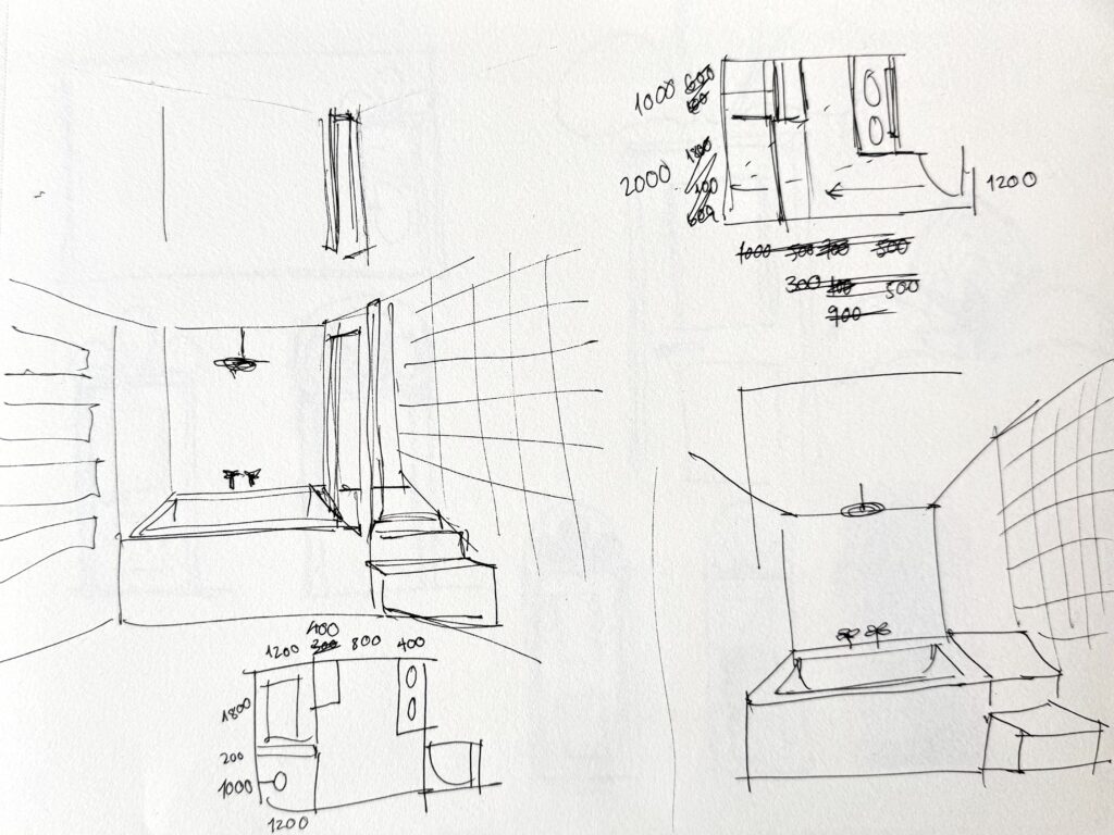
This week began with some further contemplations on how to develop the bathroom space within my design. I had already dedicated quite a bit of thought to this, however up to this point it had been largely for the purposes of functionality. While mulling this over over the past few weeks, I had considered many different configurations of the bathroom which separated the bath and shower – typically with some kind of dividing wall to create a shower enclosure. In doing so I felt that I was losing both the sense of space which was inherent to the domestic bathroom space in the film, as well as the simplicity and almost extreme minimalism of the space.
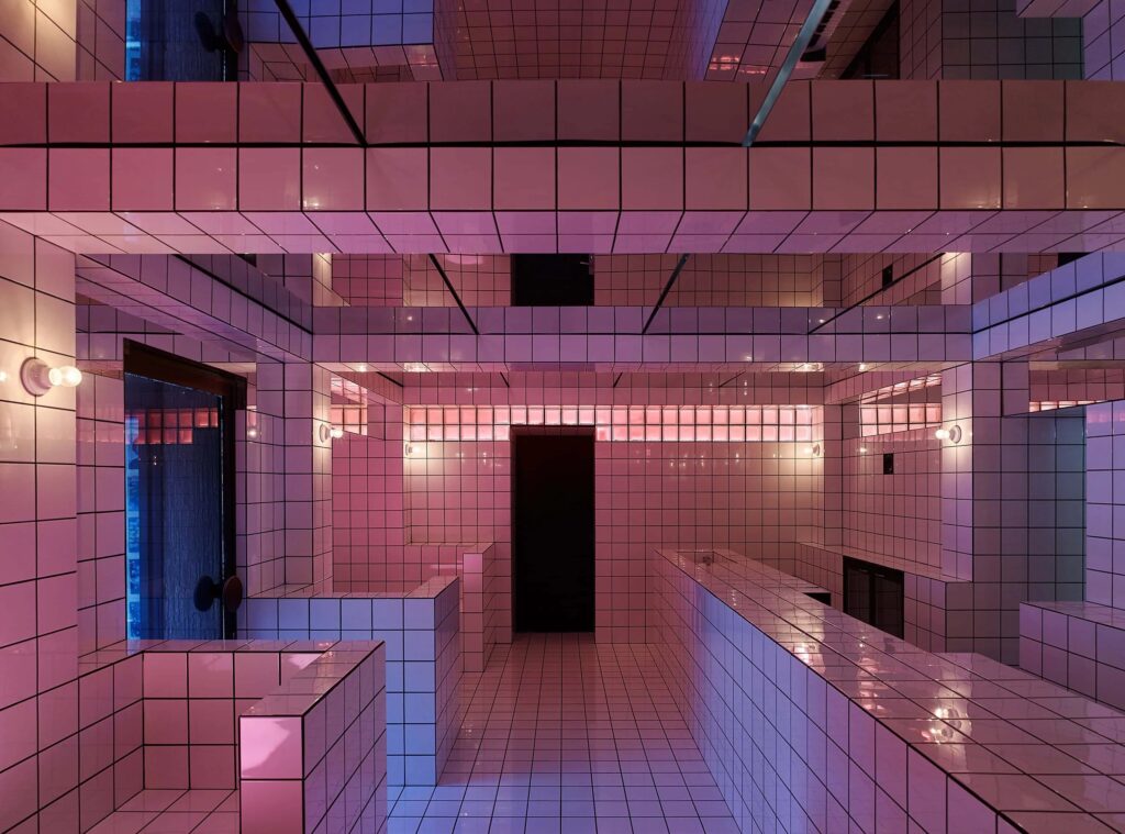
I knew that I needed a simpler solution, and when I came upon these images I felt like I had landed on something more resonant – presenting an option which felt both appropriate to a luxury hotel setting as well as being minimal and striking.
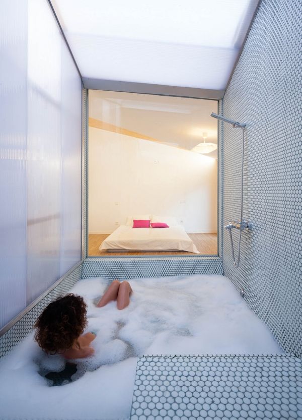
Bath tub overlooking a bedroom space in Prefabhouse, by elii Architects, 2011-12. via metalocus

Minimal bathroom in pink tile, designed by Markéta Bromová, via whitemad.pl
I had also come across an intriguing design project which I felt provided some helpful insight into how lighting might affect the user experience from within the bathroom space, using very similar materials/surfaces.
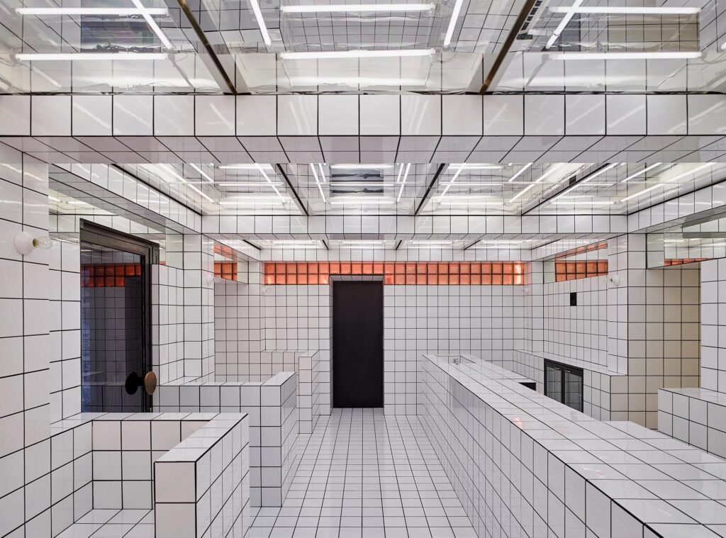
LAX Bar by Christoph Meier, Ute Müller, Robert Schwarz, Lukas Stopczynski, Vienna, via olex-design.at.
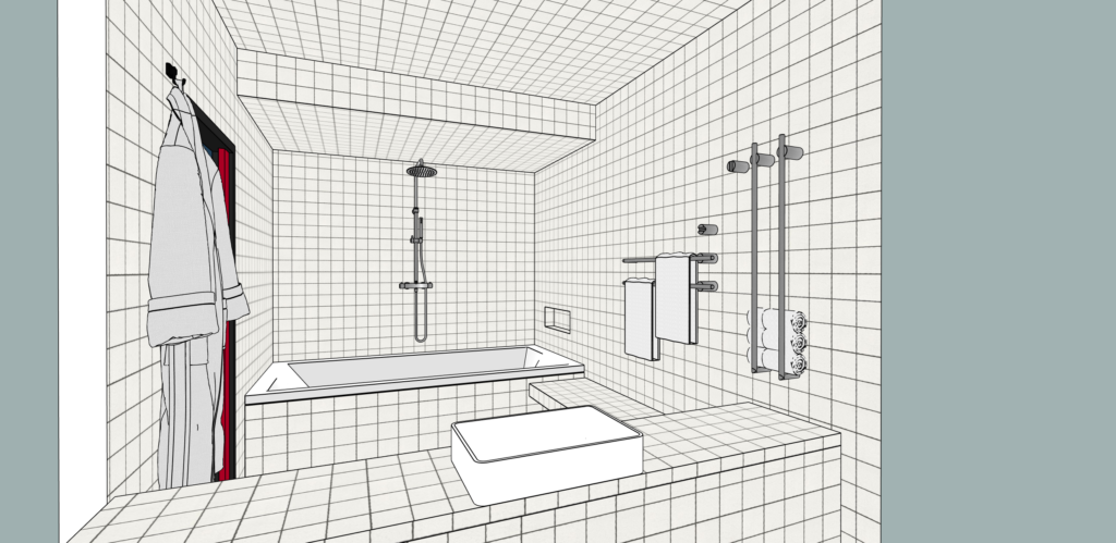
Updated bathroom design, viewed from where the glass brick wall would be (hidden in SketchUp)
With a more robust strategy in place for the bathroom, I turned my attention to FF&E selection. I found this to be an interesting challenge – with very blurry lines between objects and finishes intended for residential vs. commercial use, especially when compared with our first foray into this when tackling office design. Given that there aren’t budgetary constraints for this project, I took this as an opportunity to become better acquainted with both iconic designer pieces as well as lesser known or more recently established designers and manufacturers. 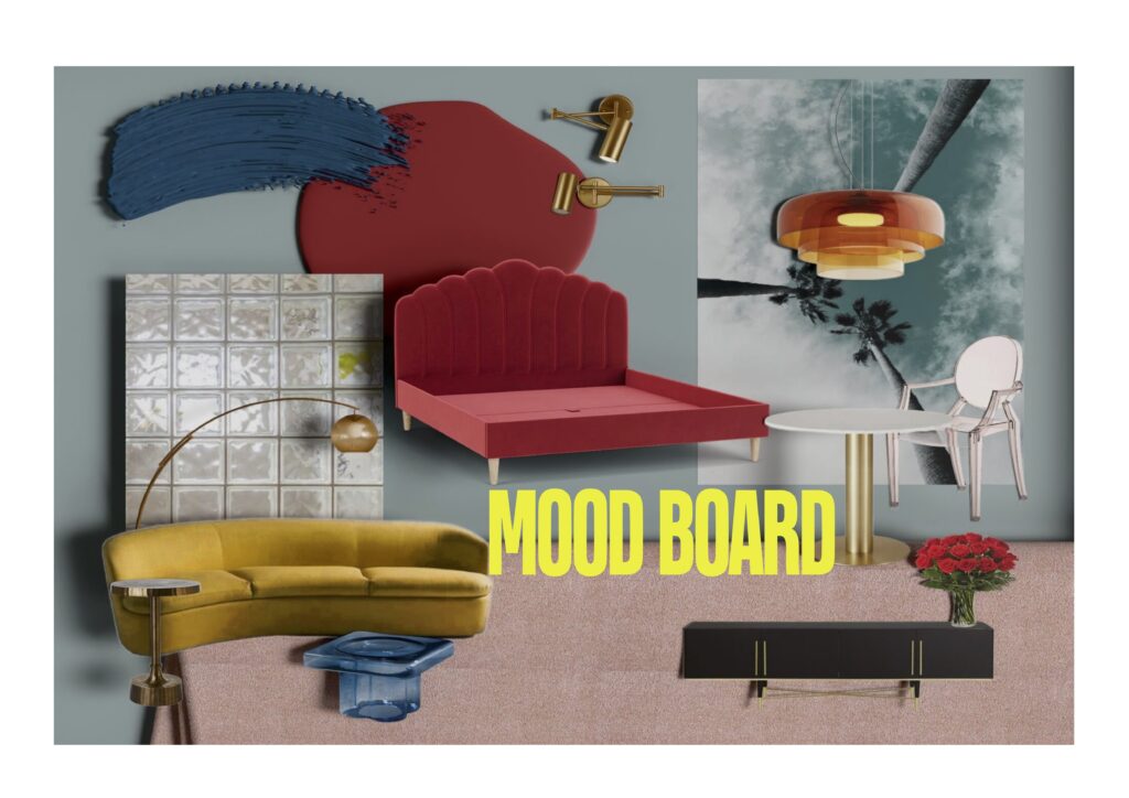
Paints by Mylands, bed in recycled velvet by Darlings of Chelsea, sideboard by Galletti&Radice, floor lamp by Soho Home, carpet by Associated Weavers
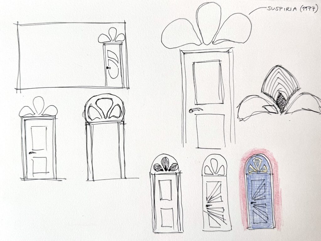
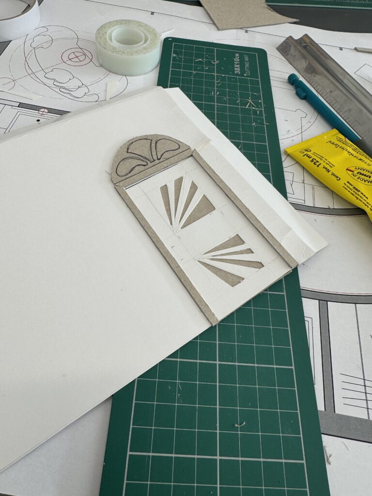
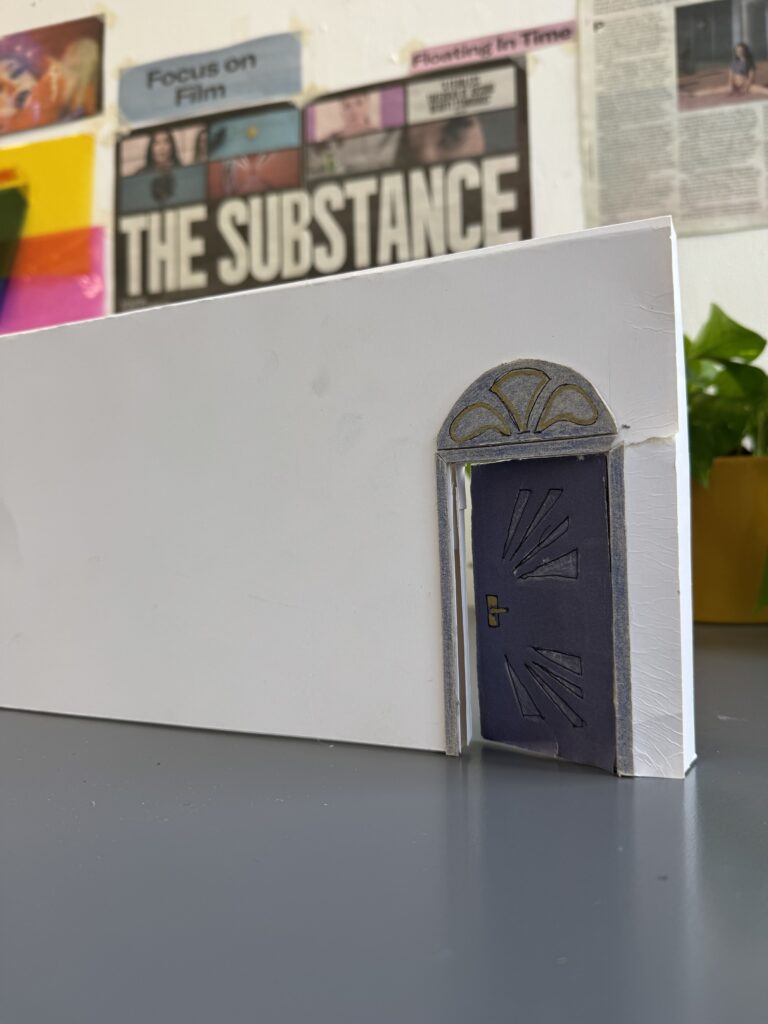
As our final task for the week, we began making scale models of our hotel rooms – beginning to think not only about what would be inside the rooms but also considering some initial thoughts on what might be going on [aesthetically] in the corridor outside. While we didn’t elaborate on this too much (yet!) I took this as my first opportunity to employ my own take on Fargeat’s horror movie “easter eggs” hidden within my own design – by including a visual reference to the 1977 horror movie classic “Suspiria”, directed by Dario Argento. Also featuring a long, red hallway, bold use of primary colours, a striking Art Deco setting, and a story centred on the female perspective – it felt like the perfect reference point to begin to move beyond the hotel room.
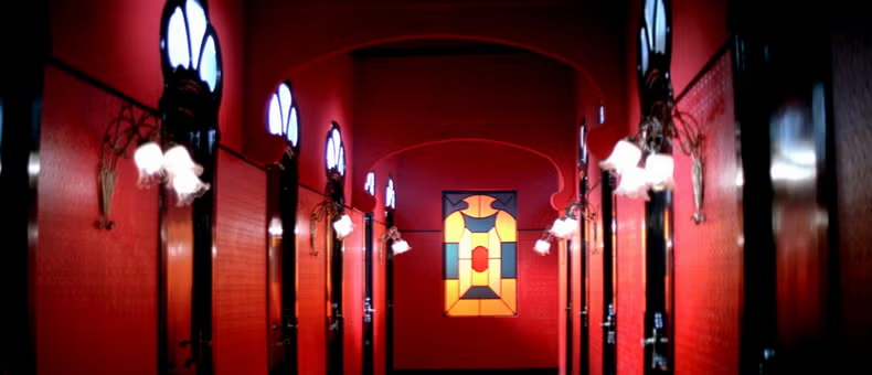
Still from Suspiria, 1977, via Elle Decor Italy
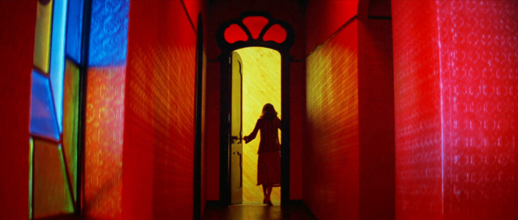 Still from Suspiria, 1977, via Tumblr