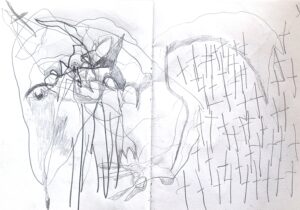
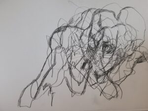
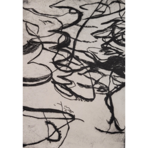
Above series of A4 drawings from people drinking in pub watching the football. May develop them through printmaking or select them to stand alone.
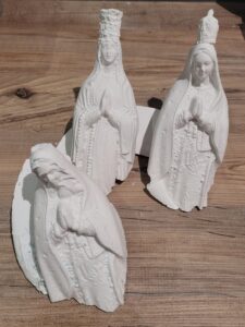
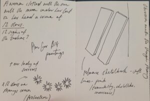
Series of 7 vitgin Mary casts from holy water bottles I own – researching Tibet sky burials and positioning these as vulchutes- carving into the faces distorting them
Antonio munez burning canvas to create marks 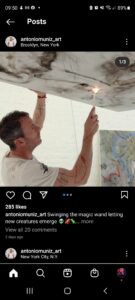
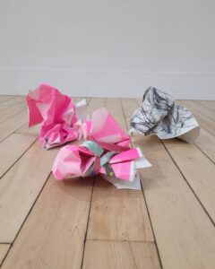
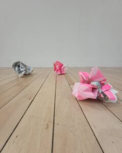
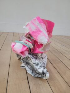
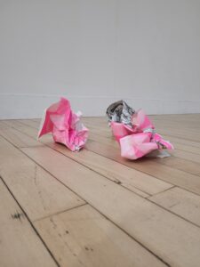
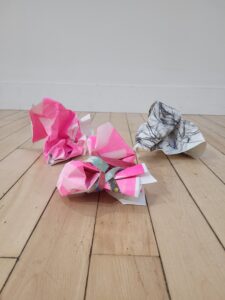
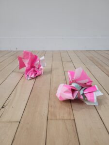
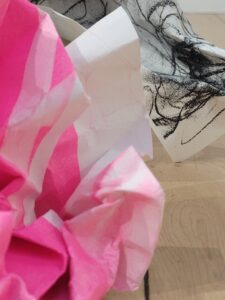
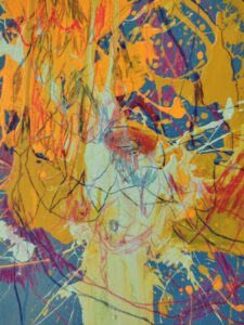
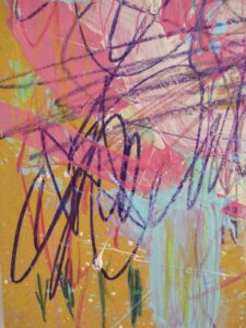
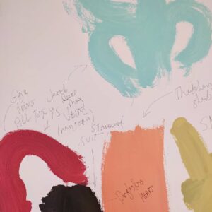
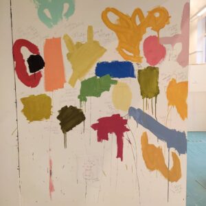
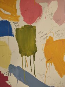
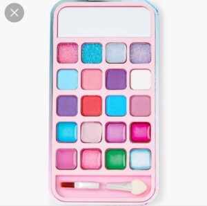
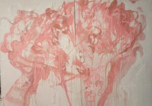
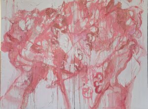
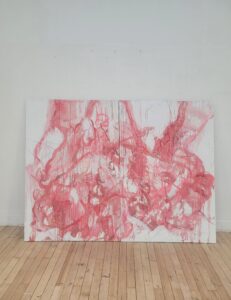
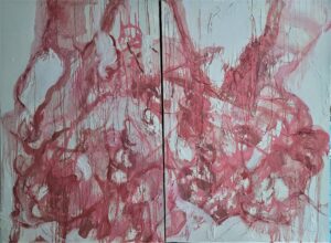
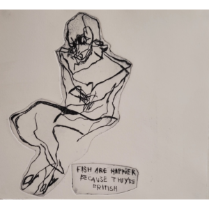
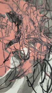
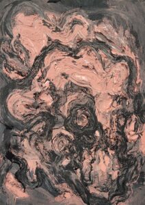
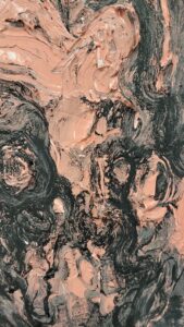
Karla Black – using makeup as a medium -thibking about pink colour palette- millenial pink- innocence- femininity- Next painting conflicted on continuing pink maybe could incorperate colours of makeup that’s reflective of pre teen early 00s
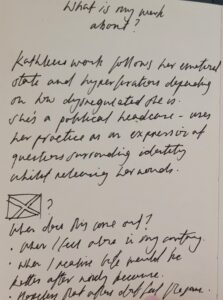
Continuing from ‘1’ (embassy submission) I am focusing on exposing emotional dysregulation .
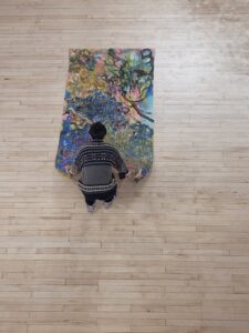
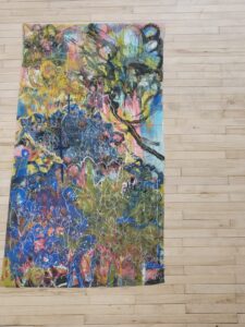
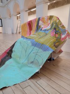
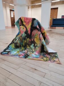
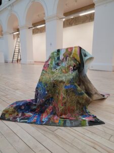
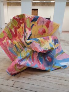
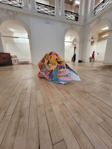
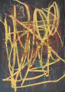
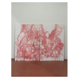
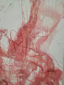
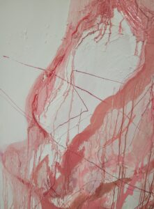
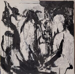
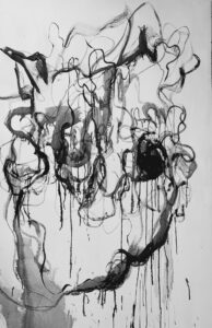
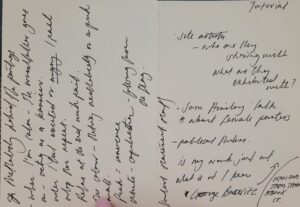
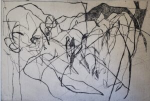
2x 80×180 cm boards. Building up texture with woodfiller I can etch into – I’ve found this to be the most successful way to produce aggressive marks that viewer can identify. I’m adding new layers every day – stripping back with more woodfiller or white emulsion I’m also working on it upside down and sideways. – looking at how Georg Bazelitz irritating the view by doing this.
I want to display this on a pink wall – continuing on from ‘1’ which was presented on a black wall.
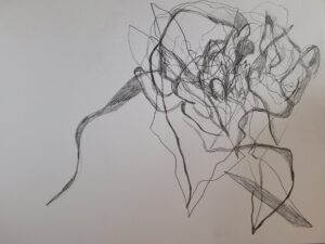
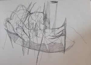
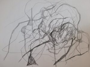
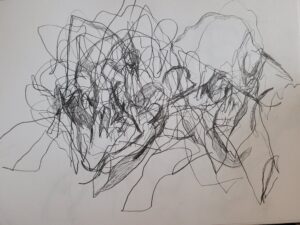
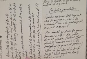
Progression
Day 3 –
Day 6
Day 8
Day 9
 .
.
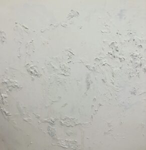
Pink reflects youth, femininity and innocence – white is a continuation from my sites research into capitulation and surrender.
https://artuk.org/discover/stories/millennial-pink-the-artists-who-got-there-first – millenial pink???)
Yet pink has been equally at home lining the shelves. In 2005, the Korean photographer
documented her daughter surrounded by a sea of pink-hued purchases. She’s nearly swallowed whole by girly, plastic-y excess—a critique of the concentrated post-World War I effort to re-package pink as feminine, led by media giants and department superstores such as Time, Best & Co., Marshall Field, and Halle’s.
“How often do you see pink in architecture or machinery?” asks photographer and performance artist
. “How often is pink presented outside of a gendered perspective?” Her digitally manipulated photography saturates everyday scenes with a spectrum of pink, in response the color’s hyper-feminization beginning in the ’90s. “The insistence upon socializing women to identify with a color that doesn’t exist in the ‘real world’ is, to me, a testament towards the patriarchal hierarchies that work to keep women submissive in everyday life,” Pierce says.
4ft×4ft
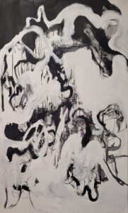
Final – Day 14
Right way up – Day 7/ 8
Day 1
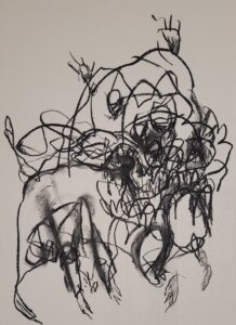
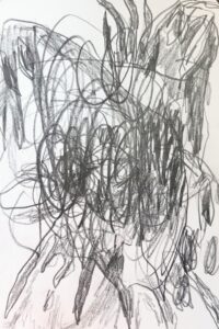
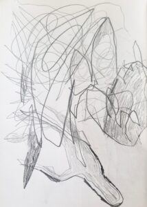
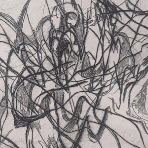
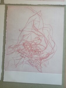
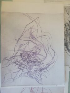
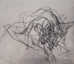
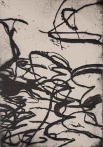
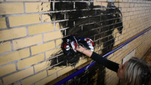
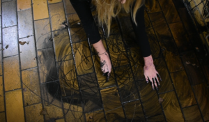
Carrying on from the performance I did in Dunfermline Station – I want to experiment and develop these marks in a controlled way. The images here are samples of mediums I’ve been looking at.
I feel its pertinent for me to continue mark making in this way regardless of how therapeutic it is.
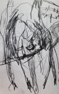
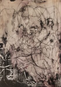
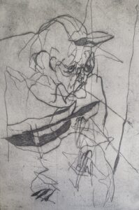
The second image is an a5 mixed media piece taken from a memory of a child in Rosyth outside the food bank. It is not representative but I feel my marks emphasise the emotion behind this travesty.
Today I photographed some people that existed in a way that interested me – eg a woman holding her purse as the queen does, a woman with down syndrome blowing kissed to the bus driver, a man using his hand as a facemask.
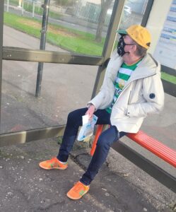
I see this man often at the bus stop outside the pharmacy – he wears the same top and hat – to be easily recognisable as a Celtic fan? – I find it interesting that he wears orange shoes – orange being the colour of the ‘enemy’ the opposing team Rangers. On the left is a proof of an etching of him.
‘And I didn’t join in the IRA songs, but I do know the words’ – facetious.
 180 x 90cm
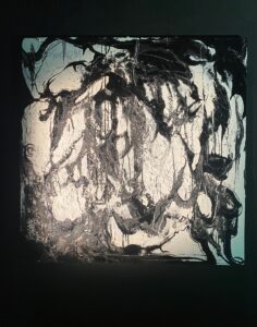
180×190 – from projections

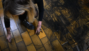
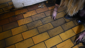
Site – dunfermline train station 1889
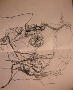
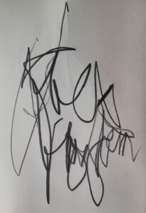
Trialing mark making on different surfaces with materials. Hands, charcoal, nails, stick and brushes.
Stills from footage of mark making in the Dunfermline Train Station. (Sites)
Link to playlist:
Joe Corrie – captions of poems I feel stand today Eat more fruit the slogans say But I’m on unemployment pay Howkin and cursin that hale shift through, Half starved, half blin, half mad; For eicht and fower a day; For 7.83 an hour ME made
laughable tae. Its fine when ye stand in the queue at the door o’ the doleOn a snawy day To Ken that you leive in the bonniestLand The bravest, tae To sing a wee bit sang O’ the Heather HillsAnd glens below. No dole here for you! To proodly turn, And think o’ the bluidy slashin’ The English got at bannockburn
after the image o’ god. Jings! But it’s
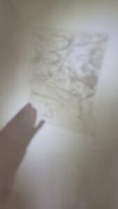
Here are some images from my thought book that I carry with me and keep ideas/ future collaborations and notes from tutorials – this will be left on my desk for assessment –
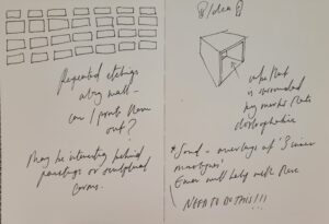
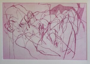
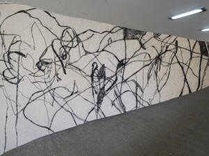
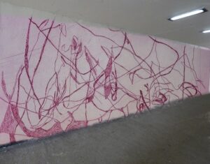
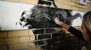
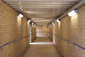
How I am considering to develop my practice – first image below is an underpass in Dunfermline which leads the footfall from Dunfermline Station to the town centre. It is council owned and currently has minimal graffiti. (These are the people my work is about so I’m interested in gaging a reaction.) Image above is a quick experiment of what my marks could look like on the wall of image 1.
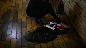
The second image is the station itself and privately owned. In the post above I did an experiment with soluble mediums as a site test. This was not problematic for the staff as all materials used washed off.
It may be helpful for the development of my practice to continue experimenting with these mediums on a larger scale in the first underpass.
I am interested in this becoming a video/ performance piece.
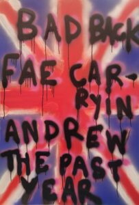
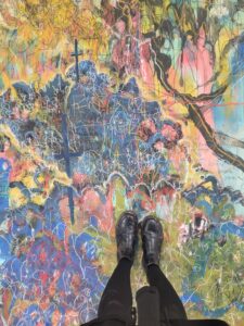
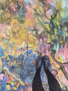
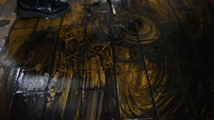
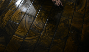
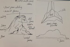
Referencing the videos above I learned that the floor of the station works well for my work. I wanted to incorporated the Brit flag continuing on from my research into Scotland last semester but use it in a less direct way. This I want to develop.
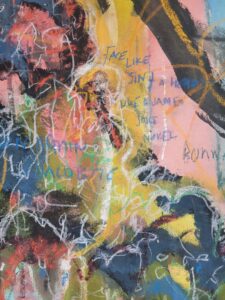
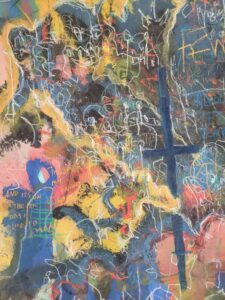
There’s a disconnect between the abstraction and directness that I need to challenge. Looking at Joe Corries series of poems there may be a way for me to incorporate text into this (see sketchbook images). His poetry is direct and fitting of what we as a nation are experiencing now. This included may extend and make clearer my work to viewers.
1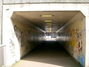
2
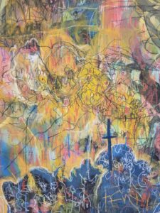
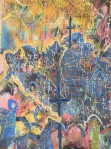
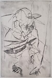
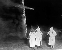 The KKK and Scotland – after an etching of priests that printed more like a group of KKK members I decided to look deeper into the relationship between the KKK and Scotland. Of course the burning of the cross being commandeered in the 1915 film a birth of a nation sparked the actual KKK adopting a call to arms. I’m sitting on this just now but I have an urge to develop from the etching to a painting as part of a series. It ties in with the ugly side of Scotland today – poverty porn, orangemen etc.
https://www.thetimes.co.uk/article/8b112430-8754-11e6-9270-cf26736cb244?shareToken=3cf420e9d571fd8d3817462f88725f40