Any views expressed within media held on this service are those of the contributors, should not be taken as approved or endorsed by the University, and do not necessarily reflect the views of the University in respect of any particular issue.
Week 9 was an interesting week going into more detail about the different coloured LEDs and trying to develop an understanding of how different colour temperatures can change the textures and objects within a space in a positive or negative manner.
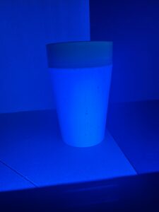
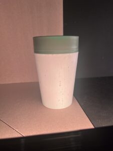
This reusable coffee cup is made of recycled coffee cups and has a lot of texture of these on the outside of the cup. The blue LED made it very difficult to see these details on the cup and would be an unsuitable way of illuminating the object.
(Blue LED – Josie Lancaster)
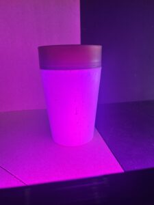
The use of the Red/Blue LED made the green at the top of the coffee cup appear a browny dull colour it also again disguised the details in the cup making it an unsuitable luminance for the object.
(Red/Blue LED – Josie Lancaster)
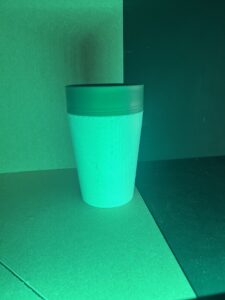
The green LED showed the colours in the object more true to what they actually are but did not highlight the detail of the texture in the cup. This would not be a suitable luminance for this object.
(Green LED – Josie Lancaster)
The warm temperature LED- 2000K made the details in the object slightly more obvious but is still not the best choice for luminance.
(2000k luminance LED – Josie Lancaster)
The final test was with a 4000K luminance LED which was a much cooler light. This colour temperature showed the colours of the object very true to what they are and also highlight the detail within the object to the best.
(4000K luminance LED – Josie Lancaster)
This task gave me a valuable insight into the way different colour temperatures can affect what they are illuminating and change the way we see the luminance. This has given me a greater understanding of the importance of lighting.
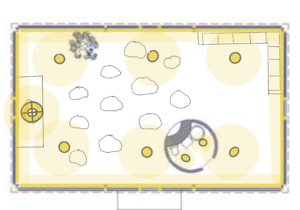
We were given the task of creating a lighting strategy for a Meditation Space. Our strategy was based off what we thought was appropriate for this type of space.
The space provided was a glass walled building so we chose to put recessed strip lighting in the flooring that was diffused and tunable to cast a gentle glow up the walls of the building, the aim in using a diffuser was that the glare from the reflection of the glass would be minimised. `These luminaires were also chosen for the way they would illuminate the look of the building from the outside when in use at night time.
Recessed celling luminaires that are tunable would allow for the space to be brighter for different requirements/times of day. For example a cloudy day may require a more natural light (approx 5000K) evening might require a more ambient warm light (approx 2500K).
Pendant Luminaire would be situated above “stage” area to cast a soft downward glow of the person taking the guided meditations. The pendant luminaire would also be tunable to allow for the different types of meditation and natural light coming into the space at different times of the day.
(Reflected Celling Plan – Glass House – Josie Lancaster)
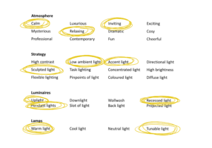
The aim of this lighting concept was to create sculptured ambient light within the space that is inviting and welcoming. I think this has been successfully achieved within our concept. Having a greater knowledge of how the glare from glass is affected by luminance would enable us to design a more though approach to the project.
The built environment has a significant role in “improving health, wellbeing, comfort and cognitive performance. These factors have prompted revision of the “health issues and wellbeing in building services”. Artificially lighting is a huge part of our built environment and the visual impacts of artificial lighting on the human eye can affect our visual comfort, circadian rhythms, and overall health.
Our eyes are made up of visual receptors which comprise of millions of rods and cones that respond to light. Bright light is managed by the cones (photopic vision), and dim light is managed by the rods (scotopic vision).
Nighttime vision is most commonly in the mesopic range which sits in the “yellow-green and blue-green” light spectrum. The rods and cones translate the colour of light and signal the brains circadian clock. The natural rhythm of our circadian clock is influenced by light exposure altering our physiological functions, and sleep patterns.
Our circadian rhythm is fundamental for regulating human behaviour such as “digestion, metabolism, hormone release, body temperature”. Melatonin is the hormone that indicates to the body that it is time to sleep, this hormone can be suppressed by blue light raising cortisol. Cortisol is the hormone that raises our alertness, warm white light suppresses cortisol and increases melatonin. Natural light is bluer (cooler) in the morning and white/yellow (warmer as the day continues. Without the influence of artificial lighting the natural light would regulate our circadian rhythm organically.
Correlated Colour Temperature (CCT) measures light colour in Kelvin, with lower CCTs (warm white) promoting relaxation and higher CCTs (cool white) enhancing alertness. Flicker and glare from artificial lighting can cause discomfort, headaches, and health issues, particularly from LEDs.
Artificial lighting is not just about stimulation, it is vital for our health and wellbeing and needs to be appropriately considered to mimic natural light allowing our bodies to regulate a natural circadian rhythm which is significant to our health. LED lighting allows this to be achieved through the tuning of colour ranges. This is a complex topic and that is still evolving.
Dwyer, T, 2019
Cibse Journal; Module 157: Lighting the way for occupant wellbeing
The speaker was looking after horses as a hobby and learned that changing the lighting in the stall increased the hair growth of the horses, this discovery led her to further explore the effects of light on our environment. The speaker believes that the earth is affected by the “Theia Theory” and that Theia has become part of our planet. Theia is the light and dark of the moon forming that causes photosynthesis and allows us to have life on earth.
Light impacts nature and our environment, it has taken many years for humans to grasp the full understanding of how much we need darkness. In the 80s and 90s the speaker explored way ambient light effects on our biological clocks and the effects of LEDs on our Circadian Rhythm. She learned that our bodies are controlled by light: feeding times, temperature etc, if our bodies get a signal for example that we are reading in bed from a screen with blue light it wakes up to start its natural cycle. We are now losing awareness of our body’s natural cycles.
There are 1.7 trillion species on the earth, but humans have only named 1.8 million, if we do not know all the species inhabiting our planet how can we be aware of the ways in which we might be impacting species with light pollution. For example, eel grass grows in the water, it feeds many other life forms generating economic support. Eel grass growth is supported by zoo plankton faeces, but because of the lack of darkness zoo plankton is dying off because it has an aversion to light which is created by the reflection of light from the bridge it grows under.
Lighting designers have a responsibility to look beyond the immediate environment when designing lighting. Epigenetic design is a response design i.e. what we illuminate effects spatial materials and our contextual sensitivity this effects our memory. That is why it is important to illuminate things correctly, so we do not lose our natural abilities generated in darkness. Scientific evidence needs to be combined with our natural intuition, for example, if our grandma tells us to “eat broccoli because it’s good for you” we still wouldn’t do it unless we knew that this was the truth, and we had evidence of how good it is for us. “All species need darkness no just dark skies.”
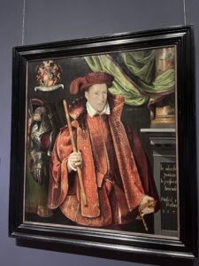
Week 5s first task was to measure the illuminance and luminance level in the portrait gallery. Our group chose two portraits in contrasting spaces to access the difference in illuminance and luminance levels.
This room was painted with a blue matte paint. Blue Wall luminance 1.58, Glass Surface Portrait luminance 3.21, Gallery illuminance 27.5 lux, Surface mounted track lighting providing lighting close to portrait measuring at 65.1 lux. Natural Light was minimal in this gallery preserving portraits. Darker space with track lighting on portraits made them stand out. These portraits have minimal light to preserve them.
Green room with matte paint. Green wall luminance 2.89, Portrait canvas luminance 10.15, Gallery illuminance 17.4 lux, Close to portrait 66.6 lux. This gallery had some natural light but the lux levels in the overall gallery were a lot lower than the blue room but the room was a lot brighter, this was partially due to natural light within this space. Higher luminance and illuminance levels closer to portraits and no glass on the portraits.
The library had no windows and no natural light within the space. Down lighting in the form of pendants, and recessed in shelving. Lighting was cool white in this space. Mini spotlights lighting objects in cabinets from specific angles with narrow beams. Space felt cold.
(Portrait Play Area/Lighting Sketch – Image Credit Josie Lancaster)
Natural light from windows, diffused with coverings. Track lighting on celling with warm directional light. Lighting highlighted material textures making the room feel warm.
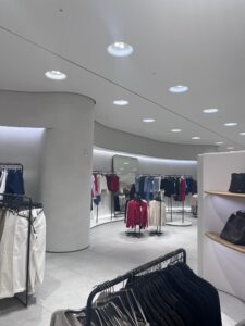
Cool blue lighting throughout store. Featured down lighting in curved spaces, spot lights on celling. Overall space is brightly lit but feels minimalistic. Products were all equally highlighted, no focus on specific products. Lighting temperature is intentional to create a bright minimalist feel to the space, making it feel light and airy. 3002 lux.
Warm yellow lighting throughout store. Directional track Spotlights, Tracks with pendants hanging lower to highlight specific areas. Bit overkill with the lights but space felt warm and cosy. Did not feel intentionally lit, although spotlights were purposely directed at mannequins which was intentional. Superdry sign was neon lit behind counter which is intentionally highlighting the brand which aligns with their products that are all highly branded. 826.1 lux.
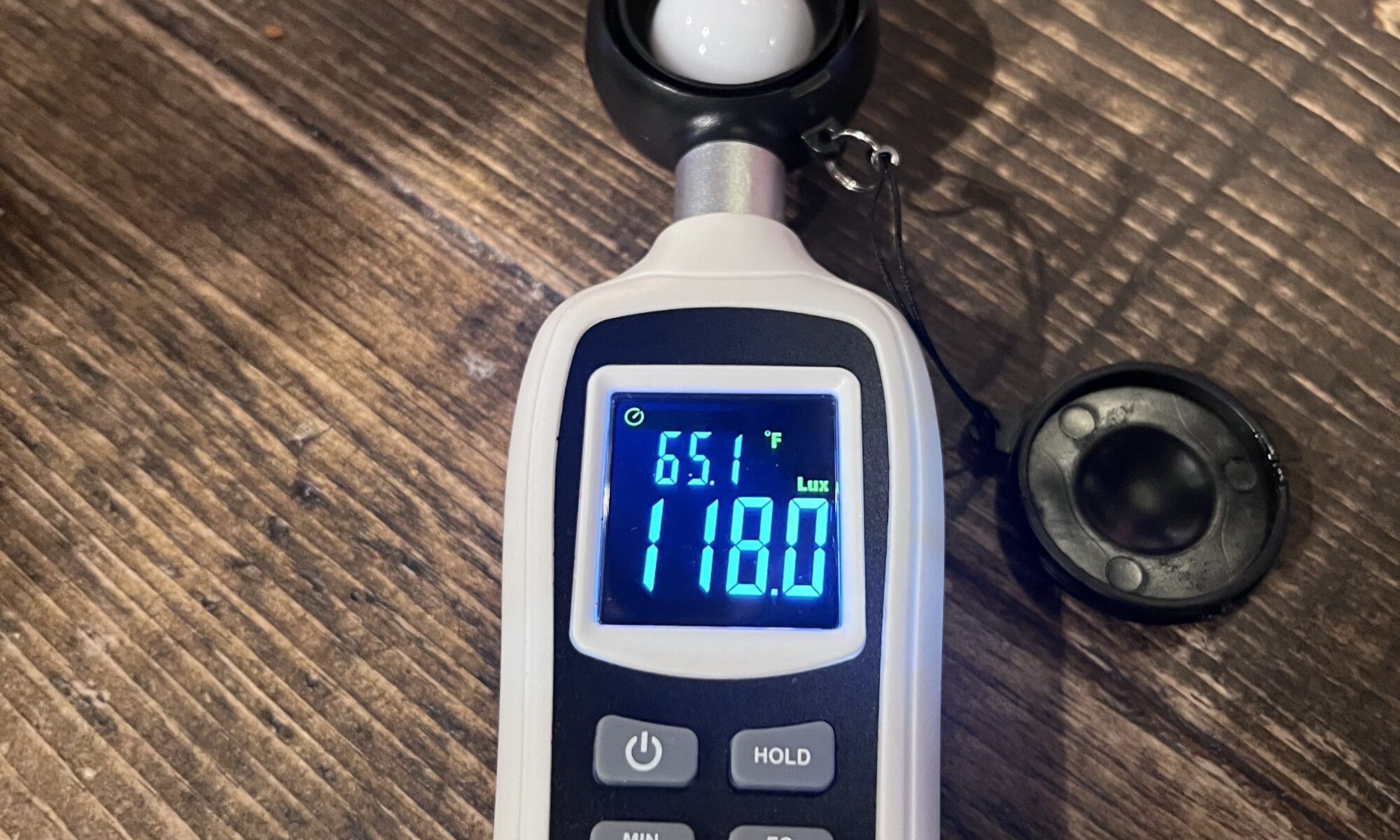
Warm light. Low pendant lights over tables creating intimate spaces. Spotlight purposefully pointing to service areas. Lots of depth, drama, shadows created within the space from the lighting creating multiple points of interest within the interior. 20.5 lux (general areas) 118 lux (at tables).
Week 4 the tasks were to explore the museum noting the different lighting and analysing the lighting temperature, location, ambiance, appropriateness for the materials and objects displayed.
Kingdom Of Scots:
Material Stone 12.3lux (Image Credit: Josie Lancaster)
Elevation Sketch Illuminance On Stone (Image Credit: Josie Lancaster)
Analysis: Directional lighting from above natural light appearing warmer on materiality of stone. Creating lots of depth, shadow and texture.
Material Metal 45.1lux (Image Credit: Josie Lancaster)
Sketch Illuminance On Metal (Image Credit: Josie Lancaster)
Analysis: Warm light from small spot lights covering all angles. Highlighting shine of metal. No Shadows created. Brightly Illuminated makes material feel expensive.
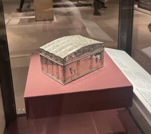
Material Wood (Image Credit: Josie Lancaster)
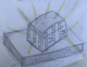
Sketch Illuminance On Wood (Image Credit: Josie Lancaster)
Analysis: Warm illumination one spotlight, specific direction creating shadow and highlighting harp details.
Fashion & Style:
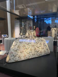
This room was dimly illuminated, Light boxes under garments and small spotlights with low UV lighting garments. Intentionally lit to look like runway/show.
Analysis: This garment contained a lot of detail in the fabric and had no lighting below. Small directional spotlights with a soft warm illuminance highlights the centre of the dress.
Kids/Imagine Zone:
Kids/Imagine Space (Image Credit: Josie Lancaster)
Kids/Imagine Space Light Sketch (Image Credit: Josie Lancaster)
Analysis: Initially the lights felt bright, fun, playful and exciting. After time the illuminance felt overstimulating causing a strain to the luminance on the eye, making it hard to adjust to the room. Use of different coloured lights to signify different areas within the space. Mostly matt surfaces/materials (to reduce glare??)
Traditions In Sculpture:
Cain & Able (Image Credit: Josie Lancaster)
Cain & Able Sketch (Image Credit: Josie Lancaster)
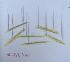
Analysis: Brightly Illuminated, 630-670lux. Lots of natural Illuminance creating shadow of bust on walls. Illuminance fluctuates as sunlight alters. Material texture and form easily visible. I thought space was to brightly Illuminated, a darker space with direct Illumination of objects could create more drama or distinction of objects making them stand out from neutral surroundings.
Analysis: 20.3lux this was poorly Illuminated with warm muted illuminance above object. Lighting was behind frosted plastic light coverings dimming our luminance. I think this was intentionally lit in this manor to mimic the natural habitat of this nocturnal creature.
Analysis: This object was extremely well Illuminated with multiple directional spotlights from every angle. Warm Illumination. Created interesting, fun shadows of the object as pictured below.
Dinosaur Shadows (Image Credit: Josie Lancaster)
Shadows:
Bell Object (Image Credit: Josie Lancaster)
Bell Shadow Sketch (Image Credit: Josie Lancaster)
Analysis: This object was successfully lit to enhance the form and materiality of the object. Directional, warm spotlights from above cast a soft warm illuminance on the object. The lefthand side had two spotlights closer together and the righthand side had two spotlights place further apart, this created unique shadows underneath the bell and down the metal of the bell the created an intensity and mystery to the object.
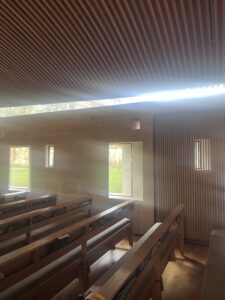
Week 3 we visited St Alberts Chaplaincy to analyse the lux levels of natural light within the interior space. The building interior was a striking mix of natural materials highlighted by the lighting to create an atmospheric space.
Task A: Find the locations where you could no longer see the sky.
Analysis: It was possible to see the sky from all seated locations within the interior space. The only space where you could not see the sky was standing in the back passageway of the space as demonstrated in the below images.
Daylight Coming Through (Image Credit: Josie Lancaster)
Outward View Of Chaplaincy (Image Credit: Josie Lancaster)
Daylight From Above (Image Credit: Josie Lancaster)
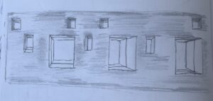
Task B: Draw light and shadow in the space.
Analysis: The spot marked below was the place within the interior where you could see the most sky. Shading on plan reflects shadow and light within the interior. Light above and in the windows to the right hand side of the building create natural light on the edges of the space creating a darker pathway in the centre of the interior leading you towards the large windows/alter at the front of the interior.
This led us onto calculating the real daylight factor inside the interior which we measured at different points within the space. At the time of measuring it was 11am and the outside indirect light was measuring at 12000 lux. The real daylight factors read as follows:
Alter-18.8
Rear Left Seating-0.7
Narthex-0.04
Foyer- 18.6
How Daylight Affects The Interior Sketch (Image Credit: Josie Lancaster)
Analysis: Sketching how the afternoon light creates shadow on the right hand wall within the space. The deep set windows create direct beams of natural light into the interior creating bright openings and shadowed walls.
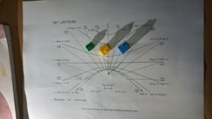
Week 2 started with testing the suns path using the sundial method, this process began by tracking how the sun moved throughout the day at different times of the year. This task was useful first step for developing a clearer understanding of the suns position in the sky and how this might affect an interior space throughout the day as the sun moves.
Sun Direction: 0700 August/April 2021 (Image: Josie Lancaster)
Observation: 0700 hours in April/August. First test to understand how the sun affects houses during the months of April and August (spring/summer). During this time of year the sun is higher creating less shadow behind the houses.
Sun Direction: 1100 February/October 2021 (Image: Josie Lancaster)
Observation: 1100 hours in February/October. Second test to determine the contrast of the sun during the months of February and October (winter/autumn). The sun during these seasons is much lower in the sky creating greater shadow. Houses were grouped to understand how this would impact neighbouring properties, the green house received minimal sunlight at this time.
Sun Direction: 1500 March/September 2021 (Image: Josie Lancaster)
Observation: 1500 hours in March and September. Houses were arranged in a horizontal line to determine if this provided an equal share of sunlight to the houses. This formation of housing provided mostly equal sunlight throughout the day. The green house was slightly overshadowed by the yellow house during the early morning sunlight but at 1500 hours the houses had equal sunlight/shade and approximately 75% of the houses had light at this time.
Sun Direction: 1200 January/November 2021 (Image: Josie Lancaster)
Observation: 1200 hours during January and November when the sun is extremely low in the sky. The houses in this formation received approximately 50% light at midday during these months. This task lead me to think more about the patterns houses and buildings are laid out in the cities we inhabit and how they might be effected by the sunlight. Was the suns path considered during the construction and planning of the buildings we see on a daily basis?
Sun Direction: (Image: Josie Lancaster)
During this lighting test I observed the effects of the sunlight on the interior space during March and September 1600, Azimuth 245, 20 degrees North. The sun light shone through the slit and reflected onto the wall adjacent to the opening creating a pattern as pictured above.
Coloured Light: (Image Josie Lancaster)
Observation: December 1400 hours, 208 Azimuth, 11 degrees North. The colour transformed the interior space providing a soft hue to the space. The sun was very low in the sky at this time and most of the interior space still remained quiet dark but the effects of the colour were still extremely prominent.
I really enjoyed this task, it took some time to understand in the beginning but it was a useful way to develop my knowledge of how light can impact the internal design of a space.
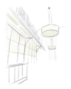
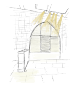
Welcome to week 1 of my lighting design blog, this is week one of the course and I am really looking forward to learning more about the way light can create atmosphere within a space, enhancing desired aesthetics by creating depth that alters the mood or feeling of a space transforming an interior from daytime to night.
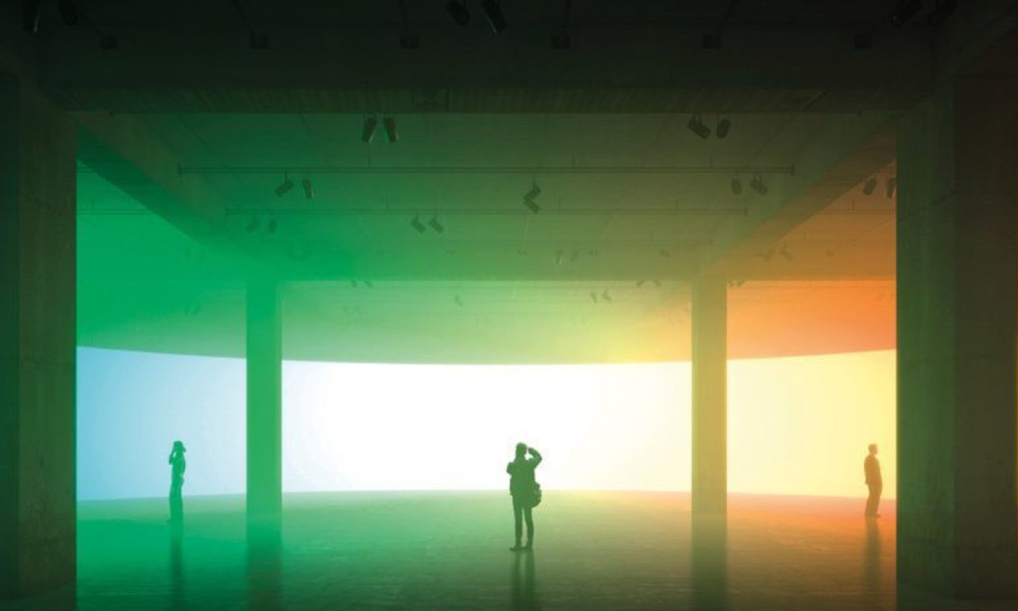
(Image Credit: Pintrest – Station Steps)
The above image I found interesting as it appears to be a standard concrete structure but the light really changes the colour of the concrete within the image. The blue/green colour appears to be affected by the natural light coming in from above. But I am curious as to what is causing the red/pink colours. I was wondering if it was a red bulb or a warmer light, but after further discussion in class I was informed that the effects in this image are down to the way it was photographed. This is interesting the way the light can change the colours through the lens though.
(Image Credit: Josie Lancaster – Thermal Baths)
The main words that came to mind when I saw this image of the baths were atmospheric, depth, shadow, translucent, heavenly, natural, mysterious, rippled. The multiple shades of light or darkness (depending on which way you look at it) within the image add shades of depth and atmosphere to the space creating interest and mystery, this combine with the steam creates a natural calmness and tranquility to the design of the space. The natural light combined with the natural materials of stone create a certain serenity.
(Image Credit: Josie Lancaster – Negative Sketch Of Baths)
Using the negative space I tried sketching the space with the intention of conveying the multiple shades of light within the interior using chalk on black paper. I feel that I achieved the light within the space but it was difficult to convey the depths of the shadows within the space, so I attempted the task in the reverse using grey scale markers on white paper. This was a much more successful way of conveying the multiple depths of shadow and light within the design. I found this task difficult at first but after progressing I found it a useful way to convey the light within the space and understand how this changes different parts of an interior.