Any views expressed within media held on this service are those of the contributors, should not be taken as approved or endorsed by the University, and do not necessarily reflect the views of the University in respect of any particular issue.

Explaining exhibition layout – Yanis

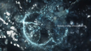
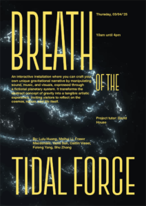
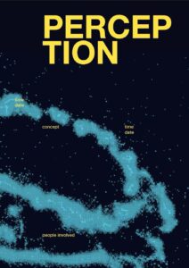
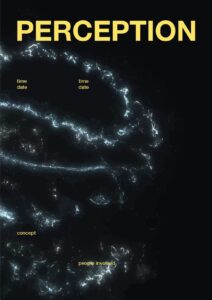
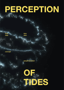
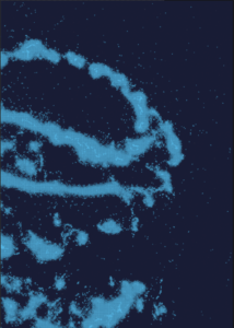
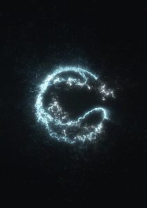
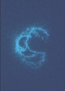
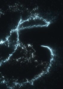
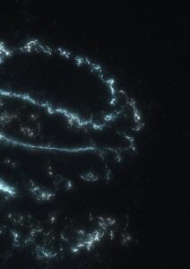
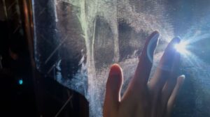
We minimized external light sources to create a serene, cosmic environment. Upon entering the space, visitors were invited to become a metaphorical force—controlling the tides of the universe. Abstract video projections representing tidal forces were displayed on both sides of the exhibition.

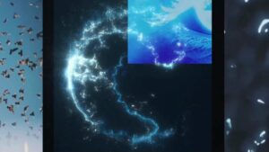
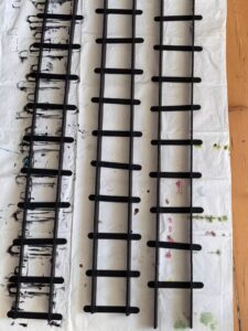
To achieve the desired visual effect, we experimented with various projection fabrics—testing different colors and textures. In the end, we chose semi-transparent black gauze curtains to hang around the space. This material allowed the projections to softly appear on the curtains while also illuminating the central installation. We carefully adjusted the projector positions multiple times to ensure the imagery fully covered the curtains while avoiding direct interference with the viewers’ line of sight, offering an optimal viewing experience.

As visitors moved through the space, their motion created gentle air currents that caused the gauze curtains to sway. This movement made the projected visuals ripple like water, turning the room into a tidal planet breathing in sync with the universe—immersing the audience in the sensation of tidal force.

At the front, the water ripple projection passed through the semi-transparent gauze and continued onto the wall behind. This visual alignment formed a continuous line with the central planet installation, creating a poetic visual echo.

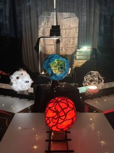
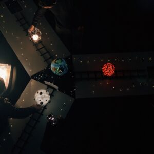
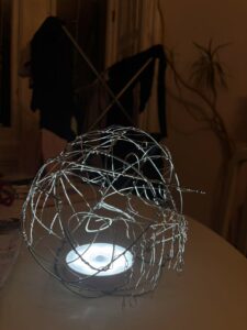
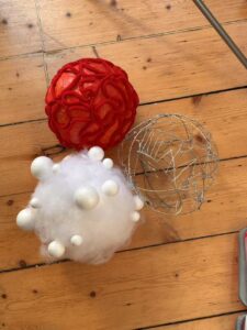
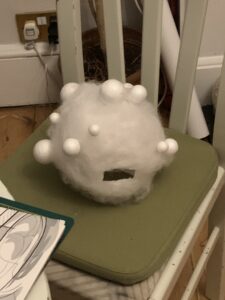
For the central installation, we slightly elevated the main star on a black platform and allowed the fabric to cascade down like a veil. Star lights were added to simulate clusters of twinkling stars surrounding four planets. Three of the planets were arranged in a triangular formation around the central star and faced the entrance, as if welcoming the visitors. With warm orange-yellow lighting and ambient music, the entire installation felt like a dreamlike cosmic scene quietly waiting in the depths of space.

Making ambience video – Yanis

Building on the visual effects developed in TouchDesigner, I created projection videos for both sides of the exhibition room. Our goal was to let the audience feel the tidal force—an abstract, subtle sensation. Water, as the core element of tides, became the central visual motif. It represents life, flow, rationality, and emotion.

I sourced video footage from Pixabay, focusing on different forms of water: waves, still water, flowing streams, and surging tides. We also considered time as another essential aspect of the tide. For us, time was a conceptual extension—water becomes a metaphor for time: always moving forward, continuous, and intangible. I collected video materials symbolizing time, weaving them into the narrative of the piece.

The video transitions from the tangible water to the abstract time and tidal force. Looking through the whole video, rippling waves gradually flow into eyes which is the “window” of the human mind, where the sensation of force peaks, every feeling burst into mind. And finally, everything quiets down into the rhythmic motion of a ticking clock. I also included an excerpt from Virginia Woolf’s The Waves, adding a poetic, literary thread that connects the physical and emotional qualities of the tide.

Final poster design

Yanis and I looked at more typefaces and settled on this compressed, tall one. I fitted it to the grid so it would sit nicely between all the information on the poster. As a group we also decided that we might need a small guide on how to use the installation as our models were quite fragile.

Everyone was really happy with the poster, and it really feels finished off now. It’s also nice to have a small souvenir of the project that isn’t an awkward planet model.

Iterative process of creating final poster

For the poster I made a grid system to juxtapose the flowy visual in the background. The bitmaps were very blue, so to contrast this I opted for yellow type. I did try a lighter blue but felt it wasn’t striking enough.

Grid system used

I did try a lighter blue but felt it wasn’t striking enough.

Blue type trial

Then it was just a matter of finding which bitmap worked the best. I tried different layouts, both with how zoomed in the background image was and where the type was placed. I showed Yanis to get some feedback and he suggested adding squares that were inverted to further this idea of a different perception. But we both felt it wasn’t quite hitting.


One issue with the bitmaps was that there were lots of little shapes, which did look cool but also made it look a bit like an optical illusion, and that isn’t the most comfortable thing to look at. This was happening due to there being lots of particles swirling around the central sphere shape, which were being recognised by the bitmap.
I took the original image of the Touchdesigner visual and image traced it in Illustrator. This also had lots of little particles still swirling, but were much bigger and less contrasting to its immediate surrounding, so made it so much more comfortable to look at.


Another thing we did together was play around a bit with different fonts, as I had just been using Helvetica as a base font. We looked at more digital looking typefaces, that felt more futuristic.


This whole process was something that I’ve really missed doing. A lot of, not only this project, but the course in general has been learning a lot of new skills. That has been great, but it’s always nice to just do what you know well. It also felt like a nice way to just decompress after working non-stop on the physical models.

Creating poster visual

I decided to make a poster for our exhibition. I wanted to use one of Yanis’ visuals as the background of the poster. The problem was that he had to use the free version of Touchdesigner which doesn’t let you export anything at a high resolution. The solution for this was to put it in Photoshop and make a bitmap. I then cut out the white of the bitmap and was able to fill it with a different colour.

I tried some different options, and played around with the bitmap settings and subsequent colour combinations. This was a really fun process, and was finally something that I did know how to do.


28/03 – Finalising physical elements

We had finished the lava and air moon, so now we had to do the metal moon, the tracks for the trains and the central “earth”.

We had been told by the others that the tracks would need some type of system to slow down the trains. They were worried that the audience would want to move the trains extremely quickly, which would then cause a small delay to the data. We decided we would use wooden sticks and then secure the foam board sides to the sticks so the tracks would be separate, and thus easy to transport, but also create sort of speed-bumps for the trains.

Yanis focused on the metal moon, using a balloon as a template to bend the metal wire to a spherical shape. He made it quite abstract and added small dangly parts.

Here they are all done:

Lastly, was the central planet. We used one of the transparent balloons and stuck our fake grass on top of it. We used some paper and kitchen towel to create a watery texture. We also put some UHU glue over this to create a layered, squiggly texture to look more like waves. We painted over it to represent grass and water, and the let it to dry for a while.

31 march

All of our models are very crafty, and slightly look like a primary school project. But that’s not to say that the process was very enjoyable, and Yanis and I in particular are very proud of the result. We had to do a lot of rethinking about how we were going to make them. We went through so many different ideas and had to constantly be problem-solving, which I would say is the real thing we took from it.

Building trains

We had our trains (yay!) but now we had to assemble them. For some reason, the trains were printed slightly too big and we had already gotten screws to attach the wheels, which now obviously didn’t fit our prints.

I went back to my dad to see if he had any other screws, and luckily for us he is Bob the Builder, so that was solved.

Every time we completed a small task, it was a massive weight off of our shoulders. Lots of changes had been made to our concept, but also the requirements for the data collection, so we didn’t have as much time to create everything as we would have wanted.

We had to put our foot down at a certain point because the others responsible for the sound and data collection kept thinking of new ideas, which were great, but kept delaying when we could start producing everything. So that process was slightly frustrating on our end, but we understood why it was happening and tried to resolve all the issues they arose as quickly and creatively as possible.

Digital visual regroup

Yanis had taken over figuring out Touchdesigner and had gotten the tutorial to work, the next step was to find a way to input our real time data. He and Lulu tried to figure it out, but it wouldn’t work. So seeing as Touchdesigner was not working out very well for what we needed, we needed to rethink how we were going to make our visual.

When we got our MAX tutorial from Jules, he had mentioned that Jitter was able to create interesting visuals. I looked into this as we had all our sensor data, sound data and orbiting planet data on MAX so it would probably be an easier process to input our data to create a reactive visual system.

Again, Yanis and I are not familiar with MAX or Jitter, so I looked for tutorials that could help us. I found a tutorial series on YouTube that, again, worked with particle attractors with coordinates.

Tutorial series used

This is the only picture I took of me following the tutorial, and just really felt like this man was my saviour as we had been struggling so much with Touchdesigner and something was finally working in our favour.

It broke a few times when I was following the tutorial, so it was a real trial-and-error process.

How far I got with the tutorial:

I got to a good base with the visual, as the rest of the tutorials started exploring constantly moving attractors and different colour/textures, and I didn’t want to jump too far ahead if it wouldn’t work with our data.

The patch included a node for the attractor coordinates, and I had checked the later tutorials to see if he incorporated multiple attractors, which he did. I tried to figure out where I could customise these coordinates, but I didn’t know enough about MAX or our sound patch to figure it out.

I asked Lulu for help at this stage, as she had done a lot of the maths for our patches and knew how it was set up. I handed over my patch to her, with the tutorial link and she was able to figure out how to make it reactive to our data changes.

Lulu’s revision of the patch using our sensor data:

I’m not great at maths and could not wrap my head around how she managed it, but it worked. They were able to customise it to represent the different moon types too by changing the colour.

3D printing trains

Originally our idea with the tracks would be that the sphere’s would be stuck to a pole that would be in a track, but we already established that this would be too hard and expensive. Add that onto the down-scaling of our set-up we brainstormed other solutions.

Yanis suggested maybe making a small cart, like a little train, so we could wheel the planets down our track. I looked at Thingiverse for options to 3D print these trains as building them from scratch would be too hard to figure out and we didn’t have much time left to make it either at this point.

Toy Train Tank Car BRIO / IKEA compatible

Yanis booked a 3D printer and was able to print one to test out, but it took a while to print. So I ordered it through the Click-and-Collect service at Minto House in the meantime, in case printing them ourselves would take too long as we were never able to book the right printer.


23/03 – Building physical models

Unfortunately we didn’t take that many pictures of the first stages of building the models. It mainly consisted of covering balloons in paper maché so we would have customisable base for all two of our moons. The third moon would be made of metal and would be hollow, but I was still trying to find the tools to make these.

Originally our idea was to use the red wool we had bought to create squiggly shapes over the base sphere, and we were going to glue this down so the wool would be stiff and hold its shape. We started this process and quite quickly realised it didn’t work that well, and kept falling out of place as the glue wasn’t strong enough. We tried multiple different methods like completely dousing the wool in the glue and using super glue to glue parts of the wool together, but nothing worked so we decided to revisit it once what we had managed to do, had completely dried.

The earth planet we kept as the last one to do. We had bought clear balloons for this one, which were extremely hard to blow up ourselves, so we needed a pump. I was able to find one later which made the process so much easier.

Once the bases had dried, we could customise them. Here’s what we did

Air planet:
– added cotton stuffing all around it (I’m an avid sewer so luckily had some lying around from projects over the years)
– stuck different sized styrofoam balls on top to make it look lighter

Lava planet:
– checked the dried wool to see if it was usable; it wasn’t – it wouldn’t keep it’s shape and we would have had to use a lot of glue to further secure it to the base, and we only had half the sphere
– the base was quite soft, so I decided to sew the wool into the sphere; which was tedious but worked
– then we painted the base in a reddish-orange colour to look like lava

This meant that we only had the lava planet to finish off, and to make the metal and earth ones.

This process was very time-consuming, but also really fun. It took our mind off of other projects and we could just muck around a bit and see what happened. Yanis and I have had 2 meetings, each of about 3 hours, to make these models, and both times have put a movie on in the background to make the process feel less tiring.

css.php

Report this page

To report inappropriate content on this page, please use the form below. Upon receiving your report, we will be in touch as per the Take Down Policy of the service.

Please note that personal data collected through this form is used and stored for the purposes of processing this report and communication with you.

If you are unable to report a concern about content via this form please contact the Service Owner.

Please enter an email address you wish to be contacted on. Please describe the unacceptable content in sufficient detail to allow us to locate it, and why you consider it to be unacceptable.
By submitting this report, you accept that it is accurate and that fraudulent or nuisance complaints may result in action by the University.

  Cancel