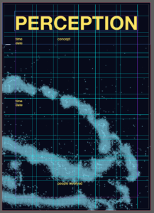
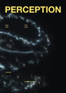
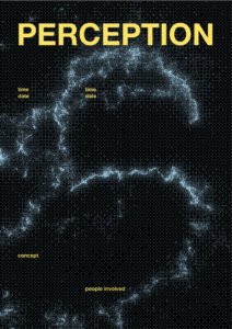
For the poster I made a grid system to juxtapose the flowy visual in the background. The bitmaps were very blue, so to contrast this I opted for yellow type. I did try a lighter blue but felt it wasn’t striking enough.
I did try a lighter blue but felt it wasn’t striking enough.
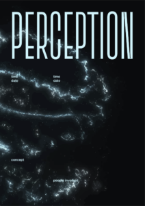
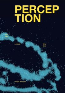
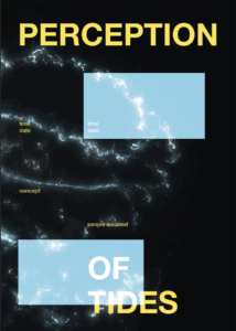
Then it was just a matter of finding which bitmap worked the best. I tried different layouts, both with how zoomed in the background image was and where the type was placed. I showed Yanis to get some feedback and he suggested adding squares that were inverted to further this idea of a different perception. But we both felt it wasn’t quite hitting.
One issue with the bitmaps was that there were lots of little shapes, which did look cool but also made it look a bit like an optical illusion, and that isn’t the most comfortable thing to look at. This was happening due to there being lots of particles swirling around the central sphere shape, which were being recognised by the bitmap.
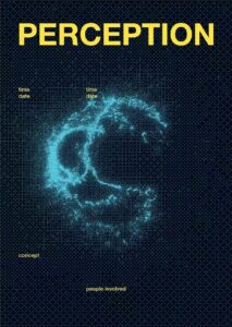
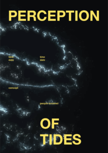
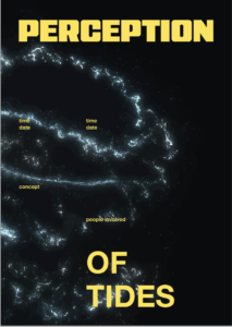
I took the original image of the Touchdesigner visual and image traced it in Illustrator. This also had lots of little particles still swirling, but were much bigger and less contrasting to its immediate surrounding, so made it so much more comfortable to look at.
Another thing we did together was play around a bit with different fonts, as I had just been using Helvetica as a base font. We looked at more digital looking typefaces, that felt more futuristic.
This whole process was something that I’ve really missed doing. A lot of, not only this project, but the course in general has been learning a lot of new skills. That has been great, but it’s always nice to just do what you know well. It also felt like a nice way to just decompress after working non-stop on the physical models.