Any views expressed within media held on this service are those of the contributors, should not be taken as approved or endorsed by the University, and do not necessarily reflect the views of the University in respect of any particular issue.
As we wrapped up the project and debriefed with Julie-Ann and Claire, we kept discussing access and engagement.
Our two brief problems both hinged on these concepts, in reference to the Art Collection:
Access is also central to both of the institutions’ aims. However, over the course of our de-brief conversations, it became apparent that the two institutions evaluated “access” differently—and that our exhibition had in fact been navigating two distinct modes of access and engagement all along.
As I commented in this post, I think it was a major strength of our exhibition and interpretive text that some viewers found the text enriching, but others chose to enjoy navigating the space without it. Claire additionally remarked that she thought the exhibition was very successful in removing narrative pieces like wall text and hanging the works in a “randomized” way. We had made those decisions in order to mimic the appearance of the actual collection, but it also meant that there was no singular path or narrative to follow inside the Travelling Gallery.
The art was hung “randomly,” as though in storage, creating multiple potential connections and meaning between very different works.
These effects enhanced the accessibility of the exhibition in terms of the Travelling Gallery’s model. Visitors were encouraged to interact with the art on their own terms, and were given the time and space to chat with us about their interpretations (and sometimes just to chat!). Many visitors left the Gallery feeling excited by their visit and a sense of community, but may not have even looked at most of the works or learned about the University Art Collection.
While this may initially seem to imply that we did not succeed in providing “access” to the University Art Collection—if that was to be measured in terms of providing clear information and instructions to every visitor about the Collection and “promot[ing] engagement with [its] holdings”—we realized we had ended up addressing those aspects of the brief in a different way. We discussed with Julie-Ann how it had become apparent that there is a need to separate the internal and the external in our considerations and conclusions, which was a nuance unanticipated by the initial brief.
While the Art Collection needs to raise internal awareness about its holdings within the University, we discovered through this exhibition that it has a different role to play for the general public. Situated managed to successfully bridge the gap between the two partner institutions by presenting a multilayered, non-linear exhibition that operated on two simultaneous planes of access: that of internally testing the potential for the Art Collection to be exhibited publicly, while externally presenting an accessible experience of looking, learning, and discussing for a diversity of visitors.
Many visitors to Situated struggled to understand the concept of a “university art collection.” Most people assumed that it was composed wholly of student artwork, or only Scottish art, and were confused to learn about its broader scale.
This lack of public awareness of university art collections is described in a 2015 Times Higher Education article. Bluntly titled “What is the point of university art collections?” the article describes how “many universities inherit unexciting art collections put together at different times with no overall organising principle.”[1] While it is true that many university art collections—including Edinburgh’s—were historically acquired relatively haphazardly, recently many have developed specific collection development plans. How do university art collections approach collection development and engagement, and how do these projects sit within the broader institutions of which they are a part?
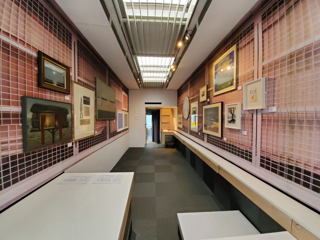
Many universities tailor their existing collection development plans—or create new ones—in an attempt to focus and/or diversify their collections. Edinburgh’s University Art Collection, for example, is currently prioritizing its Contemporary Art Research Collection. The University of Oxford, in a recent attempt to diversify their portrait collection, created the Diversifying Portraiture project that first catalogued existing university portraits of historical figures who “challenged the stereotypes of their time,” and then commissioned 24 new portraits of more recent university individuals from diverse backgrounds and communities.[2] The resulting exhibition, The Full Picture, aimed to show how “Oxford is, and always has been, a more diverse place than most would recognise.”
Some of the commissioned portraits; image is an excerpt from the cover of the exhibition booklet (https://edu.admin.ox.ac.uk/files/thefullpictureexhibitionbookletpdf).
There is an inherent risk to attempting to fill “diversity gaps” in institutional collections. There are clear resonances between institutional attempts to retroactively diversify their collections, and the feminist art historical project to “uncover” the women excluded from art history. As Griselda Pollock critiques in Differencing the Canon, this revisionist project in fact “fundamentally unaffected” the history of art, as “despite the expanding volume of research and publications on artists who are women, Tradition remains the tradition with the women in their own special, separated compartments, or added as politically correct supplements.”[3] Instead, Pollock suggests that more effective change comes from “differencing the canon”: engaging in “productive and transgressive ways to re-read the canon and…the disciplinary formation that establishes and polices [it].”[4]
Indeed, some universities’ approaches to their art collections resonate with Pollock’s art historical call for “re-reading” institutional structures. Instead of revising collections development policies or seeking to acquire new, supplementary material, these university art collections instead actively revisit the material they already hold. This can take a number of different forms, including academic research projects, new curatorial methods, and artist-led interventions.
In 2001, artist Mark Dion collaborated with students and staff at the University of Minnesota’s Weisman Art Museum on a research and curatorial project that aimed “to consider more fully how one university has collected and used objects to produce knowledge within disciplinary structures.”[5] In a catalogue essay for Cabinet of Curiosities: Mark Dion and the University as Installation, E. Bruce Robertson observes that university collections produce knowledge notably differently from the rest of the university institution, which valorizes textually-based knowledge production. He writes
Object collections… are dispersed and virtually invisible to outsiders: the official museum collections are the tip of the iceberg of the specimens and artifacts owned by the university. Moreover, physical collections have begun to be discounted as sites of knowledge production, unlike the laboratory for the sciences, fieldwork for the social sciences, the library and archive for the humanities. Instead they tend to be conceived of as repositories—or at least that is what many academics would believe.[6]
In light of this observation, research projects led by artists—rather than academics—could therefore be understood as a compelling method for university art collections to “re-read” themselves and their histories outside of the broader institutional framework, while also allowing for new modes of public engagement.
The nine “curiosity cabinets” created for the “Mark Dion: Cabinet of Curiosities” exhibition at the Weisman Art Museum in 2001.
Dion notes, however, that such projects are “fundamentally site-specific.”[7] This raises a particular challenge for university art collections seeking relevance to a broader public; a challenge closely tied to broader institutional goals of forming relationships with external communities alongside the diversification of their own internal research, teaching, and collections.
In “Art in Special Collections: Latino and African American Fine Art and Photography Collections in Academic Institutions,” Rebecca Hankins and Miguel Juárez suggest that the two projects of community outreach and internal diversification are entwined. They discuss how university collections may not have the diversity “gaps” they think they do—some of the material may already be there, just obscured and under-researched. Hankins and Juárez call for institutions to address this issue by making their collection material “visible” to the public via digitization.[8] They identify digitization as one of the most important actions institutions can take, writing that “the physical door is not the only portal for viewing an institution’s holdings. Providing collections via digital projects is a virtual door that goes hand in hand with providing multiple levels of access.”[9]
University art collections’ approaches to acquisitions and engagement are to an extent informed by broader institutional calls for diversity and accessibility. It is important to note, however, that in many regards these are questions they have always engaged. Indeed, the oft-critiqued “haphazard” collecting strategies underpinning many of these university collections seems tied to a unique inherent flexibility and creativity. The Weisman Art Museum was founded in 1934; its first director, Hudson Walker, remarked that the university collection “should emphasize a ‘workshop character,’ as opposed to the ‘traditional notion of a museum as a place for safekeeping of rare objects.’”[10] This encouragement for creative community engagement is also apparent in a 1944 description of the University of Nebraska Art Collection, which describes:
pictures are loaned continually…. A “picture of the month” program is kept going in the University of Nebraska Student Union the year round. Extension Art Exhibitions that include work from the University’s collection are often sent to county fairs and exhibited alongside fancy work, canning exhibits, and even hog shows. The most sincere appreciation and criticism of paintings often comes from Nebraskans of rural districts—farmers are avid art enthusiasts.[11]
There is a sustained focus throughout these historical and contemporary university collection documents on making art accessible and enriching to the lives of all on campus and in the broader community. The challenge of making university collections publicly relevant has been longstanding; and “re-reading” their “unorganized” histories is just as important as new acquisitions to keep them continually engaging.
[5] Colleen J. Sheehy, “Introduction: Restaging the Cabinet of Curiosities,” in Cabinet of Curiosities: Mark Dion and the University as Installation, ed. Colleen J. Sheehy (Minneapolis: University of Minnesota Press, 2006), xiii, https://www.jstor.org/stable/10.5749/j.ctttv73x.5.
[6] E. Bruce Robertson, “Curiosity Cabinets, Museums, and Universities,” in Cabinet of Curiosities: Mark Dion and the University as Installation, ed. Colleen J. Sheehy (Minneapolis: University of Minnesota Press, 2006), 44, https://www.jstor.org/stable/10.5749/j.ctttv73x.8.
[7] Bill Horrigan, “A Conversation with Mark Dion,” in Cabinet of Curiosities: Mark Dion and the University as Installation, ed. Colleen J. Sheehy (Minneapolis: University of Minnesota Press, 2006), 40, https://www.jstor.org/stable/10.5749/j.ctttv73x.7.
[8] Rebecca Hankins and Miguel Juárez, “Art in Special Collections: Latino and African American Fine Art and Photography Collections in Academic Institutions,” Art Documentation: Journal of the Art Libraries Society of North America 29, no. 1 (Spring 2010): 34, https://www.jstor.org/stable/27949536.
Hankins, Rebecca, and Miguel Juárez. “Art in Special Collections: Latino and African American Fine Art and Photography Collections in Academic Institutions.” Art Documentation: Journal of the Art Libraries Society of North America 29, no. 1 (Spring 2010): 31–36. https://www.jstor.org/stable/27949536.
Horrigan, Bill. “A Conversation with Mark Dion.” In Cabinet of Curiosities: Mark Dion and the University as Installation, edited by Colleen J. Sheehy, 29–42. Minneapolis: University of Minnesota Press, 2006. https://www.jstor.org/stable/10.5749/j.ctttv73x.7.
Kirsch, Dwight. “The University of Nebraska Art Collection.” College Art Journal 3, no. 4 (May 1944): 152–156. https://www.jstor.org/stable/773205.
Pollock, Griselda. Differencing the Canon: Feminist Desire and the Writing of Art’s Histories. London: Routledge, 1999.
Robertson, E. Bruce. “Curiosity Cabinets, Museums, and Universities. In Cabinet of Curiosities: Mark Dion and the University as Installation, edited by Colleen J. Sheehy, 43–54. Minneapolis: University of Minnesota Press, 2006. https://www.jstor.org/stable/10.5749/j.ctttv73x.8.
Sheehy, Colleen J. “Introduction: Restaging the Cabinet of Curiosities.” In Cabinet of Curiosities: Mark Dion and the University as Installation, edited by Colleen J. Sheehy, xi–xiv. Minneapolis: University of Minnesota Press, 2006. https://www.jstor.org/stable/10.5749/j.ctttv73x.5.
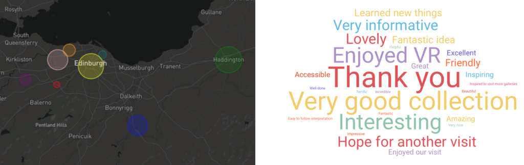
The two-week tour felt very successful. Although not all of our venues had large visitor numbers, many of them had more than we anticipated, and we had lovely, positive interactions at each stop.
Exhibition evaluation graphics created by Barbora. The left graphic shows the locations and proportional visitor numbers at each venue, and the right graphic represents the range of comments left in the comment book.
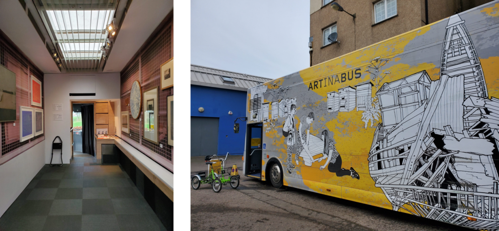
Apart from the opening event, I had two invigilation shifts: in the afternoon at Drumbrae Library on February 17th, and in the morning at North Edinburgh Arts on February 19th. Drumbrae Library was a particularly quiet venue, with only a few visitors coming in during my shift; North Edinburgh Arts drew a larger crowd, with more people coming in to see the art and chat.
Left: waiting for visitors at Drumbrae; right: parked behind North Edinburgh Arts.
I was personally very proud of the positive response visitors had to the interpretive text. Although not everyone chose to read it, many visitors did pick it up and commented on its value. I think it speaks to the efficacy of our exhibition and curatorial decisions that the exhibition was not dependant on the text and that visitors felt encouraged to freely explore the space and make their own connections with the art—I was particularly taken by one woman who looked closely at the art and then asked if the theme was “light.”
I was also thrilled to see this review in Loaf Magazine. The reviewer notes that “by embracing movement in its display,” the exhibition encouraged an accessible encounter with art for a diverse audience. They also write:
The work that isn’t Scottish in origin or subject feels clear in its relevance, too. The modern, pop art-esque Secreting Myths adds discomforting chromatics to classic colonial portraiture, whilst the minuscule, intoxicating Antediluvian Landscape transports the viewer to a place in the world. Given the movement at the heart of the exhibition and of the facilitators Travelling Gallery, this seems fitting.[1]
I was pleased to read this particular impression of the exhibition, and found it immensely exciting that this underlying theme of movement had been apparent to an external visitor. As discussed in an earlier post, our theme and exhibition had grown out of an initial interest in putting static works of art in motion, and I find it poignant that this interest continued to shine through in our final product.
Our opening night was a big success—even though we had some unexpectedly stormy weather, we had 137 visitors come see the bus over just a four-hour period!
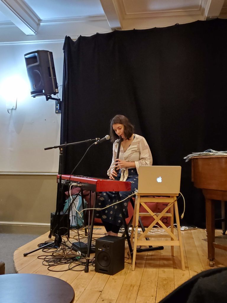
The highlight of the opening event for me was Carla’s musical performance: an original thirty-minute set of compositions and improvisations created from her work with the Scottish Sound Archive to consider non-visual representations of place and to showcase another University Collection. It was captivating, moving, and resonated beautifully with the themes of the exhibition.
I was also, however, reflecting on how Carla’s performance resonated with our brief overall. We had initially decided to commission a performance due to the brief’s outline that we should “[program] associated events,” but Carla’s performance—as well as the process of commissioning it—ended up addressing several of the brief problems as well.
The second “general” brief problem asks: How can we create experimental programs and activities with institutions that achieve a balance between “fit” and “challenge”? Carla’s performance and experimental use of the Sound Archive introduced a “third” institution to our project.
This process of integration also linked to our first brief problem: What is the purpose of the Art Collection, how should it be used, and who is it for? In this instance, Carla demonstrated how creative interventions can use these institutional archives and collections as sources of inspiration for contemporary projects.
There were also interesting parallels between our navigation of constraints with the Art Collection and the Travelling Gallery, and Carla’s navigation of constraints with the Scottish Sound Archive, addressing the question: How can we navigate constraints, including accreditation standards, stakeholder interests, spatial limitations and audience needs, in order to promote engagement with our holdings? Much of Carla’s work with the Sound Archive involved navigating the complexities of copyright access. This highlighted for me a parallel between her experience and that of encouraging public visitors to access the Art Collection: the tension between promoting engagement and the difficulties of accessing that material to engage with it.
I was particularly moved by Carla’s integration of a “Unknown Air” she was inspired by from the Sound Archive. There is a challenge to working with collections that have limited recorded knowledge of many of their items; but Carla’s performance demonstrated how not just a research approach, but a creative one, can create something beautiful from these gaps.
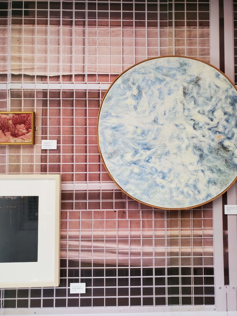
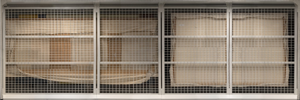
As discussed in my case study, we were initially very committed to displaying the works on collection storage racks, enabling viewers to see what the works “normally” look like in the collection itself. I got in touch with both the Van Abbe Museum and MIMA, who also used storage racking in [an exhibition], to ask how they managed security and stability concerns. Their strategies, however, were still not secure enough to address the concern of how the works would shift while the bus was in motion, which was obviously not a constraint they faced.
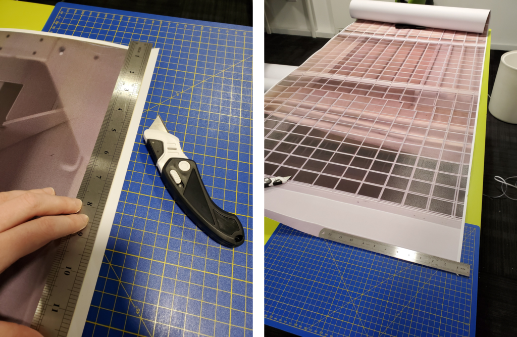
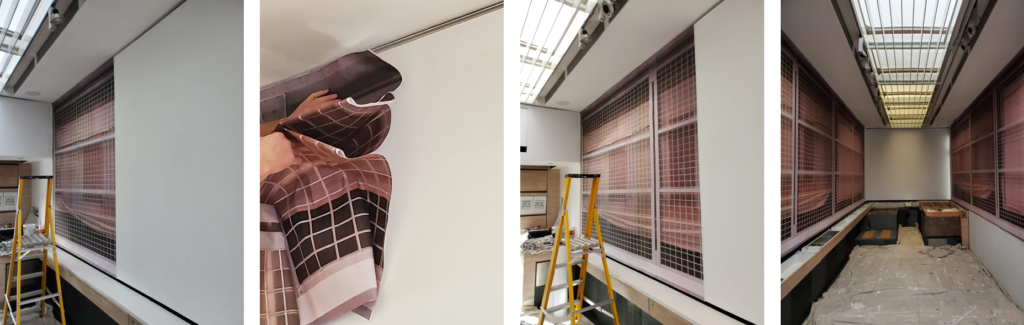
To mitigate these risks to the art, we instead investigated the possibility of creating a wallpaper for the bus that would provide a backdrop of a storage rack. We were initially uninspired by this suggestion, worrying that it would look “fake” and seem patronizing to our viewers, but we decided to research its feasibility regardless. I volunteered to lead this part of the project, from initial research to installation.
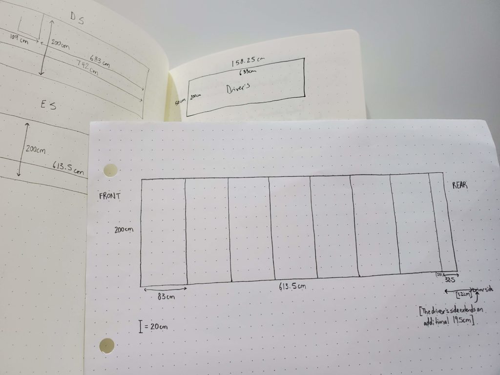
Since we were printing with ECA Reprographics, I had to sort out the measurements, files, and installation requirements myself. Working from the Travelling Gallery wall plans, I mapped out the requirements of the space.Working from my plans, a photographer took photographs of an empty rack at the South Gyles store and created a composite image file. This file (pictured above) was then “cut” into file strips that I took to Reprographics for printing.Despina and I trimmed the border on all the sheets and prepared them for installation.Installation!
I was very impressed with the final product. The image had a depth that I hadn’t anticipated, and truly appeared to be a three-dimensional rack. I had initially been concerned about the colour quality, since we could only afford to use Reprographics’ least-expensive printer, but in person the colours actually helped increase the three-dimensional effect of the image—and it was incredibly crisp.
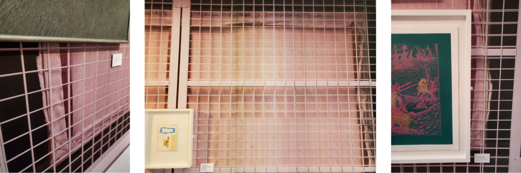
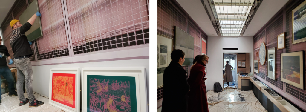
Thinking back to Charlotte Klonk’s remarks about the importance of “honest” installations (discussed in my case study), I feel that this photographic reproduction of the rack was in fact as “honest” as using a real storage rack would have been. It added useful visual context when explaining the premise of a “university collection” to members of the public, who all quickly grasped what was being represented.
An unexpected benefit to the wallpaper was how easy it made the artwork installation. Its grid-like pattern made it easy to communicate clearly with the installers and each other where exactly we wanted works situated, and by using the lines of the rack to make things appear level we didn’t have to worry about levelling works ourselves. The bus was ready to tour!
This week, we are starting to draft our interpretive text. We have decided that we will present this text as a short leaflet divided into three sections, each corresponding to our exhibition subtitle: “Place,” “Art,” and “Collection.” I have been working on writing the “Place” section, and I am completing background research into how the theme of “place” has been conceptualized in relation to visual art.
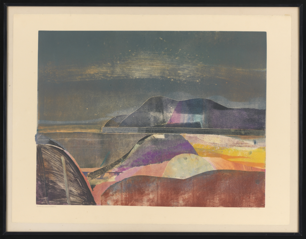
For this thematic analysis, I’m exploring a topic peripheral to our exhibition development: how art presents place outside of the landscape genre. Taking my inspiration from one of the works selected for Situated—Barbara Rae’s Ardnamurchan—I ask: How does Barbara Rae situate “place” as central to her artistic practice and artworks, while working outside of the conventions of the landscape genre?
The Barbara Rae work included in the exhibition: Barbara Rae, “Ardnamurchan,” 1983, print.
The essays in The Place of Landscape: Concepts, Context, Studies are particularly helpful in developing an analysis of place in art. In the first essay, “Place and the Problem of Landscape,” editor Jeff Malpas theorizes the close relationship between landscape and place. He considers how landscape art is “the view of a view”—not just a rendering of the artist’s visual viewpoint, but also a representation of the artist’s engagement with that view.[1] Malpas suggests that the term “place” encompasses the more-than-visual in landscape art, as it suggests the time and space of the artist’s engagement as well as its visual dimensions. For Malpas, then, landscape art “is the re-presentation of a relatedness to place,” opening up a dynamic he refers to as “emplacement.”[2]
In “Landscapes as Temporalspatial Phenomena,” Theodore R. Schatzki echoes Malpas’s understanding of the time and space of place in art, writing that landscapes are “[temporalspatial phenomena] by virtue of anchoring and being drawn into something I call the timespace of human activity.”[3] Schatzki’s notion of the “timespace of human activity” can be extended beyond landscapes to art about place more generally.
Malpas’s and Schatzki’s understanding of a temporalspatial dimension to art provides an intriguing theoretical backdrop from which to consider Barbara Rae’s artistic practice. Rae’s work is inspired by locations—often those in Scotland, or ones she encounters while travelling—and her website states that “in subject matter Rae’s studies are of a socio-political nature, traces of human existence and artefacts weathered by time and fortune. She records time passing.”[4] Although her works are about places and landscapes, the statement continues: “She is not interested in topography. Though pattern and structure in the background can be a dividend enriching the composition it’s just as often ignored as incorporated in the image. Her point of departure is the history of a place and its people…. She distills the presence of mankind.”[5]
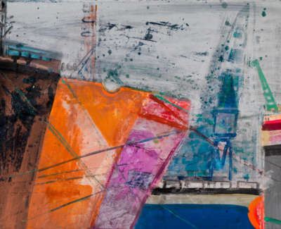
I am particularly compelled by this description of her work “distill[ing] the presence of mankind” given how few of her works include human figures. In this regard, the theoretical framework of “the timespace of human activity” resonates with Rae’s work and can provide a model for it. In Aberdeen Harbour (Scotland), for example, the “timespace of human activity” can be read through Rae’s quick, slapped brushstrokes, which convey a sense of the motion and dynamism of a working harbour. The multi-coloured hulls of the ships appear worn from years of use.
Barbara Rae, “Aberdeen Harbour (Scotland),” 2005, mixed media on paper.
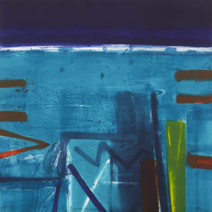
Indeed, Rae’s use of bright colours and her vivid, visible brushstrokes invoke the “timespace” of another human activity—that of her own act of painting. In an echo of Malpas’s description of the more-than-visual dimension of place in art being the time and space of the artist’s engagement with that place, Rae’s engagement with the places she paints is apparent and contributes to their depth and vividness. The low vantage point, cool colours, and bold, straight lines of Island Landing suggest the cold, inhospitable-to-humans setting of a cold-water ocean. By contrast, the higher perspective, warm colours, and organic lines of Roadside – Lanjaron convey a different physical and mental atmosphere embodied by Rae while she worked. Roadside – Lanjaron is more recognizable as a landscape than the geometric abstraction of Island Landing is, but both works are centrally informed by Rae’s engagement with a specific physical place.
Barbara Rae, “Island Landing,” 2014, carborundum on paper.
Barbara Rae, “Roadside – Lanjaron,” mixed media on paper.
In a review, James O’Nolan writes that “much of the attraction and mystery of [Rae’s] work lies in this instantly recognizable mix of interior and exterior topography.”[6] Like Malpas’s “view of a view,” O’Nolan’s description suggests how Rae’s artworks are both descriptions of an external, worldly setting and of her own internal emotions and experience of artistic creation. O’Nolan claims that it is in this sense that Rae is in fact “not a landscape painter at all”; and that just as “she uses place to re-find, re-affirm and reinvigorate her system of interior motifs… [her colours] are applied rather than received colours and are instinctively the colours that come for her, as Bacon put it, directly off the nervous system.”[7]
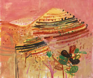
Rae’s abstract, expressionist paintings therefore convey place not through stylistic allegiance to the conventions of the landscape genre, but through their fusion of carefully observed physical setting with attentiveness to her own “interior topography.” The brilliant colours of works such as Cliff Fence are a record not of the places she sees, but of the places she experiences, as she interacts with the landscapes around her through the act of painting.
Barbara Rae, “Cliff Fence,” mixed media on paper.
To briefly consider Situated in light of this analysis, I’m additionally interested by how the notion of these works presenting “the view of a view” can be extended one step further to include the viewer, who brings their own temporalspatial reality to bear on their engagement with the artist’s view. These implications seem all the more compelling with regard to the art in Situated, which will be viewed in a transient bus and which, in many cases, presents places that may be familiar to the viewers from their own lives.
[Word Count: 959]
Footnotes
[1] Jeff Malpas, “Place and the Problem of Landscape,” in The Place of Landscape: Concepts, Contexts, Studies, ed. Jeff Malpas (Cambridge: The MIT Press, 2011), 12.
[3] Theodore R. Schatzki, “Landscapes as Temporalspatial Phenomena,” in The Place of Landscape: Concepts, Contexts, Studies, ed. Jeff Malpas (Cambridge: The MIT Press, 2011), 65.
[6] James O’Nolan, review of Barbara Rae, by Bill Hare, Andrew Lambirth, and Gareth Wardell, Irish Arts Review 25, no. 2 (Summer 2008): 147, https://www.jstor.org/stable/20493334.
Malpas, Jeff. “Place and the Problem of Landscape.” In The Place of Landscape: Concepts, Contexts, Studies, edited by Jeff Malpas, 3–26. Cambridge: The MIT Press, 2011.
Malpas, Jeff, ed. The Place of Landscape: Concepts, Contexts, Studies. Cambridge: The MIT Press, 2011.
O’Nolan, James. Review of Barbara Rae, by Bill Hare, Andrew Lambirth, and Gareth Wardell. Irish Arts Review 25, no. 2 (Summer 2008): 147–148. https://www.jstor.org/stable/20493334.
Schatzki, Theodore R. “Landscapes as Temporalspatial Phenomena.” In The Place of Landscape: Concepts, Contexts, Studies, edited by Jeff Malpas, 65–90. Cambridge: The MIT Press, 2011.
Our theme development occurred largely in parallel with the process of researching potential artworks for the exhibition. It was fascinating to experience, and then reflect on, the ways in which these two processes entwined with and influenced each other.
The process of selecting artworks from the Collection resonated strongly with the second brief question: How can we navigate constraints, including accreditation standards, stakeholder interests, spatial limitations and audience needs, in order to promote engagement with our holdings?
Teaching ourselves to navigate the two collectioncatalogues was a necessary step that also generated conversations about the theme and how and why we would select works. The catalogue search function is not straightforward, so even initially attempting to find landscape paintings required creative alternative search times such as “nature,” “trees,” and “water.” Often, encountering works that we liked aesthetically then prompted searching of their own tagged terms. This roundabout search strategy helped us explore creative resonances between seemingly unrelated works.
Jonathan Owen, “Eraser Drawing (Portrait of Audrey Hepburn),” 2016, paper and ink. This work appeared serendipitously in a catalogue search. We were drawn to its atmosphere of transience and ephemerality, which in turn helped us reflect on how those concepts were at play in the nature of a collection itself.
Something particularly interesting is that two of the most important works for our initial concept were not included in the final exhibition. We were very drawn to Marissa Stoffer’s Postcard Series, and used her Anti-Matter on our mock-up promotional postcard. Stoffer’s Series spoke to our themes of place and changing landscapes, and encouraged us to think deeply about the concepts of transience, imagination, and visual record. However, they ultimately could not be included since they were already on display in a private residence, highlighting a constraint of working from a university collection.
Marissa Stoffer, “Postcard Series,” 2013, acrylic/watercolour/gouache on paper.
Our mock-up postcard also included Tessa Lynch’s Couplings, Escalator for Sale, to convey how three-dimensional art can create a sense of place by opening into the viewer’s space. However, it was decided that it was too challenging to securely mount sculpture in the Gallery. (Interestingly, another physical constraint was that we could not include charcoal or pastel works, as the motion of the bus could have shaken loose some of the pigment particles.)
Tessa Lynch, “Couplings, Escalator for Sale,” 2017, perforated steel.
Even though we were unable to include either of these initially central works, the process of rationalizing why we wanted them helped us further explore our theme. By testing a variety of artworks against our concept while searching the catalogue, we were set up for a focussed, efficient trip to the stores at the end of the semester.
Our brief encourages us to explore how to “promote engagement” with the University Art Collection, alongside the guiding question What is the purpose of the Art Collection, how should it be used, and who is it for? While refining our exhibition theme, we’ve been asking our own, related questions:
How can museums make their collections accessible to the public?
What does it mean for a collection to “belong” to a public if they are unable to view the works held within it?
How can people be made aware of collections they may not even know about?
How do people wish they could interact with collections?
We’ve been thinking about place in art, but have also been reflecting on the contextual place of the collections and exhibitions in which those works are situated. The Art Collection is a unique collection to ask the above questions of. Not only does it not have a permanent exhibition space, meaning that the vast majority of its works are never visible to the public, but as a university collection it is virtually unknown outside of the institution (not to mention the number of individuals at the university who also seem unaware of its existence).
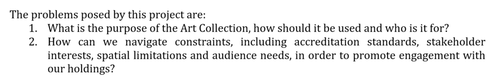
Even aside from these barriers, it can be difficult for members of the public to grasp what a collection is, let alone how it can be relevant to them. While considering these things during our last group meeting, Barbora had the fantastic idea of displaying the works in the Travelling Gallery on collection storage racks. Unlike a “white cube” exhibition model, mounting the works to appear as they are the majority of the time in storage offers a unique way for visitors to encounter the art and consider how it is stored and displayed.
An interesting case study to consider as we discuss these questions, themes, and display techniques comes from the Van Abbe Museum. From November 2013 to July 2017, the Van Abbe Museum ran a project called the DIY Archive as part of their exhibition The Collection Now. The museum describes that “[the DIY archive] was a combination of a storage facility, a workplace and an exhibition space”; visitors were encouraged to take works from the racks and work with museum employees to mount them in their own, temporary exhibition.[1]
As seen in the above video, this rack system was formed of magnetic strips on the wall. However, I got in touch with Aurora Loerakker about the Van Abbe Museum’s use of racks in exhibitions and she additionally directed my attention to their Viewing Depot, which ran from 2006 to 2009 and displayed works on the same racking system used in their collection storage.
Photo credit: Peter Cox for the Van Abbe Museum. Accessed at https://vanabbemuseum.nl/en/programme/programme/viewing-depot/.
The Van Abbe Museum’s use of storage racks in this way is interesting from the perspective of staging an interactive exhibition and inviting public engagement with collection holdings. However, with particular relevance to our project, I am interested in the aesthetic effects of arranging the exhibition space in this way. Although there is, clearly, a lack of scholarship on collection storage hanging, the critical literature on how context informs encounters with art can be usefully extrapolated to our considerations.
A range of studies—both psychological and art critical—have shown that encountering art in a “gallery context enhances the aesthetic experience—both of art appreciation and aesthetic emotions.”[2] Surveying this literature in the context of their own 2019 study, Szubielska et al. also find that in addition to the physical context of being in an art gallery, “elaborative contextual information semantically corresponding to the artwork increases viewers’ ratings of comprehension and/or appreciation.” But what about the effect of the visual contextual information of the gallery space itself?
In 2001, the Walters Art Museum completed an extensive renovation, which included re-installing its artifacts in galleries that aesthetically mimicked their original contexts. In a Washington Post review by Jo Ann Lewis, Museum Director Gary Vikan explained: “What we’re after… is the effect of an icon in a Byzantine church, or a Limoges book cover in a Gothic cathedral.”[3] Lewis comments that the new installations engage the viewer “not only with labels but also with four different audio tours and suggestive, often moody and theatrical (occasionally overly theatrical) installations that echo the architecture of each period.”[4]
Unique installations do run the risk of being overly “theatrical,” and can overwhelm the art or artifacts being shown. However, many critics suggest that the white cube model is not, in fact, without its own risks. In the seminal 1976 trio of articles titled “Inside the White Cube,” Brian O’Doherty outlines how the white cube, rather than being a “neutral” backdrop, is itself an aesthetic object. O’Doherty argues that the white wall context of art galleries has become a “transforming force” that heavily influences the viewer’s experience of the art hung upon them.[5] In this understanding of the gallery space, “context becomes content”: “The wall, the context of the art, had become rich in a content it subtly donated to the art.”[6]
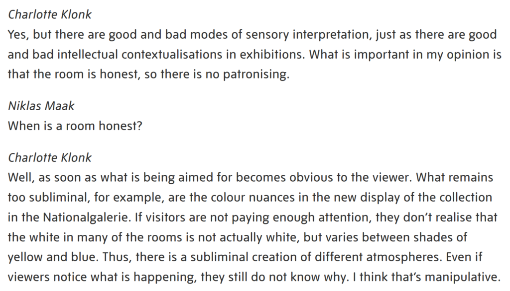
This argument of the almost insidious subtlety of the white wall’s influence continues to inform critical discussion about the role gallery context plays in aesthetic experience. In a 2011 Tate Etc. interview, Charlotte Klonk, Niklas Maak, and Thomas Demand discuss how sensory aspects of gallery spaces are controlled to affect viewers’ experiences. Against these tactics, Charlotte Klonk proposes that what is most important is that the room is honest:
Excerpt from Niklas Maak, Charlotte Klonk, and Thomas Demand, “The White Cube and Beyond: Museum Display,” Tate Etc. (January 1, 2011), https://www.tate.org.uk/tate-etc/issue-21-spring-2011/white-cube-and-beyond.
I argue that what makes the Van Abbe Museum’s use of racking effective is how the resulting gallery installations correspond to Klonk’s description of an honest room. Unlike the subtle “illusion” of timeless neutrality created by a white cube gallery, but also unlike the overt theatricality of immersive, sensorially domineering spaces, the use of collection racks to display works is straightforward and honest in its depiction of an active art collection.
Considering the lack of alternatives to the white cube model, O’Doherty writes that “a rich constellation of projects comments on matters of location, not so much suggesting alternatives as enlisting the gallery space as a unit of esthetic discourse. Genuine alternatives cannot come from within this space.”[7] The Van Abbe Museum’s Viewing Depot successfully presents an alternative that enlists not the gallery space, but a place outside of it: the collection storage room. The result is a space that hangs in between storage room, exhibition, public, and private; a fascinating fusion that seems all the more compelling in relation to the unique setting of the Travelling Gallery and its mission to bring contemporary art accessibly and honestly to a diverse audience outside of the white cube model.
[2] Magdalena Szubielska, Kamil Imbir, and Anna Szymańska, “The influence of the physical context and knowledge of artworks on the aesthetic experience of interactive installations,” Current Psychology (June 15, 2019): https://doi.org/10.1007/s12144-019-00322-w.
O’Doherty, Brian. Inside the White Cube: The Ideology of the Gallery Space. San Francisco: The Lapis Press, 1986.
Szubielska, Magdalena Kamil Imbir, and Anna Szymańska. “The influence of the physical context and knowledge of artworks on the aesthetic experience of interactive installations.” Current Psychology (June 15, 2019). https://doi.org/10.1007/s12144-019-00322-w.
Our initial conversations about theme were equally informed by two considerations: the works in the Art Collection, and the unique characteristics of both the Collection and the Travelling Gallery.
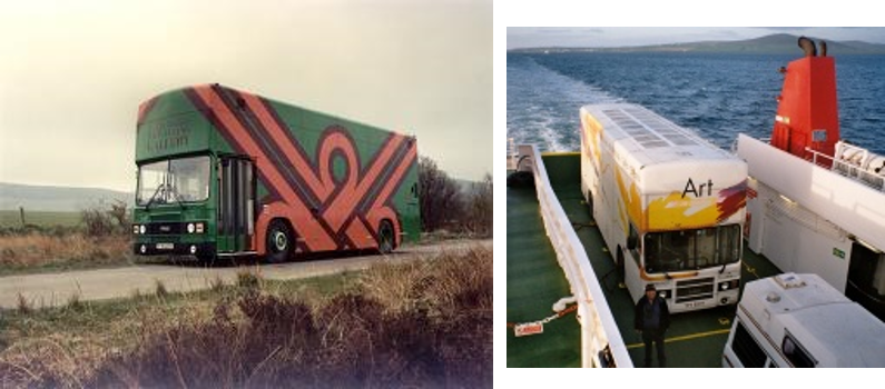
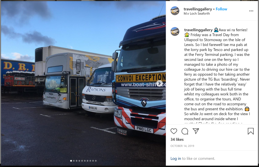
During our first visit to the Travelling Gallery, driver and guide Andy Menzies showed us some archival images of the bus. He said the Gallery’s most popular social media posts are those showing where the bus is on its travels.
Archival photos of the Travelling Gallery, accessed from https://www.travellinggallery.com/whatwedodefault.Instagram posts about the bus’s travels continue to be popular with the public, such as this one from October 14, 2019. Accessed at https://www.instagram.com/travellinggallery/.
Thinking about Andy’s comments and the bus as travelling gallery, during our next group meeting I proposed a potential focus on landscape art—I was interested in the curatorial dynamic of having static images of Scottish landscapes travel through contemporary Scotland in a mobile gallery. We quickly realized, however, that restricting ourselves to landscapes would not do justice to the Art Collection, and would potentially limit our exhibition overall.
To revise this idea, we returned to our project brief, which centres the collaborative relationship between the two partner institutions and asks us “to test the potential of this partnership.” With this in mind, we outlined several intriguing parallels between the two institutions:
The Art Collection does not have an exhibition space; the Travelling Gallery is an exhibition space, but does not have a fixed or permanent home.
The majority of the Art Collection is inaccessible to public view; the Travelling Gallery aims to make art broadly accessible.
Neither the Art Collection or the Travelling Gallery are usual spaces in which to encounter art.
We realized that we kept circling back to the concept of place. Thinking about art about place allowed for a greater diversity of the Collection to be shown than just landscapes, as well as encouraging a meta-reflection on the sites in which these works are stored, displayed, and viewed.
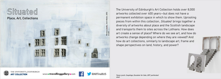
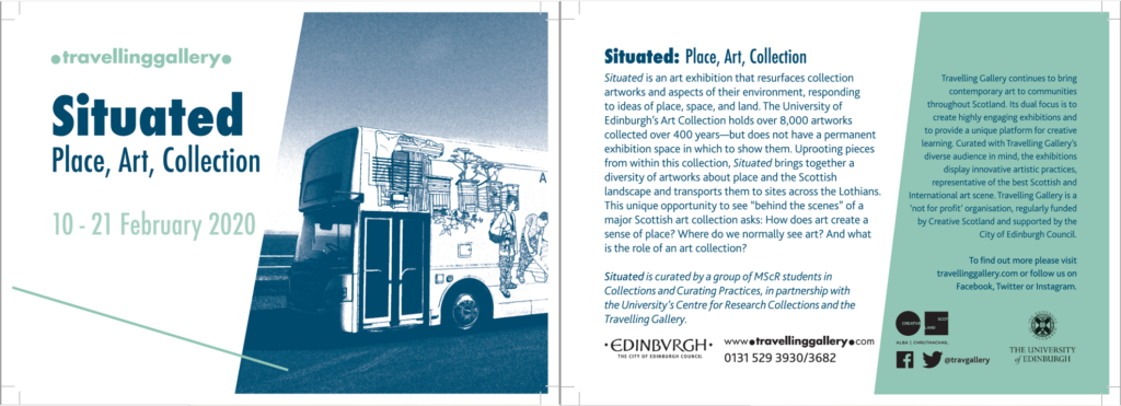
For our project pitch, I summarized these concepts in a mock-up promotional postcard.
The mock-up promotional postcard I created for our project pitch, featuring the first draft of our exhibition description.
Our theme and description remained mostly unchanged from this point, although we did continue to tailor our concept to the partner institutions as we worked more with them. Our broad focus on art collections in general, for example, gradually became more rooted in the specificities of the University Art Collection. For the final exhibition description, which was used on our public promotional material, I edited our guiding questions slightly to reflect this increasingly “behind the scenes” focus.
The promotional postcards used to advertise the exhibition (graphic design by the Travelling Gallery), with the final copy of our exhibition description.
1. Identify your key responsibilities and list the main areas of work you have been involved in. Briefly highlight the skills and competencies that are relevant to this project/work area.
Our approach to delegating responsibility was different over the first few weeks than it was for the majority of the project. After receiving the brief, the first month was spent settling into the project, learning about each other and our group dynamic, and starting to map out our ideas and approach. We found it most effective to work together during this introductory period, rather than delineating individual roles and responsibilities.
The focus of the first month of work was to brainstorm and explore an overarching exhibition theme. I discuss this process further in my next post, but it included a visit to the Travelling Gallery, group discussions about what general themes interested us, and familiarising ourselves with the Art Collection catalogue and the works within it. From an interpersonal perspective, group communication skills were a key aspect of this process, encompassing active listening, brainstorming, and constructive critique of ideas. The ability to competently navigate the collection catalogue was also an important skill to develop, as we learned together how to efficiently search, locate, and browse for different pieces and genres of work in the catalogue.
Once we settled on a theme and began discussing more of the tangible, logistical aspects of the exhibition, it became necessary to divide roles and responsibilities. My key responsibilities and main areas of work—as well as their pertinent skills and responsibilities—were as follows:
Coordinating the design, printing, and installation of the wallpaper.
Researching and contacting different print companies for project quotes; collating and pitching the results to my group with attention to budget, timeline, and project specifications.
Liaising with our hired photographer and CRC staff (Julie-Ann and Anna) to coordinate a trip to the South Gyles store to photograph the rack.
Creating design layouts and wall plans to communicate project specifications to the photographer and to the printers (ECA Reprographics).
Measuring and trimming the printed wallpaper sheets; bundling and labelling them for efficient installation.
Coordinating the commission of the musician.
As a group, we hired Glasgow-based musician and composer Carla Sayer to create a musical performance for our opening event. I took on the role of coordinating this process.
Communicating with Carla on a regular basis regarding venue details and PAT testing specifications, the Scottish Sound Archive archival research process, and opening night logistics.
Keeping an inventory of, and invoices for, all charges associated with the musical commission and relaying this information to the group for discussion and input into the budget.
We established Carla’s fee in accordance with the Scottish Artist’s Union Guidelines.
Ensuring the high standard of our written content and material; this included co-writing, editing, and proofreading the text for our interpretive leaflet.
Researching and writing the “Place” section of our interpretive leaflet.
Revising and copy-editing the four sections of our interpretive leaflet to a high standard, with a focus on unifying tone and voice, ensuring clarity and readability, and adding relevant, researched material on each work of art in the exhibition.
Writing, copy-editing, and proofreading promotional material for the exhibition, including the text for our promotional postcard and the Facebook event for the opening night.
In taking the lead on the interpretive leaflet, I additionally coordinated its printing, which included selecting the printing press, communicating timelines and budgets with the printers, and coordinating the pick-up and drop-off of the material.
2. Looking ahead, list your key objectives for the GRP. 3–7 SMART (Specific, Measurable, Achievable, Relevant and Timed) objectives should be noted with realistic timescales and focused outcomes.
Group goals:
By the end of October, to have worked as a group to generate a clear exhibition title and description, as well as a list of relevant works from the Collection.
To create and implement a program of public workshops and talks to run concurrently with the exhibition tour in mid-February.
To use this exhibition as an opportunity to evaluate public engagement with both the Travelling Gallery and the University’s Art Collection, by collecting information on engagement during the tour that can subsequently be presented as a report to the partner institutions.
Personal goals:
To develop my personal knowledge and skills of writing interpretive exhibition text, by researching this style of writing, practicing writing interpretive copy, and, by the time of the exhibition, contributing significantly to our own exhibition’s printed interpretive material.
3. Discursive self-reflection. Use this section to, 1) reflect upon the progress of the project to date (both as a whole and with regards to your own specific area/role). 2) Critically reflect upon your experience working with the group. Here you may consider your contribution so far, the value of your specific strengths and expertise, the effectiveness of group communications and your performance in group meetings. Looking ahead, how might the group enhance its performance?
Our collaborative first month of brainstorming themes and big-picture exhibition ideas as a group felt effective and productive. Working as a group (rather than individually researching different components of the collection) meant that we encouraged each other to think creatively and expansively, and to build off of one another’s ideas.
As the project progressed, we had to develop a balance between maintaining these creative group discussions and dividing tasks so as to efficiently make progress on the project. Many of our individual roles arose organically over a number of weeks as we received our budget, met with the Travelling Gallery, and worked together to create a timeline for the project, based on our individual interests, skills, and prioritization of tasks. For example, I identified near the beginning of the process that I wanted to take the lead on the interpretive text, and communicated that I was able to contribute strong writing and editing skills to written copy throughout the project. Other responsibilities, however, were picked up more fluidly as they came to light—I volunteered to coordinate the musical performance after serendipitously being able to meet Carla in person and represent our team at an event in Glasgow.
Throughout the project, our group continued to communicate clearly and effectively about the larger picture of the exhibition. However, some obstacles did arise as our working arrangements shifted to working within more specific roles and responsibilities. We had hoped to create a system wherein we would check in about our individual action items at our weekly group meetings and maintain open lines of communication. Ultimately this was only moderately successful; although some items were completed on schedule, many other tasks were repeatedly delayed to later dates. While everything was done on time in the end, we could have worked much more efficiently and calmly in advance by holding each other more accountable to the personal deadlines we had set.
On reflection, this project differed in a significant way from co-curatorial projects within paid employment environments. Although we had individual areas of responsibility, since these were not “official” positions I noticed we had a wariness of “stepping on toes” or clearly holding each other accountable to our tasks. Although our working arrangement positively facilitated a non-hierarchical, creative space to explore the project together, outlining clearer expectations for each others’ roles and feeling empowered to communicate in a more straightforward, professional manner may have helped us work more efficiently and confidently as a team.