Week 9 – Industry Visit & Lighting Workshop

This week’s course was centred around ‘Industry Visit and Workshop’, which provided us with a complete learning chain from theory to practice, from case study to technical experience.


The morning session was conducted in the form of lectures, covering a number of representative architectural lighting cases, including:

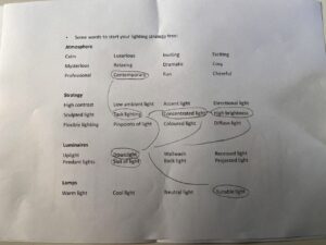
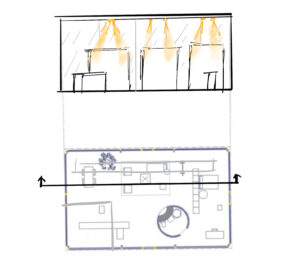
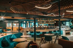
1. The Singleton Distillery: located in Scotland’s whisky distillery, its lighting strategy emphasises ‘narrative’, through the careful design of key lighting and warm colours, to strengthen the visitor’s immersive experience.


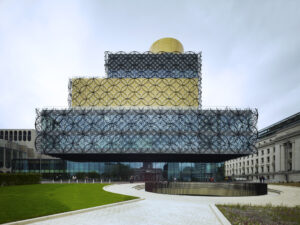
2.Library of Birmingham: As a cultural landmark in the city, the lighting design combines natural and artificial light sources to create an open, inclusive and directional public reading environment.

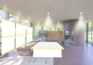
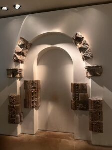
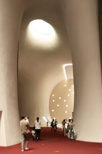
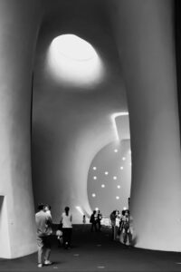
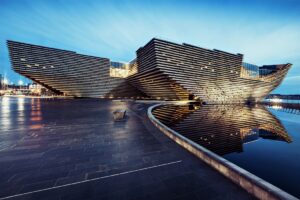
3. V&A Dundee: In this seaside museum, light is used as an exhibition medium, while assuming the role of the building’s night-time image recognition, emphasising the sculptural nature of the structure.


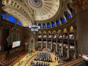
4.McEwan Hall: Located at the University of Edinburgh, this project demonstrates the role of lighting in the regeneration of a historic building, through hidden luminaires and intelligent control systems to achieve a blend of respect for the original appearance and functional enhancement.


Through the presentations, I think these cases not only enhanced my understanding of the relationship between lighting and spatial narrative and architectural identity, but also inspired me to think about the differentiated needs of different types of buildings in terms of the way they intervene with light.


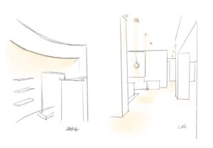
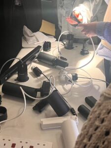
The afternoon programme, hosted by representatives of lighting brands, focused on the demonstration of lighting products and basic installation operations. Not only did we get our hands on various actual luminaire components, but we also began to understand the synergy between ‘hardware selection’ and ‘conceptual strategy’ in lighting design.

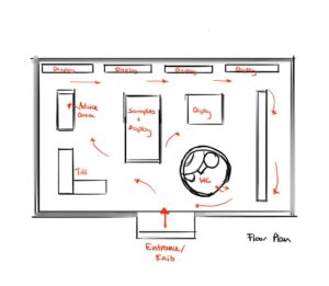
The following are some of the types of fixtures I was exposed to:

1.Track Light: Suitable for flexible and changeable space scenes, such as exhibitions and commercial displays. Its adjustable direction and the number of lamps, easy to maintain and adjust the light later.

2. Spotlight (Spotlight): used to provide focused lighting, strengthen the visual focus, commonly found in galleries or product display areas.

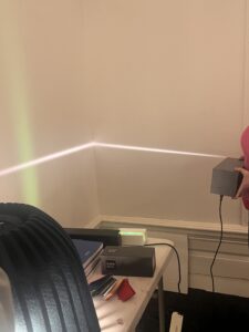
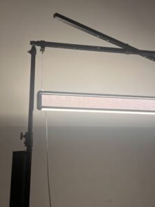
3. Linear Light (Linear Light): used to form a continuous band of light or wall-washing effect, suitable for corridors, bookshelves, ceiling gaps and other long spaces.

4. Dimmable light (Tunable White) lamps and lanterns: support for colour temperature adjustment, help to simulate the natural light environment, to adapt to changes in sunlight or space atmosphere change needs.


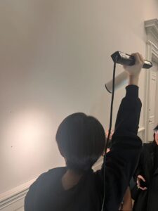
We also learnt how to install track lighting on site, including power connection, rail structure assembly and lamp head installation. I think this process is especially critical to understanding the actual construction process and the details of working with the structure.


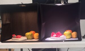
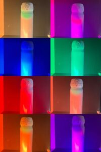
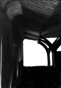
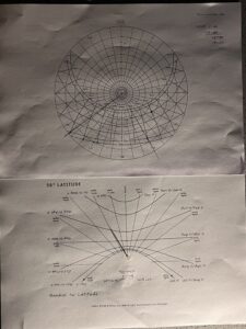
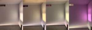
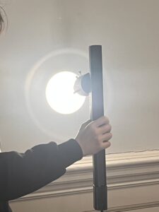
In the interactive session at the end of the course, I experimented with lighting the same object with lights of different colour temperatures. Under different colours of light, the same set of material and colour samples showed significantly different visual effects.

This experiment reinforced my understanding of ‘colour temperature as a spatial language’, lighting not only lights up the space, but also participates in spatial perception, material semantics and emotional regulation.


Week 06 – Workshop Reflection – Lighting Strategies

This week’s class was a workshop on Lighting Strategies, where we analysed the function of different spaces and learned how to use light to create atmosphere, direct flow and enhance the emotional expression of the space. The type of space that my group and I were given was a “Paint Store”, and the venue was set in Philip Johnson’s Glass House, an iconic modernist building.

Based on the “Lighting Strategy Tree” provided by the teacher, we selected keywords from the tree to create a lighting scheme that balanced functionality and mood. The finalised keywords include:

– Atmosphere: Contemporary

– Strategy: Low ambient light, Task lighting, Concentrated light, High brightness, Diffuse light.

– Luminaires: Downlight, Slot of light

– Lamps: Tunable light.

Why did we choose this lighting strategy?

As a paint shop, we see light not only as a functional requirement, but also as a presentation medium. Paint itself is an expression of colour, and the perception of colour is strongly influenced by the colour temperature and brightness of different light sources. Therefore, we put forward the following core demands:

1, real colour reproduction: choose adjustable light source (Tunable light), can simulate cold light, warm light, neutral light and other different daily situations, so that customers can experience the visual effect of paint in different lighting.

2、 Emphasis on functional areas: Task lighting and Concentrated light are used in the sample display wall and colour mixing trial area to ensure accurate and clear colour performance.

3、 Create a sense of hierarchy: the overall space is based on low ambient light, and the visual rhythm is built through key lighting and high-brightness areas, which strengthens the spatial orientation and focus distribution.

4, space clean and pure: the choice of downlights (Downlight) and light groove (Slot of light), hiding the body of the lamps and lanterns, to keep the ceiling surface simple, and Philip Johnson’s modernist context echo.

Secondly, in the course of our discussion, we also wondered whether this could also be a dialogue between light and the glasshouse. Placing the paint shop in a glass house is a reflection on the relationship between “transparency” and “spatial definition”. As the glasshouse space is almost borderless, our lighting strategy plays an important role in delineating the space and guiding the view. Through the directionality of light and the contrast of luminance, we have achieved a balance between functional zoning and emotional change in an “open and unified” spatial shell.  


Week 06 – Key Strategies for Enhancing Visual Comfort and Directing Attention

Lighting design plays a critical role in shaping the ambience of a space and enhancing visual comfort. This week I read ‘How to Design for Visual Comfort Using Natural Light’ and ‘The Six Priorities Determine Where the Eye Looks First’.

Based on the ArchDaily article, I understand that visual comfort is determined by the following metrics: First, the Illuminance Level should match the function of the space, ensuring that there is enough brightness without overdoing it. Secondly, Luminance Contrast needs to be appropriate to avoid visual fatigue. Glare Control is also key, as too much light can cause discomfort. In addition, the Color of Light should be coordinated with the use of space, the choice of warm and cold tones will affect the mood and feelings of people. Finally, light distribution should be even, avoiding shadows or bright spots.

Peachpit’s article emphasises the priority of visual attention, which is also important in lighting design. Firstly, Movement attracts the most attention, so dynamic lighting directs the eye. Secondly, areas with a clear focus become the centre of vision, so highlighting a specific area or object by means of a spotlight, for example, can be an effective way of directing attention. Difference is also key, unique light and shadow effects or colour changes can attract attention. Additionally, areas of greater brightness are noticed first, so adding brightness to areas that need to be emphasised is a common technique. Size and In Front can also affect visual priority, with larger objects or elements in the foreground more likely to be noticed.

Taken together, successful lighting design requires comprehensive consideration of light intensity, distribution, colour and coordination with the function of the space, as well as using the principle of visual attention priority to subtly guide people’s eyes and create a comfortable and functional environment.


References:

https://www.archdaily.com/911210/let-there-be-light-key-indicators-to-describe-and-design-visual-comfort?ad_source=search&ad_medium=search_result_all

https://www.peachpit.com/articles/article.aspx?p=3089307&seqNum=2


Week 05 – Lighting Atmosphere in Shopping Malls and Art Spaces

Throughout the course, I have come to understand that lighting is more than just providing a source of light, it can also influence the ambience of a space, the user experience and the visual focus.

In this week’s lighting study, we visited and explored the lighting strategies of Edinburgh’s St James Quarter shopping centre and the Scottish National Portrait Gallery to discover how different types of spaces use light to shape a unique experience.

At St James Quarter, I found that the retail shops used ambient lighting to provide a uniform base light source and accent lighting to highlight specific items. For example, Zara and cos shops use warm white light to make the colours of their products stand out, while Superdry combines cooler lighting to create a more comfortable shopping experience. In addition, some shops (e.g. Aesop) use feature lighting, such as LED strips or chandeliers, to draw customers’ attention to specific areas. The colour temperature of the different light sources also affects the mood of the shopper and the brand’s image.


In contrast, the National Portrait Gallery of Scotland’s lighting is more focused on the work on display. The lighting in the gallery has been designed with illuminance and luminance contrast in mind, to ensure that the paintings contrast appropriately with the backdrops and that glare does not detract from the viewing experience. At the same time, natural light is strictly controlled to prevent UV damage to the artwork, while in some galleries, soft indirect lighting mimics natural light to bring out the best colours in the artwork.


From retail spaces to art displays, I learnt that lighting design is not only about brightness, but also about atmosphere. The proper use of light can enhance the functionality and emotional experience of a space, creating a more immersive visual environment.


Week 04 – Light in the National Museum of Scotland

The National Museum of Scotland offers a fascinating exploration of how light interacts with space and materials, shaping the overall atmosphere of the museum. As we moved through different galleries, we observed how natural and artificial light influenced our perception of exhibits and architectural elements.

One key aspect was how light reacted with different materials. In areas with glass and polished metal, light reflected and scattered, creating a sense of openness and brightness. Meanwhile, surfaces like wood and stone absorbed light, resulting in a warmer, more intimate atmosphere. Particularly in the historic sections of the museum, soft, diffused lighting enhanced the texture of aged artifacts, adding a sense of depth and history.

Light also played a crucial role in defining the atmosphere of different zones. In open atriums and central halls, large skylights allowed natural daylight to flood the space, creating a lively and dynamic setting. The contrast was striking in more enclosed exhibition areas, where controlled artificial lighting focused attention on specific objects, evoking a sense of mystery and contemplation.

Additionally, transitional spaces, such as corridors and staircases, demonstrated a gradual shift in lighting intensity. Moving from bright, naturally lit areas into dimly illuminated galleries heightened the sense of anticipation, guiding visitors through the museum’s narrative journey.

Ultimately, the interplay of light, material, and spatial arrangement in the National Museum of Scotland transforms it from a mere exhibition space into an immersive experience, where light is not just an illuminator but a storyteller, shaping the way we engage with history and culture.


Week 03 – Experiencing Light and Space at the Chapel of Saint Albert the Great

Visiting the Chapel of Saint Albert the Great was an immersive experience highlighting the powerful relationship between light, space, and perception. As we observed the interior from different viewpoints, we noticed how the framing of the outside world changed—some windows offered narrow, focused glimpses, while others provided expansive, open views. This contrast shaped our understanding of the space, making certain areas feel intimate and enclosed while others felt connected to the outside world.

To further explore this relationship, we sketched the chapel’s light and shadow in black and white, focusing on how natural and artificial light interacted with the architecture. Strong contrasts appeared where sunlight streamed through windows, creating sharp, directional shadows, while artificial lighting produced softer, diffused illumination that shaped the space’s mood.

Finally, we measured the light intensity at four key points:

  1. The darkest interior space, where minimal light creates a solemn, meditative atmosphere.
  2. A spot near artificial lighting, where warm tones softened the surroundings.
  3. A location near natural light, where daylight enhances the textures and depth of the space.
  4. An exterior point, where the open sky provided the brightest illumination, contrasting with the chapel’s sheltered ambience.


This study deepened our appreciation of how light defines architecture, influencing both spatial perception and emotional experience.


Week 02 – Explore Sunlight Testing

In this workshop, we explored the impact of sunlight on architectural space through a series of simple but interesting steps.

First, we used pins to simulate global sunlight on white paper to intuitively understand how sunlight illuminates the earth and deduce the basic laws of sunlight. Next, we fixed the house model in Edinburgh and conducted a lighting test to observe the pattern of the sun changing with time and angle.

Then, we simulated the sunlight in Edinburgh at 16:00. on January 20th, adjusting the angle of the light source to allow light to shine into the model. To gain a deeper understanding of how light shapes the atmosphere of space, we observed inside the box and analyzed the impact of light and shadow changes on the internal environment of the building.

Finally, we used transparent paper of different colours to simulate coloured glass and test how different light colours affect the perception of space. Warm orange light creates a comfortable atmosphere, while cool purple light creates mystery and depth.

This workshop deepened my understanding of sunlight. It made me further understand that light is dynamic and it changes over time, thus affecting people’s perception of space.


Week 01- Intro (Case Study)

National Taichung Theater is located in Taiwan, and designed by Japanese architect Toyo Ito. It is a building with curved walls as the main structural support. The building is composed of 58 curved walls and 29 caves. The spaces are of different sizes, separated and connected, forming a flowing space. The glass curtain wall and cement wall on the exterior of the opera house are shaped like wine bottles, so that we can see sunlight shining into the interior through the “holes” in the ceiling. The large glass curtains in the building and the space without obvious boundaries make the opera house an open building. Its purpose is to allow sunlight, air, water and sound to flow together in the theater.


(Photograph by myself)


Welcome!

Welcome to your new blog site!

This is your first post. You can edit this or delete it and start blogging.

You should read the Terms of Use if you haven’t already.

For help and advice on getting started with a WordPress blog, see the Academic Blogging help pages.

Your blog is private by default

You can open your blog up to as many or as few people as you like in Dashboard > Settings > Reading > Site Visibility:

  • You can open your blog up to specific University members by adding them as users to your blog.
  • You can open your blog up to all University members who have an EASE login.
  • You can make you blog open to the world.


The featured image on this post comes from the University Collections. If you want to use more images in your blog posts, or perhaps use your own choice of image in your blog header, you can: