09. Finalising FF&E, developing a hero image of the “first impression”
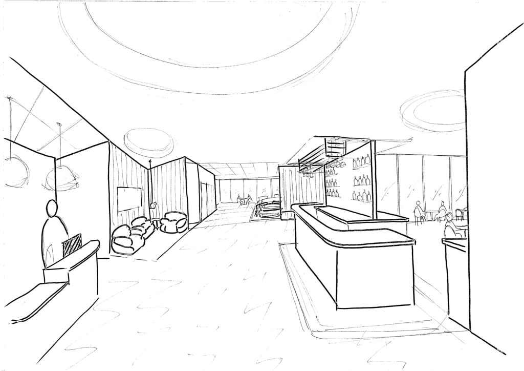
This week, I turned my attention to finalising the general arrangement and FF&E of the proposed design – and pulling together a mood board reflective of some other elements of the film. I began with a sketched view of the open plan reception, lounge and bar/restaurant areas, which I could later use as the basis for a digital collage to create a more atmospheric view of the space.
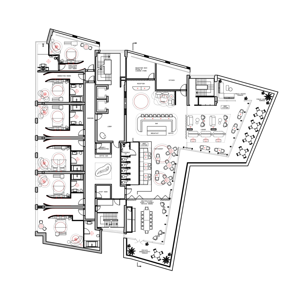
Fourth floor general arrangement – note that lighting is indicated in red.
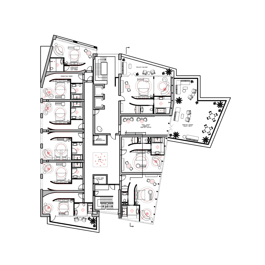
Fifth floor general arrangement – note that lighting is indicated in red.
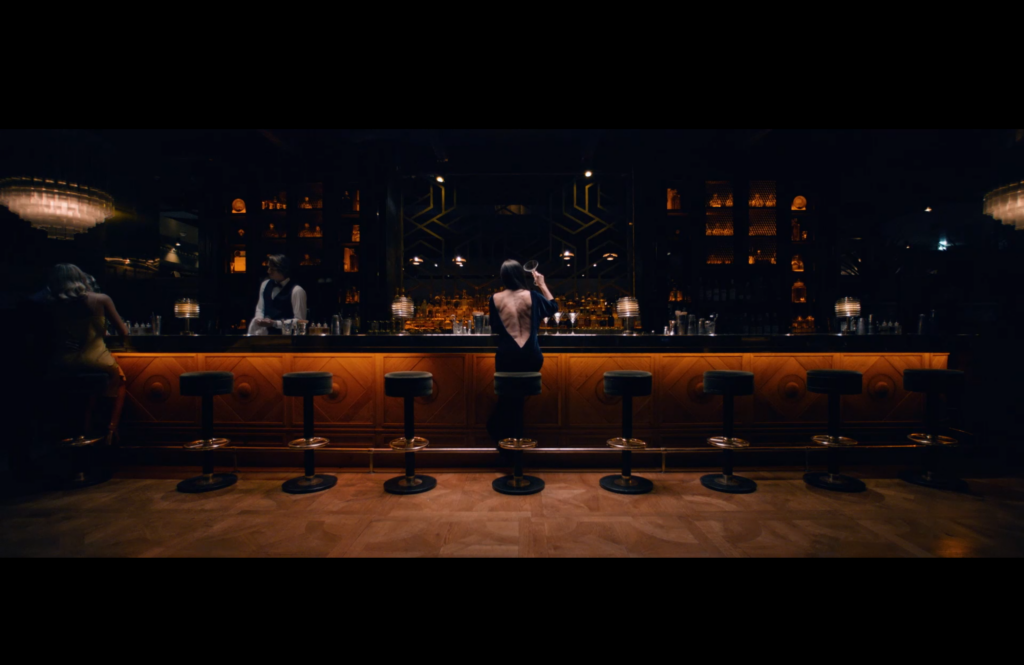
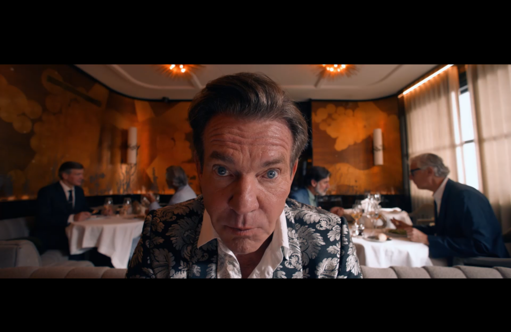
The Substance takes place over a very limited number of locations, centring primarily around Elisabeth’s home (which I used as the basis of the private spaces), her work and then small glimpses of hospitality settings. In contrast with Elisabeth’s private space, the non-domestic settings have a mid-century modern feel – with flashes of chrome and brushed aluminium, wood panelling and a more high contrast colour palette. I used this as the basis for my own approach, as well as pulling colour and material details from key moments in the film.
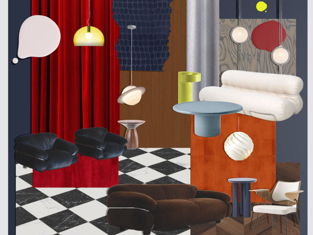
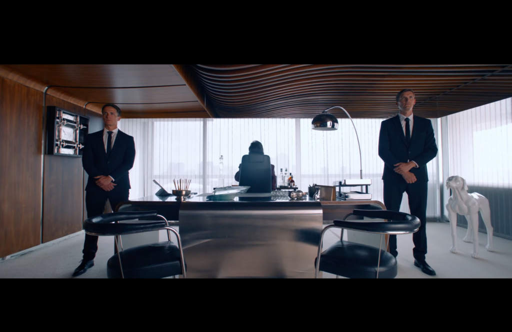
Reception & lounge area mood board – inspired by Harvey (Dennis Quaid)’s office, as well as a touch of flock wallpaper which references a turning point in Sue’s (both literal and metaphorical) unravelling – see below.
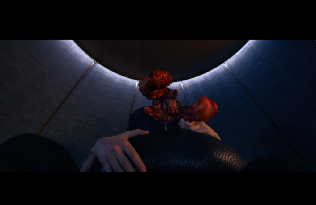
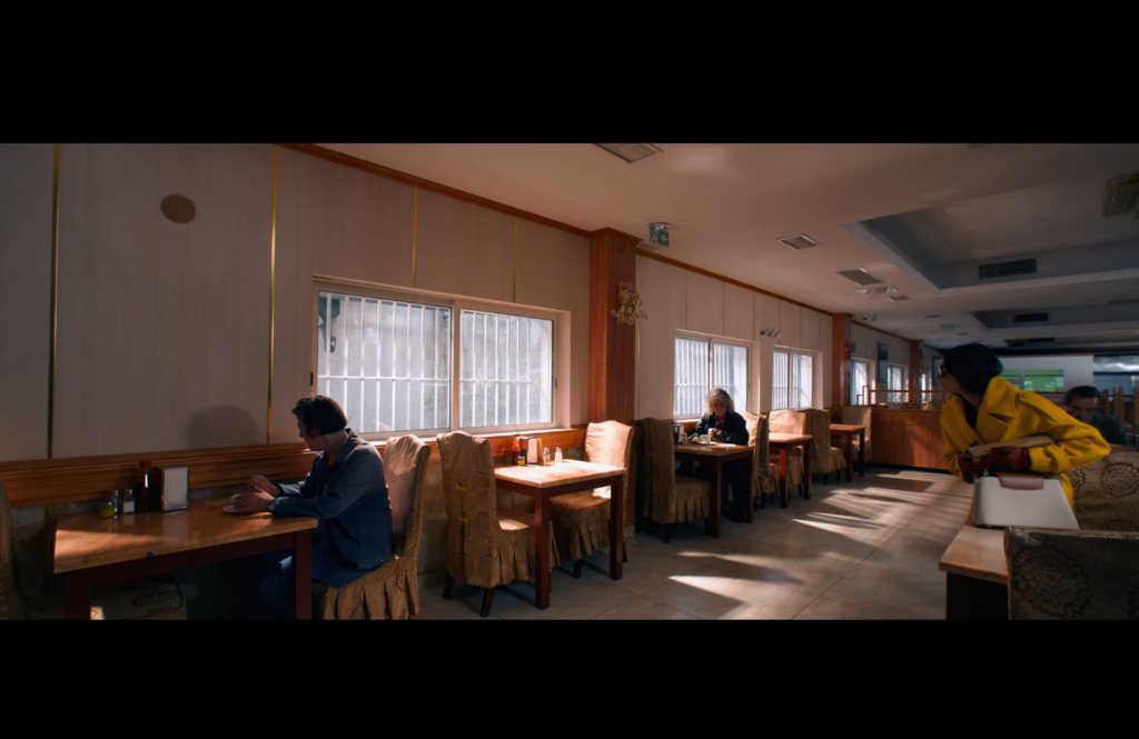
A moment in the film when Sue fears she is losing control – and decides to take drastic action to ensure her continued access the “The Substance”.

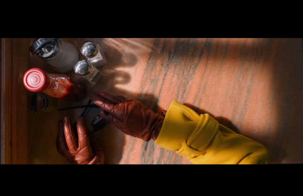
The Substance “activator” – featured in a very limited but crucial capacity through the story. Reflected in quantity in terms of splashes of this colour in the public lounge.

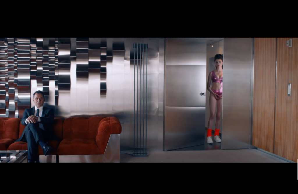
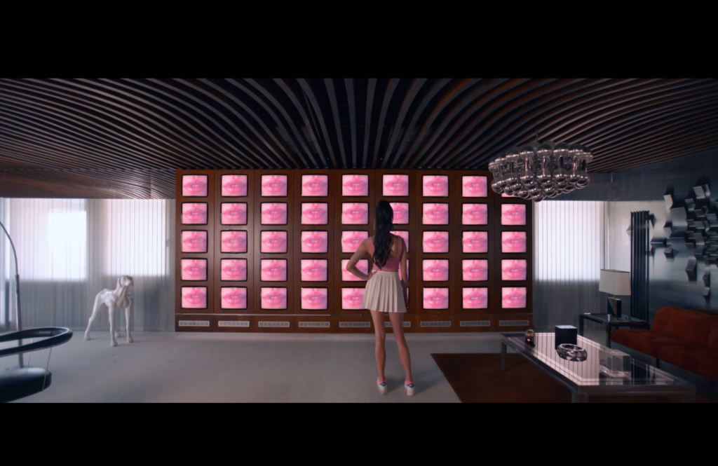
A still from The Substance’s promotional video in the film – referring to the idea of duality, and the all important use of the colour yellow to symbolise Elisabeth and Sue’s relationship.
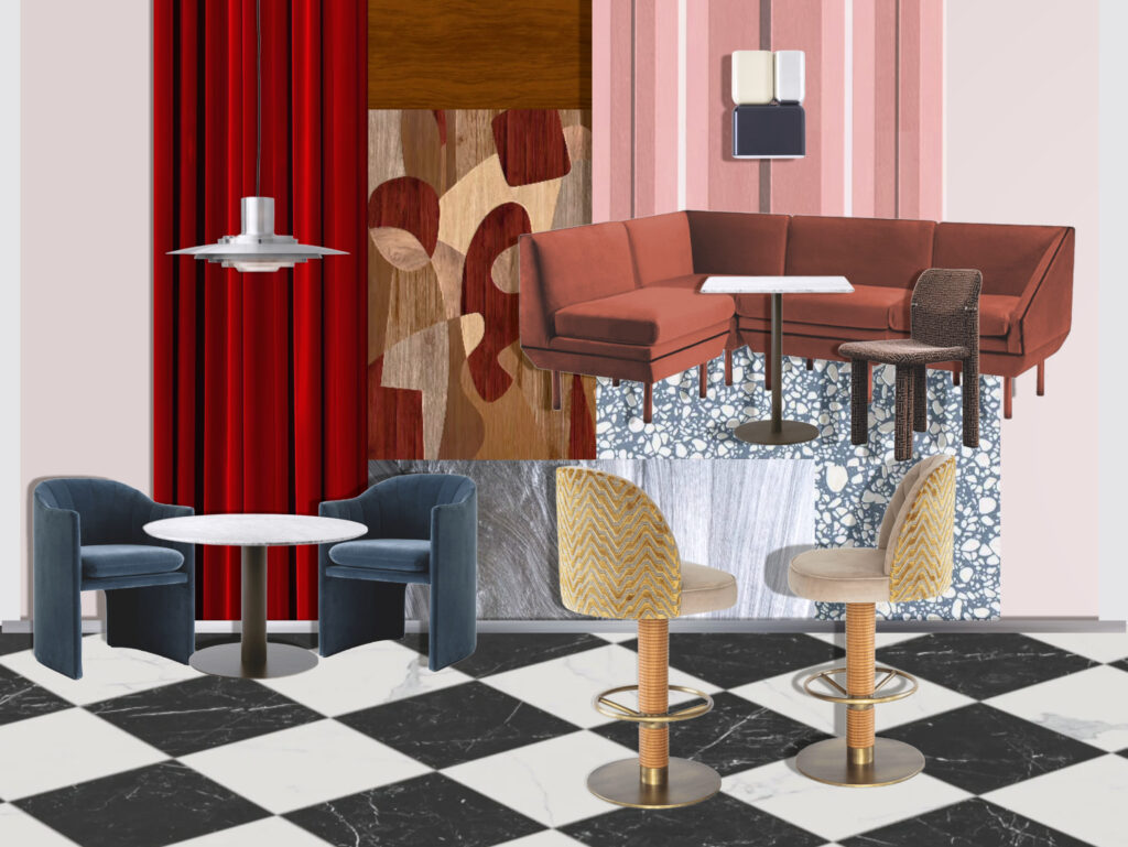
My approach to the bar restaurant area is a little more pared back, although still vibrant. While the hospitality settings in the film place an emphasis on the colour orange, I felt it important to keep primary colours and pinks as the central colour palette – in keeping with the costume designer’s approach to the characters costuming, playing with tints and tones to maintain cohesion throughout.
When sourcing FF&E, I had come across an image on Pinterest of the Casa Clarita hotel, designed by Jaime Hayon. Curious as to where some of the objects had come from, I reached out to the hotel directly on Instagram and they were able to provide some information about their furnishings. While I wasn’t able to find the table in question – I did manage to find another useful source for FF&E – which I have found throughout this process to be quite an interesting challenge in terms of both product quality and useful assets as a design student.
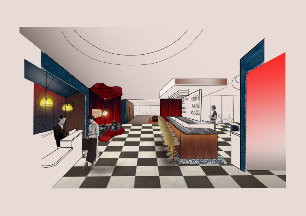
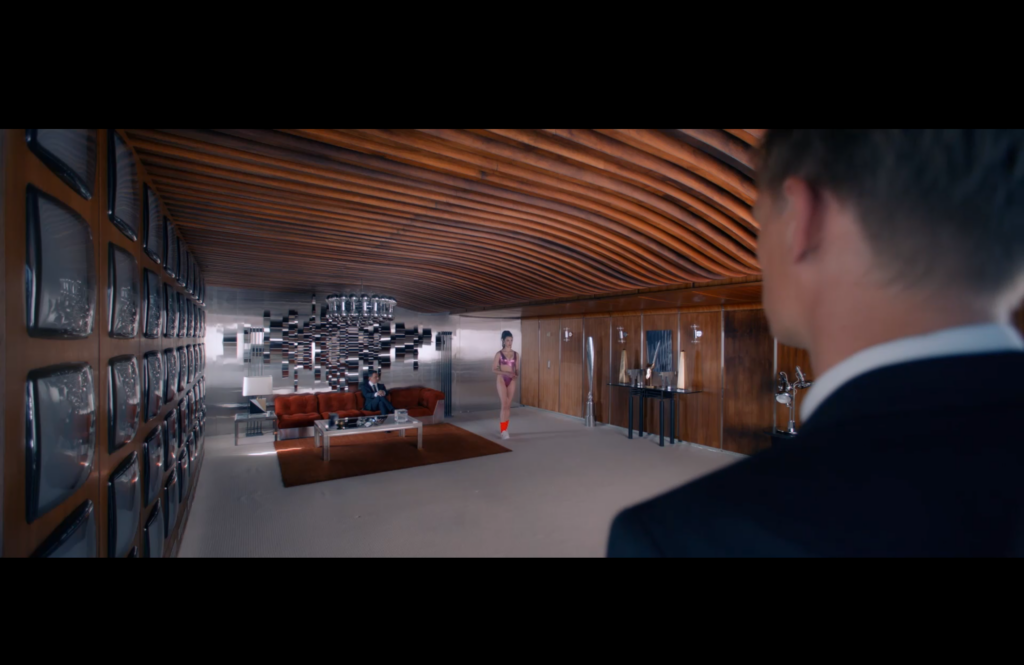
Work in progress – a hero image to show the guest first impression when entering.