In week 7, i started to put my overall room plan into the actual building plan. The very first thing that i considered is the location of the reception. As the reception is usually connected to various public spaces like restaurant, it has to be located at a place where the user can easily access the view of the nearby scenery. Due to this issue, i decided to locate the reception onto the 5th floor, as this can allow more sunlight to shine into the public spaces and also providing a better initial impression for the clients when they first entered the hotel.
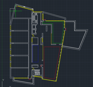
 The first overall plan of the building.
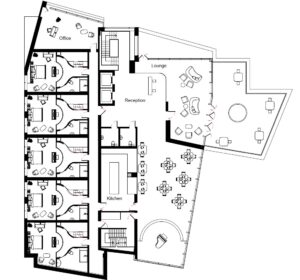
After decided the location of the reception, i started to arrange crucial facilities like the kitchen and restaurant. The restaurant is planned next to the reception, designed to be a open space, directing people into it as it is the only place that has no isolations with the reception. A stage is planned at one end of the restaurant, musical instruments will be provided up there, this serves as an easter egg from the film (La La Land), also enhancing the musical elements for the hotel theme. The central area on this floor is decided to be a kitchen, the reasons for this is because it is basically impossible to access the view from there, and as being the central area of the entire floor, it is easier for staffs to deliver food to different parts of the hotel. Because of the window behind the reception is facing directly to the castle and a large balcony area can be accessed from there, the space behind the reception is designed to be a lounge for the clients, this space can be used as an resting area after the check in or an optional space for social activities.
 One scene of the character playing piano in a dinning space.
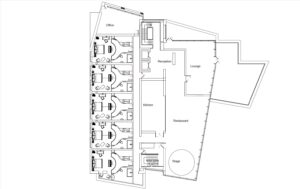
Having all of the essential public facilities arranged onto the east side of the 5th floor, i can now confidently place private hotel rooms onto the west side of this floor to provide more client capacity for the hotel. When designing the rooms, i restricted my room plan under 45 square meters, placing the room into the building will not be a huge problem. Hence, i decided to utilize the existed building structures to arrange the space. There are a lot of existing columns near the west side of the building, based on them, i planned 5 new walls to separated the space into 6 rooms. These six rooms are each approximately 50 square meters in their size, each with a 40 centimetre wall between them, providing the user a decent spacial experience. However, as the northwest room is in an odd shape, it is impossible to retain the spacial feature of the hotel room design if the design is planned into it, i eventually planned it into a manager’s office.
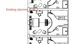 Existing columns
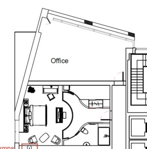 The odd shape room.
The original idea for the 4th floor was to hold as many hotel rooms as possible. With this concept, I started with a plan that has 13 rooms on that floor. But as the hotel design went on, i noticed that the initial concept was unacceptable, as the room in the central area will have absolutely no windows.
 Initial F4 concept (rooms are separated by walls, green areas are resting areas)
Hence, i decided to arrange some thing else into that place. The site research of The Scott hotel gave me an idea for the design. Inside The Scott hotel, though the old architectural space for the hallway is narrow, they still arranged several tables and couches into their ground floor corridor. Not like their restaurant space, where usually holds long time dinning, these tables serves as a place for breakfast and a quick cup of drink. They were frequently used by people and also provided a public space to rest. These features can be useful for a floor that is filled with hotel rooms and as it is the central area that needs to be rearranged, placing a public space there will provide all the residents on that floor a convenient access. Therefore, i removed one room and utilized that space to created a central brunch area.
 Brunch area on the ground floor of The Scott Hotel
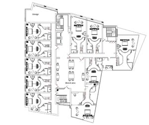 Edited F4 plan
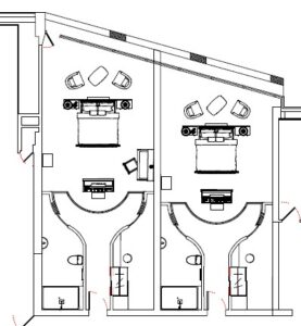
As the interior building structure of the west side of 4th floor is basically the same as the 5th floor, the arrangement of the west part of the 4th floor stays the same, 5 private hotel rooms and 1 staff room for hotel storage (Arranged into storage space because of the staff from The Scott Hotel always complains that there are not enough storage space). The east side of the 4th floor was a bit harder to handle, only 1 room on that side is in a standard square shape, others were either too long or with a weird shape. In order for the room plan to fit into these spaces, multiple adaptations were made. For the longer and thinner rooms, couches and tables were planned behind the bed. As they are next to the window, room structures do not need to be changed, and the user experience will not be influenced. For the weird shaped rooms, the downside of them is that it is hard to plan, but the upside of them is that it is much larger than the standard rooms. Hence, i decided to design them to premium rooms. These rooms have larger windows inside them, and the size of them are competitively larger.
 The longer and thinner rooms
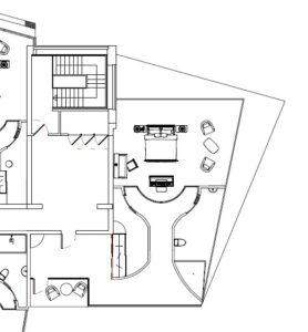 Premium room (facing the castle)
 5th floor concept arrangement (green represents the kitchen, red represents the restaurant and blue represents the rest area)
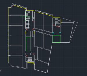 4th floor concept arrangement (green represents resting space)
 Site survey drawings
 Measurement drawing of the site (office)
 Measurement drawing about the site (staircase, corridor and the lift)
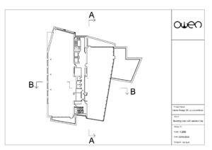 General building plan with section lines
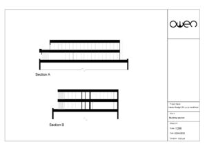 Section drawings of the existing building
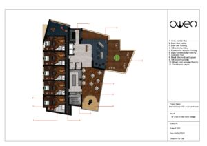
 Textured hotel design plans
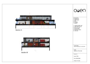 Textured hotel sections
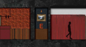 Hotel corridor section with texture (zone E)
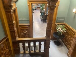
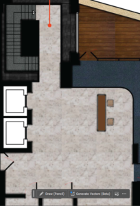 Northern staircase and reception
  Tile decorated observatory hall
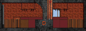
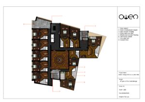
 Edited 5th floor plan
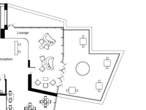 The improved lounge and balcony
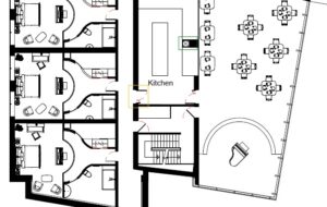 The improved kitchen and restaurant ( yellow zone is the new exit, green zone is the dumb waiter)
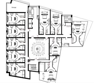 Edited 4th floor plan
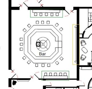 Edited bar (green zone is the tables, yellow zone is the screen and audio device)
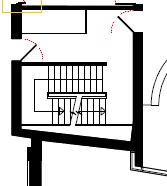 F5 staircase
 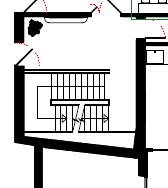 F4 staircase
 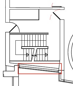 Removed window (red zone)
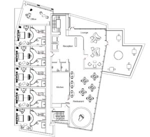 The edited F5 plan
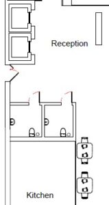 Two public bathrooms
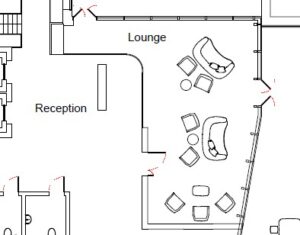 The transparent glass wall between the reception and the lounge
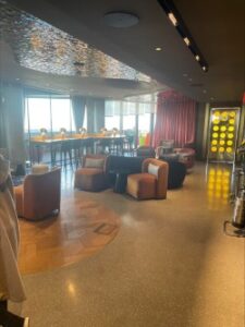 Lounge arrangement in the W Edinburgh hotel
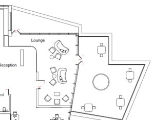 Lounge space and the balcony area
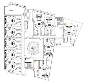 The edited F4 plan
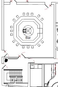 The 4th floor bar and the staircase to access it (dumb waiter is planned at the centre of the bar)
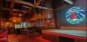 Interior image of the bar (The Lighthouse Cafe:
 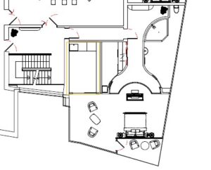 Premium room with its own hallway connected to the staircase ( yellow zone is the kitchen)
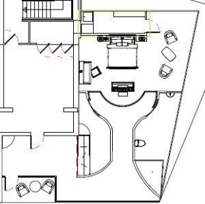 Premium room facing the castle with new kitchen( yellow zone is the kitchen)
 The expanded floor plan(without furniture)
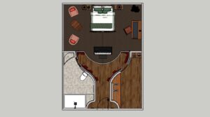 The expanded floor plan
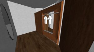 Designed wardrobe that can be accessed on both sides
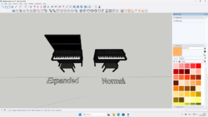 3D model of the piano set
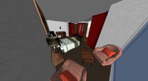 Bedroom area with the TV wall removed
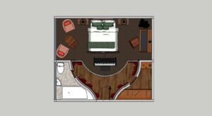 The edited room plan
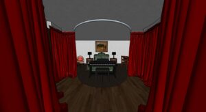 View from the hallway (3D model)
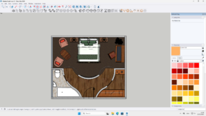 The alternative plan
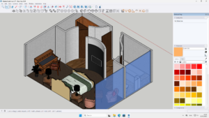 3D model of the design(showing the wall holding the TV screen)
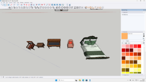 Colourful but dark antique furniture
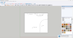 The initial plan that i made for the model
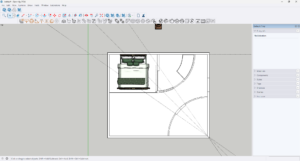 The second plan that i generated
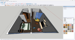
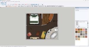 The second plan with more detail
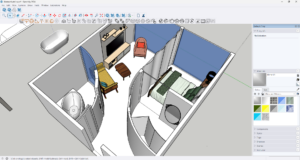
 3D model of the second plan