Week 8 Collage story board and week 3 improvements
This story describes a situation in which I was in a state of confusion, a process of going from confusion to clarity in my studies. The story version uses collage to tie hand-drawn (watercolour and marker) and modelling together into one story
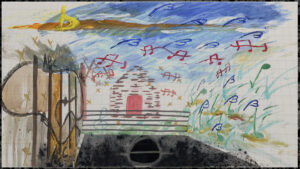
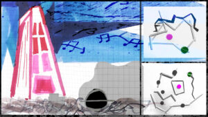
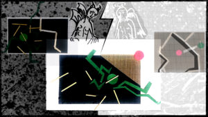
The first one depicts a time when I was having difficulty in my studies, like being sucked into a black hole, where my surroundings were beautiful, but I was in my own darkness, unable to integrate with my surroundings. The picture turns the watercolour into a three-dimensional space, with black notes representing myself. The second one uses the score in a noisy environment to represent my inner world, surrounded by dilemmas, with three different elements all indicating my situation.
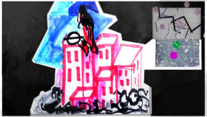
The third one shows how jumping out of a rut is like a tall building that I try to overcome and topple over. But there are always demons and angels pouring into my ears. I need to choose between them.
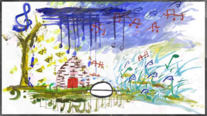
The fifth one indicates that I overcame a difficult situation. Emotional drain is one of the easiest ways to fall into a ‘black hole’, but when you reflect on it and get out of the box, you will love life more and learn faster!
This week’s assignment didn’t quite fit the brief, I’ll improve the storyboard next week!
The Other improvements on Week 3
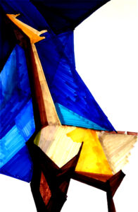
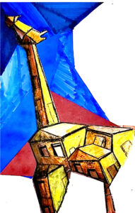
Charles Sheeler’s style
In this giraffe, I have added Sheeler’s rigorous painting style, architectural perspective, and contrasting colour relationships. Originally, I used markers only to express the perspective of the giraffe, but this time I improved it by using red cardstock to collage the background, using oil pastes to lay down the colours and contours of the buildings, and finally using acrylics to make the brighter areas sharper
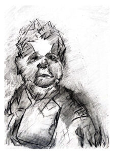
Oche Okeke style
In my past self-portraits, I have used charcoal and pencil to contrast the old man’s form in more detail, and by imitating Okeke’s minimalist style, I have erased excess lines to give the image a religious colour and a simpler expression of line.
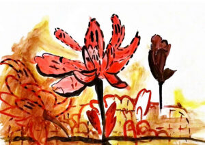
Philip Guston style
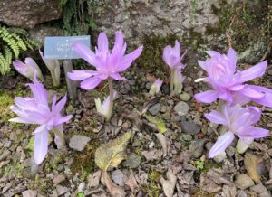
This is a new drawing as I did not paint the botanic garden in week3.
Philip Guston’s paintings show mainly the use of colour, the contrast between dark and light colours. The use of different lines, such as straight lines and broken lines. In this group of flowers, I have used Philip Guston’s style to create a contrast between the flowers, with different lines for the outline of the flowers.