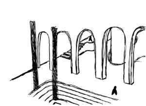
This week in 4C we began developing the project images for our final Design Scheme. As I have not yet completed my model I am not able to choose any accurate perspectives from within my space, however as the ground floor brewery and first floor viewing gallery are my main spaces I am able to imagine the space from my developed floor plans and create quick sketches of the design which I used to inform and develop my image which I will submit for the next review.
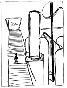
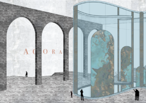
The vast scale of my building and design scheme meant that choosing the best angle was difficult, however as the main elements within my design are the glass void and copper brewery equipment it was necessary to show those, and subsequently the surrounding viewing gallery. After experimenting with different techniques and drawing styles I decided on sketching my space, and using photoshop to create distinct lines before layer realistic materials. I quite like the finished image and the slightly off angle of the materials give the image an abstract quality which I feel works well. The slightly raised perspective also raises you above the space rather than being first person which I feel makes the space seem larger and allows more of the space to be capture. Unfortunately as the model still isn’t finished there are a lot of detail (beams, windows) which haven’t been included. Also, as the image was initially sketched from imagination the angle of the perspective is warped and the elements aren’t accurately to scale. Finally the contrast of the simple black silhouettes works well, contrasting the lighter materials as to stand out but not enough to detract.
This week in 4A we began also to experiment with creating Design Concept Drawings. As these are meant to convey our overall theme in a more abstract way, and as the viewing gallery and brewery are my main spaces I thought it integral to in some way incorporate the main design element within my design, this being the logo shape and void structure.
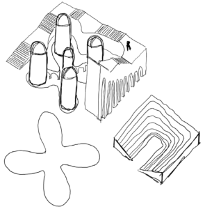


My initial concepts are more literal, trying to convey the structure of the main space, however I didn’t like the result so I decided to use the main void and logo shape and attempted to play around with it. These various iterations evolved into a simple but well formulated and attractive diagram that works well with, and conveys the theme of my scheme and which is uncomplicated but graphically distinct
Obviously conveying the void and logo shape which is at the centre of my design scheme, my finished concept diagram is a literal representation of the glass void structure, with the scale meant to represent the vast space of my building, and using the the colour of my design book and branding from week 5 (the colour of lager) to create a visual and conceptual consistency. Finally simple black silhouettes tie in with the project image created earlier in the week and represent how people within the space circulate around the void structure.