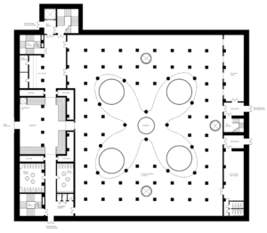
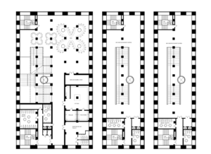
Based on the updated, developed and accurate plans and sections drawn last week of the grain store building I was able to layer my week three plans and resolve any inaccuracies with size scale and location of my spaces. I was also able to incorporate the existing internal structural columns, altering my design to work within the grid framework. Rather than simply being structural, I have tried to incorporate the columns within the design using them as anchors between which shelving, bars and walls are aligned and supported.
On the previous plans the space on the north wall doesn’t extend the full height of the building. Because of this I have aligned the toilets and fire escapes in the same place on each floor, with the water facilities located in the same place as in the existing building.
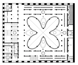
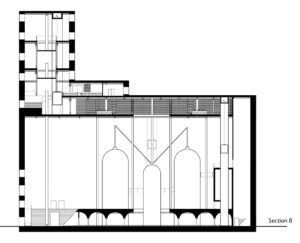
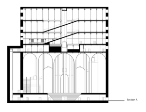
Although I have removed the concrete grid system of the grain silos, I have retained the ones around the edge to form a base for the main first floor stair case as well as tubes for lift shafts. This retains a structural element as well as providing a practical grain storage solution for the brewery, as well as retaining some of the buildings history. Because the silos proved structural, I have replaced them with strategically placed columns and beam structures, particularly around the void which is the most sensitive area. This creates an open plan an allows for the full height of the space to be visible.
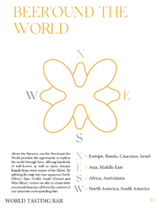
Finally, I have changed the use of the first floor from an interactive experience space into a world bar. This seems more practical and in keeping with the theme of the scheme. The void creates an anchor with the the bars arranged it, creating 4 distinct areas (splitting the world into 4 quarters, and serving beer from each of these areas) therefore creating a space for people to come, visit and explore the world through beer.
As the purpose of my design is a brewery I have decided to focus on developing my ground floor brewery and first floor viewing gallery as my main space, in particular the central void and glass structure.
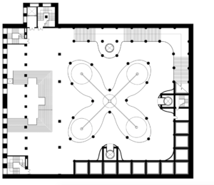
Second Floor World Bar Concept

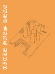
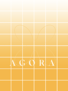
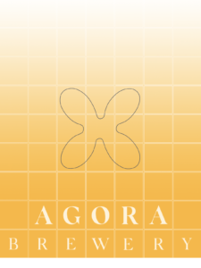
This week for 4C we began looking at design books, and how to create a graphic presentation that best represents, and both professionally and aesthetically represents our design scheme and design concept. Although not initially working out It has developed into an attractive graphic image that communicates the concept and theme well.
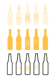
- The grid pattern represents the existing grid structure of my building
- The name is arranged in the centre of the page between the lines giving the image symmetry (enhanced by the almost symmetry of the name AGORA)
- the brand logo fits in a box beneath
- the colour transition from golden to white represents a glass of lager
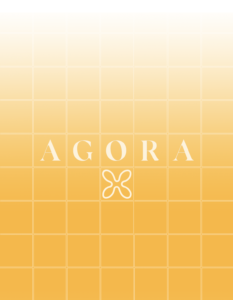
I also used this new colour palette and design aesthetic to attempt creating a branding scheme for my final project which I will incorporate in my final design book