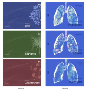
We developed two different design directions for the passports of our virtual nations.
Version A took inspiration from real-world passports, focusing on a more conventional and official aesthetic. Each passport used a distinct colour associated with its nation, combined with botanical motifs representing the country’s symbolic plant identity. Flowing line patterns across the cover were designed to suggest moving air currents, reinforcing the project’s connection to atmosphere and air mobility. This version aimed to feel believable and familiar, echoing the visual language of existing travel documents.
Version B, in contrast, moved towards a more speculative and symbolic approach. Instead of following traditional passport graphics, we placed illustrated lungs at the centre of the cover, treating breathing and air as the core identity of each nation. The lungs were filled with environmental imagery—such as forests, bamboo, and lotus ponds—to connect each country’s ecological qualities with respiratory metaphors. This version felt more experimental and concept-driven, foregrounding the project’s fictional narrative rather than mimicking reality.
By developing these two versions in parallel, we explored the tension between realism and speculation: one making the passports appear credible, the other pushing them closer to artistic artefacts. This comparison later helped us refine the final design by combining elements from both approaches.