Seeing Covid-19, or A visual journey through the epidemic in three acts, writes Cristina Moreno Lozano
Digital newspapers and TV news in Spain (and surely, elsewhere) are full of images and videos narrating the COVID-19 pandemic (caused by the SARS-CoV-2 virus). Through these images, we can see the situation as it happens in our hospitals, parliamentary rooms and balconies throughout the country from a distance. Thousands of conversations circulate on social networks like Twitter or Facebook (in many languages) including images. We can see images of professionals and citizens wearing masks and medical equipment, animals walking around empty cities, police or military officers working out in the streets, etc. Memes and infographics circulate through WhatsApp or Telegram groups of family, work, or friends. In national and local newspapers, we can see graphs of infected cases or mortality, or estimates of the number of infections. This visual scenario, which is difficult to depict in words, is not limited to Spain. We can see similar images circulate in English-speaking newspapers and social media channels. For a migrant PhD student in lockdown like myself, I wonder if it is this seeing that keeps me closer to family and friends in my hometown Madrid. Is there something comforting in the visual? Images, videos, illustrations and graphs, play journalistic and scientific roles, but also social, political and affectional ones.
Infectious diseases such as the plague, cholera, or syphilis populate our literature and cinema, in many languages. The epidemic imaginary is quite present in popular cultures (in many languages and places). Outbreaks of realistic or fictional epidemics have been imagined by dozens of authors and artists over the years. Perhaps the infamous The Plague by Albert Camus is the first that comes to mind. I’m currently (re)reading Angela Carter’s The Passion of New Eve (1977), an otherwise apocalyptic fiction. Carter’s fiction is unexpectedly full of infective or pandemic metaphors. Or rather, I am particularly receptive to them these days. Not to mention video games (like Plague Inc., Deus Ex or Infected), board games (like Pandemic or Virus), and films and TV series (The Walking Dead, Contagion, I Legend, etc.). In most of these, the main plot is an epidemic outbreak of bacterial or viral origin (see also Comelles and Perdiguero-Gil 2016; Benton 2020 in the previous Covid-19 Forum). Epidemiologists, zombies, politicians, doctors, wild animals, viruses and bacteria populate our imagination, becoming “cultural heroes” (Lynteris 2016, 2019) in popular culture. There is something in these epidemic and apocalyptic fictions that captures our attention. These imagined worlds that have captivated me so much for years now are not very easy to bear. I’m sure I’ll have time to re-imagine them in another occasion. At this point, “the next” outbreak (pandemic, this time) has arrived (Caduff 2018) and the mass media is full of news stories, but also of icons, videos, and images. How do we visually represent the pandemic in the media and social media in Spain? In these last weeks, visual representations of the COVID-19 epidemic outbreak have travelled at scales and speeds that exceed my capacity to analyse. Join me on a visual journey through the COVID-19 pandemic in three acts, where we’ll think with three different vignettes at different scales.
- The Viral Portrait
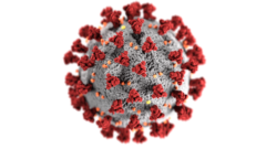
Across many digital newspapers, TV news or social media (in Spain and elsewhere) we can find virus icons, both black & white and in full colour, of the virus SARS-CoV-2. Blurred behind headlines or on the front line of your screen, a greyish sphere, with spikes or pegs shaped like cloves around it in orange and maroon red on a dark, empty background. Where does this 3-D image come from? On January 21, 2020, just after the U.S. Centers for Disease Control (CDC) activated its emergency response, CDC’s illustrators were asked to produce an icon, or “beauty shot” of the virus (CDC 2020, Figure 1). These medical artists have created illustrations for other pathogenic bacteria and virus of public health interest like gonorrhoea or Zika virus before. Apparently someone told one of the illustrators (Alissa Eckert) that this image haunts them on the sporadic trips to the supermarket: when they reach something on the shelf, they picture the spiky thing in their head and pause (Giamo 2020). Reflecting on such spread of the “beauty shot” – which has even been made into cookies and knitting projects (I haven’t seen images of these, unfortunately!) –, Eckert seems to be glad the image is “out there doing it’s job” (quoted in Giamo 2020).
But, what is the image’s “job”? I started to reflect on this thanks to the contributions made in a Twitter thread started by architectural historian Anna-Maria Meister (@tweetissima, see Twitter thread). Historians Lukas Engelmann and Robin Wolfe Scheffler (see Wolfe Scheffler 2019, on cancer molecular research, also pertinent to the discussion) commented on this thread at the end of March 2020. They noted that the illustrated spiky illustration is the visualisation of a model, produced using an EM (electron microscope) image. These images have no optical colour – the “beauty shot” is thus a colourised version, which draws attention to particular structural protein components of the model (i.e. the spikes). This reminds me of Lukas Engelmann’s work on the HIV models and the HIV icon (Engelmann 2018), where he precisely analyses these points in detail; but I am also instantly reminded of a book I greatly enjoyed reading during my Masters studies, Emily Martin’s Flexible Bodies: the role of immunity in American Culture from the Age of Polio to the Age of AIDS (1995).
Whilst these protein spikes represented in EM images are relevant for the daily work of molecular microbiologists working with these models and systems, the “beauty shot” image illustrated by the CDC (and its multiple variants created thereafter) play an important role in science communication or public health awareness instead. Is it this the job these coronavirus images need to get done? Diagrammatic, structural representations of microscopic entities like the SARS-CoV-2 virus are turned into portrait-like (viral) images of the virus, as Engelmann goes on to say in that same thread, resulting in pictures of the viral enemy, where uncertainties and unknowns seem to dissipate (see more on diagrams in the special issue edited by Engelmann, Humphrey and Lynteris 2019). Theirs is a specific kind of labour, i.e. emotional labour: in getting their job done, these viral portraits might suggest control, risk, or fear, mobilising our emotions and having a strong impact in social life.
- Epidemiological Diagrams
Data, charts and maps proliferate and circulate widely in these weeks of confinement within and across countries (I will reiterate on the idea of ‘circulation’ again and again. For an extended consideration of the notion of circulation as applied to the analysis of scientific images and objects, see Santesmases 2017, 2018, and Santesmases and Gradmann 2011). Numbers, percentages – both counted and estimated – are more often than note shown in tables, charts and graphs. In Spain, for instance, the numbers of incoming and outgoing protective gear sets bought and sold populate news headlines. Likewise, the number of temporary beds provided by the ephemeral emergency hospital set up in IFEMA convention centre in Madrid. Number of deaths, number of infections. All of them, divided by age. These numerical data are often displayed by regions, or compared to data from China or Italy. But I’m not that taken by the proliferation of these numbers as much as by how they are represented. How are we seeing these numbers?
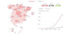
Epidemiological models and mathematical projections are extremely speculative, but in their if-scenarios they enact control. The promise of such near-real time surveillance of the epidemic (see Engelmann 2020, in the previous Covid-19 forum) takes visual forms, giving the ‘illusion of epidemiological “nowcasting” (ibid.). Epidemiological data is given visual form as it is produced (see as an example, Figure 2). Is it these graphs, maps and charts, full of coloured and curvy lines, names of countries or regions, and arrows that allow the unknown to be “cooperatively predicted”, I wonder? These representations circulate across mass media and social media, bringing (real and speculative) epidemiological numbers and other kinds of data to our homes. It fascinates me how some of my friends want to know the estimates, they discuss these models and graphs on WhatsApp. These graphs, charts and maps may also be getting a job done. These visuals might also give us reassurance and hope in the midst of the uncertainty of so many unknowns (on diagnostic certainty, see Street and Kelly 2020 in the previous Covid-19 forum). Whilst both the virus portrait and the epidemiological graph or diagram enact control in various ways, I adventure to speculate that these diagrams might combine with the emotional labour performed by the spiky viral icon.
- Nostalgic Illustrations

The present pandemic outbreak is a new chapter in the “war against microbes”. Such language, and the war metaphor, has never died out and it seems it’s here to stay (e.g., see more on metaphors by Martin 1995, among many others). As I’ve seen in my own work on resistant infections and antimicrobial resistance (AMR), with the Covid-19 outbreak this war metaphor is also fruitful in its visual form. In the last weeks, a fascinating kind of illustrations have circulated through social media platforms in Spain, such as those made by illustrators Mr Z (https://www.mrzethecreator.com/) and Javier Parra (Figure 3). They resemble the aesthetics of the Republican propaganda that circulated throughout the country during the Spanish Civil War. In these, not only a war metaphor (the war against the virus, that is) is very much present, but their aesthetics evoke a certain kind of historical nostalgia, and the politics of such aesthetics cannot be overlooked. These images are directed at those who by staying at home are “resisting” the virus together, “flattening the curve”. They are somehow also aimed as public health awareness images, yet not produced by health authorities (like the “beauty shot” made by the CDC), but by artists of their own accord.
In these illustrations the protagonists are both Spanish society, one might say, as well as public healthcare workers. What is represented in these images is an idealised public health system and its workers, and and idealised Spanish society, however: that which stays in the balconies and applauds their healthcare workers every evening, whilst they heroically fight this new bout. I wonder how do these images get their job done, as epidemiological graphs or spiky icons might do, and what kind of emotions they evoke this time. Is it control? Maybe solidarity? That’s an open question. It’s difficult not to feel a kind of emotional attachment to some of the illustrations, photographs and videos that circulate among my personal networks today. Whatever job these visual forms of information might be getting done during this outbreak, the truth is that I somehow also find comfort (not just fear and distress) in seeing them, discussing them with my loved ones back home, and going on a visual journey with them.
This article was originally published on Somatosphere: Science, Medicine, and Anthropology as part of the Dispatches from the Pandemic series (5 April 2020). Original post: http://somatosphere.net/forumpost/visual-journey-epidemic-covid-19/
Cristina Moreno Lozano is trained in microbiology and medical anthropology. At present, she’s a PhD student at the Science, Technology and Innovation Studies (STIS) in collaboration with the Edinburgh Centre for Medical Anthropology (EdCMA), at the University of Edinburgh. Her doctoral research combines historical and ethnographic methods to investigate the coordination of Antimicrobial Stewardship programmes within hospital infrastructures in the age of antimicrobial resistance (AMR) in democratic Spain (1970s-present). She’s also Assistant Editor at Medicine Anthropology Theory (MAT) journal.
Works Cited
Benton, Adia (2020) ‘Border Promiscuity, Illicit Intimacies, and Origin Stories: Or what Contagion’s Bookends Tell us About New Infectious Diseases and a Racialized Geography of Blame’. Somatosphere, March 26th 2020 http://somatosphere.net/forumpost/border-promiscuity-racialized-blame/ [Accessed April 3rd, 2020]
Caduff, Carlo (2018) ‘After the next: Notes on serial novelty.’ Medicine Anthropology Theory 5 (4): 86–105; https://doi.org/10.17157/mat.5.4.623.
Centres for Disease Control (2020) Public Health Image Library (PHIL) ID #23312 https://phil.cdc.gov/Details.aspx?pid=23312. [Accessed on April 3rd, 2020]
Comelles, Josep M. and Perdiguero-Gil, Enrique (2016) “The Walking Dead y el imaginario de la epidemia”. Quaderns de la Fundació Dr. Antoni Esteve, [online], 35: 65-72, https://www.raco.cat/index.php/QuadernsFDAE/article/view/316972
Giamo, Cara (2020). ‘The Spiky Blob Seen Around the World’. The New York Times, April 1st, 2020. https://www.nytimes.com/2020/04/01/health/coronavirus-illustration-cdc.html [Accessed April 3rd, 2020]
Engelmann, Lukas, Humphrey, Caroline, and Lynteris, Christos (2019) ‘Diagrams Beyond Mere Tools. Introduction’ Social Analysis 63 (1), 1-19.
Engelmann, Lukas (2018) Mapping AIDS: Visual Histories of an Enduring Epidemic. Cambridge: Cambridge University Press
Engelmann, Lukas (2020) ‘#COVID19: The Spectacle of Real-Time Surveillance’. Somatosphere, March 26th 2020. http://somatosphere.net/forumpost/covid19-spectacle-surveillance/ [Accessed April 3rd 2020].
Lynteris, Christos (2016) ‘The Epidemiologist as Culture Hero: Visualizing Humanity in the Age of “the Next Pandemic”’. Visual Anthropology 29 (1): 36-53. https://doi.org/10.1080/08949468.2016.1108823.
Lynteris, Christos (2019) Human Extinction and the Pandemic Imaginary. London: Routledge
Martin, Emily (1995) Flexible Bodies: the role of immunity in American Culture from the Age of Polio to the Age of AIDS. Boston, MA: Beacon Press
Santesmases, María Jesús (2017) Circulating biomedical images: Bodies and chromosomes in the post-eugenic era. History of Science 55 (4): 395-430 https://doi.org/10.1177/0073275317701145
Santesmases, María Jesús (2018) The Circulation of Penicillin in Spain. Health, Wealth and Authority. London: Palgrave Macmillan Santesmases, María Jesús and Gradmann, Christoff (2011) ‘Circulation of antibiotics: an introduction’. Dynamis 31 (2): 293-303. http://dx.doi.org/10.4321/S0211-95362011000200002.
Street, Alice and Kelly, Ann (2020) ‘Counting coronavirus: delivering diagnostic certainty in a global emergency.’ Somatosphere, March 26th 2020. http://somatosphere.net/forumpost/counting-coronavirus-diagnostic-certainty-global-emergency/ [Accessed April 3rd 2020].
Wolfe Scheffler, Robin (2019) A Contagious Cause: The American hunt for cancer viruses and the rise of molecular medicine. Chicago: University of Chicago Press
Zafra, Mariano, Blanco, Patricia R. and Sevillano Pires, Luis (2020) Casos confirmados de coronavirus en España y en el mundo. Periódico El País. https://elpais.com/sociedad/2020/03/30/actualidad/1585589827_546714.html [Accessed April 4th 2020].